The Psychology of Colors in Product Design: Influencing Minds and Markets
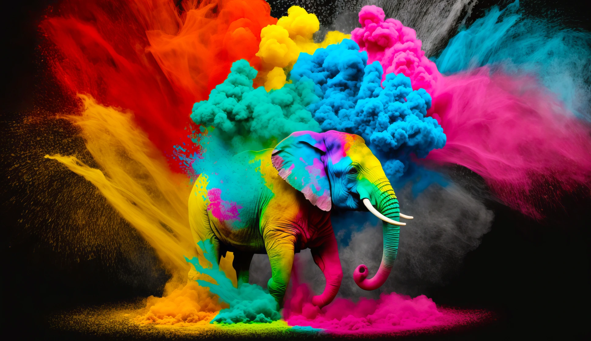
Colors are more than just visual elements—they evoke emotions, influence decisions, and convey powerful messages. From corporate logos to product packaging, the strategic use of color can define a brand’s identity and shape consumer perceptions. This article examines color psychology and its impact on branding across various industries.
Table of contents –
- Color Psychology
- Universal and Personal Perspectives on Color
- Top 6 color tools
- What is the Gradient?
- Top 6 Gradient tools
- Colors in the Design System
- Color Structure in a Design System
- Top 6 Free Design Systems
What is Color Psychology?
Color psychology studies how colors affect human behavior and emotions. Colors can influence perceptions, like how food tastes, and evoke different feelings. The impact of color varies based on factors like age, gender, and culture.
Color Psychology: How Colors Affect Us
Colors can significantly impact how we feel, think, and act. Here’s how:
- Colors Affect Behavior
Different colors can make us feel different ways. For example, blue might calm some people, while orange can energize others. - Colors Affect Perceptions
Colors can also affect how we see things, even in unexpected ways. For instance, food might look unappetizing under certain lighting conditions. - Colors Impact Well-being
Colors can help us feel better emotionally. For example, blue can help calm someone feeling stressed or angry.
While some color associations are universal, how color affects individuals can vary by age, gender, culture, upbringing, and location.
1. Orange: The Vibrant Spark of Creativity
Orange
Orange is synonymous with energy, creativity, and adventure. It works wonders for hospitality, sports, technology, and adventure brands.
This bold hue fosters enthusiasm and optimism while exuding warmth and playfulness.
For Products aiming to ignite confidence and creativity in their audience, orange is the go-to choice.
2. Blue: The Pillar of Trust and Stability
Blue
Blue is a favorite color in the corporate, healthcare, tech, and finance sectors. It conveys trust, stability, and professionalism, and its calming undertones signal its capability and intelligence.
A product that leverages blue aligns with peace, loyalty, and credibility—a perfect fit for organizations that instill consumer confidence.
3. Green: The Symbol of Growth and Harmony
Green
Green represents nature, wellness, and sustainability. It embodies freshness and balance. It resonates with environmental and finance audiences, projecting a sense of safety and prosperity.
For products that advocate harmony and growth, green is the natural choice.
4. Yellow: The Beacon of Positivity
Yellow
Yellow is associated with happiness, energy, and creativity. Its cheerful vibe makes it ideal for startups, food, and children’s products.
This youthful, friendly hue is ideal for sparking joy and optimism in product efforts, leaving a lasting impression of positivity.
5. Red: A Call to Action
Red
Red demands attention with its passionate and energetic aura. It is perfect for retail, sports, and entertainment, and ignites excitement and urgency.
Whether symbolizing love or danger, red commands action and evokes strong emotional responses, making it ideal for products seeking to inspire immediate engagement.
6. Black: The Essence of Elegance
Black
Black signifies sophistication, strength, and luxury. Often associated with fashion and high-end technology, it conveys authority and mystery.
Black remains timelessly chic for brands that want to exude exclusivity and elegance.
7. White: A Canvas of Simplicity
White
White reflects purity, minimalism, and clarity. It is a favorite among healthcare, tech, and modern design-focused industries.
Its simplicity inspires hope and innocence, appealing to consumers who value a fresh, clean aesthetic.
8. Purple: Creativity and Royalty Combined
Purple
Purple connotes luxury, ambition, and imagination. It is well-suited for healthcare, tech, and artistic brands.
This regal hue captures spirituality and mystery, making it a versatile choice for forward-thinking companies.
9. Pink: The Epitome of Softness and Joy
Pink
Pink resonates with kindness, romance, and femininity.
Popular in beauty, wellness, and fashion, this playful, gentle color resonates with audiences seeking joy and compassion in brand messaging.
Universal and Personal Perspectives on Color
While universal color meanings provide a helpful framework for understanding the emotional impact of colors, individual perceptions vary significantly. Here’s why:
- Cultural Contexts: Colors carry different meanings across cultures. For example, while white represents purity and weddings in Western cultures, it signifies mourning in some Eastern traditions.
- Personal Experiences and Preferences: Your feelings about specific colors are shaped by your unique life experiences and tastes. A shade that evokes nostalgia for one person might feel uninspiring to another.
- Color Blindness: Various types of color blindness influence how individuals perceive colors, impacting how diverse audiences interpret designs.
- Contextual Perception: How we perceive a color is influenced by its surrounding elements, including other colors, shapes, typography, and imagery. A color in isolation can feel vastly different when paired with contrasting or complementary tones.
- Tints, Shades, and Tones: A single color can have numerous variations, each with distinct associations. For example, light blue conveys calm and airiness, while navy conveys depth and formality.
Top 6 color tools I use during product design
1. Adobe Color
A versatile tool by Adobe for creating and exploring color schemes. It includes color wheel functionality, harmony rules, and the ability to extract color themes from images.
Website: Adobe Color
2. Coolors
A fast and user-friendly palette generator that lets you quickly create, save, and export color schemes. It includes features for adjusting hues, exporting palettes, and accessing trending combinations.
Website: Coolors
3. Canva Color Palette Generator
Upload an image, and Canva instantly extracts its color palette. It’s perfect for finding inspiration based on visuals.
Website: Canva Color Palette Generator
4. Colormind
An AI-powered tool that generates color palettes based on deep learning. It learns from movies, photos, and art to create harmonious palettes.
Website: Colormind
5. Paletton
This tool is excellent for designers of monochromatic, analogous, or complementary palettes. It provides a detailed visual breakdown of color relationships.
Website: Paletton
6. Khroma (Live Explainer)
Khroma uses AI to learn your color preferences and generate personalized palettes tailored to your style. You can train the AI by selecting your favorite colors, which it uses to curate combinations that suit your needs.
How to Use Khroma
- Set Preferences: Start by choosing 50 colors you like from the grid. This helps Khroma understand your taste.
- Explore Palettes: Once the training is complete, the AI generates palettes, gradients, and text-image combinations based on your input.
- Adjust and Save: Refine, save, and download palettes for your projects.
- Visualize in Context: Khroma lets you see colors applied to typography, photography, or UI design in a real-world context.
Website: Khroma

What is a Gradient?
A gradient is a gradual blend between two or more colors, creating a transition from one shade to another. Gradients are widely used in design to add depth, dimension, and visual interest. They can range from simple linear transitions to complex, multi-directional blends.
Types of Gradients
- Linear Gradient:
The color transition occurs in a straight line, horizontally, vertically, or at an angle.
Example: A gradient transitioning from blue at the top to white at the bottom. - Radial Gradient:
Colors radiate outward in a circular pattern from a central point.
Example: A gradient moving from a bright yellow center to a darker orange edge. - Conic Gradient:
Like a pie chart, the transition occurs around a center point in a circular sweep.
Example: A gradient that changes colors clockwise from one point. - Mesh Gradient:
A more intricate style where multiple colors blend across a grid, creating smooth and unique transitions.
Top 6 Gradient tools I use during product design
Defining colors in a product’s design system is crucial for consistency, accessibility, and scalability.
Here’s a step-by-step guide:
1. Establish a Color Palette
Start with a core set of colors that align with your brand identity and product goals.
- Primary Colors: Main brand colors for key elements (e.g., buttons, headers).
- Secondary Colors: Supportive colors for accents, highlights, or less prominent features.
- Neutral Colors: Shades of white, black, and gray for backgrounds, text, and borders.
2. Define Functional Roles
Assign colors based on their purpose in the UI:
- Text Colors: Ensure readability for headings, body text, and links.
- Interactive Colors: Specify hover, active, and disabled states for buttons and links.
- Feedback Colors: Use distinct colors for success (green), warnings (yellow), and errors (red).
3. Include Variations
Provide tints, shades, and tones for each base color to provide design flexibility.
- Tints: Add white for lighter versions (e.g., hover states).
- Shades: Add black for darker versions (e.g., text on light backgrounds).
4. Document Usage Rules
Clearly state how and where each color should be used.
- Examples:
- “Primary blue is for call-to-action buttons.”
- “Light gray is for background shading.”
5. Ensure Accessibility
- Test color contrasts to meet WCAG (Web Content Accessibility Guidelines) for readability.
- Use tools like Contrast Checker or Accessible Colors to verify.
6. Organize Colors in Tokens
Use design tokens (e.g., $primary-color, $secondary-color) in your codebase for consistency. Tokens help you easily apply and update colors across your system.
7. Integrate into Design Tools
Add your colors to Figma, Sketch, or Adobe XD libraries. This ensures designers and developers can use pre-defined colors efficiently.
8. Test Across Themes (Light/Dark Modes)
Adapt your color palette seamlessly across light and dark themes to ensure a consistent UX.
Example: Color Structure in a Design System
Here’s a structured example of how colors can be defined in a design system:
1. Color Palette
Define your base colors.
{
  "colors": {
    "primary": {
      "base": "#1A73E8",
      "light": "#E8F0FE",
      "dark": "#174EA6"
    },
    "secondary": {
      "base": "#F9AB00",
      "light": "#FFF3E0",
      "dark": "#C77C02"
    },
    "neutral": {
      "black": "#000000",
      "white": "#FFFFFF",
      "gray": {
        "100": "#F5F5F5",
        "200": "#E0E0E0",
        "300": "#BDBDBD",
        "400": "#9E9E9E",
        "500": "#757575",
        "600": "#616161",
        "700": "#424242",
        "800": "#212121"
      }
    },
    "feedback": {
      "success": "#34A853",
      "warning": "#FBBC05",
      "error": "#EA4335"
    }
  }
}
2. Functional Roles
Assign roles for practical use in the UI.
- Primary Colors: Used for brand elements like headers and buttons.
- Secondary Colors: Highlights, icons, or backgrounds.
- Neutral Colors: Backgrounds, borders, or text.
- Feedback Colors: Alerts and notifications.
3. Token Naming Convention
Use tokens for clarity and consistency:
{
  "tokens": {
    "background-primary": "$colors.primary.light",
    "text-primary": "$colors.neutral.black",
    "text-secondary": "$colors.neutral.gray.500",
    "button-primary": "$colors.primary.base",
    "button-hover": "$colors.primary.dark",
    "alert-success-bg": "$colors.feedback.success"
  }
}
4. Accessibility and Contrast Testing
- Primary Buttons: Ensure a 4.5:1 contrast ratio between
$colors.primary.baseand$colors.neutral.white. - Text: Use
$colors.neutral.gray.700for light backgrounds and$colors.neutral.whitefor dark backgrounds.
5. Light and Dark Theme Adaptation
Example of theme-based variations:
{
  "themes": {
    "light": {
      "background": "#FFFFFF",
      "text": "#212121"
    },
    "dark": {
      "background": "#212121",
      "text": "#FFFFFF"
    }
  }
}
6. Integration in Design Tools
In Figma/Sketch:
- Add
Primary Base,Primary Light, and other colors to a shared library. - Categorize them by usage, such as “Text Colors” or “Feedback Colors.”
In Codebase:
- Import these tokens into your CSS/SCSS or JavaScript as variables:
:root {
  --primary-base: #1A73E8;
  --primary-light: #E8F0FE;
  --primary-dark: #174EA6;
  --text-primary: #212121;
}
This structure ensures a scalable, consistent design system that can evolve with your product. Let me know if you’d like further refinements!
Popular 6 Design Systems – every UX designer should be aware!
Listed the top 6 open design systems on the Figma Community. Play, plug, and enjoy!
- Airtable Base SDK – Build your own apps on top of Airtable with Custom Apps and the Blocks SDK. Design your app with the same UI kit our team uses internally!
- AWS Amplify UI Kit
- Arco Design System
- ADS Foundations – Atlassian’s foundational design package. Includes all of our atomic components. You’ll need this and the ADS Components pack to get started.
- Forma 36 UI Kit by Contentful – Forma 36 is the open-source design system of Contentful. This UI Kit represents Forma 36 React components, including typography and colors.
- ant.design – Ant Financial has a large number of enterprise-level products. With complex scenarios, designers and developers often need to respond quickly due to frequent product demand changes and concurrent R&D workflow.
Conclusion
Understanding color psychology is essential in the competitive world of branding, but it’s equally important to recognize the nuanced ways colors affect individuals.
By carefully considering cultural contexts, personal experiences, accessibility, and contextual design, products can use colors to evoke emotions and create meaningful connections. Whether the passion of red or the calm of blue, each hue tells a story that can leave a lasting impression.