Designing a successful SaaS dashboard requires a strategic approach to data visualization, ensuring that business decisions are based on reliable insights.
This guide outlines practical techniques to help designers create dashboards that drive accurate decision-making.
What is a SaaS Dashboard?
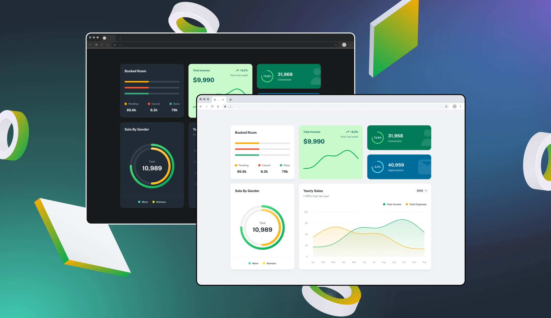
A SaaS dashboard is a user interface that visually displays key performance metrics, data insights, and analytics for a Software-as-a-Service (SaaS) application. It helps users monitor, analyze, and make data-driven decisions efficiently.
Key Features of a SaaS Dashboard
- Real-time Data: Displays up-to-date metrics from various sources.
- Data Visualization: Uses charts, graphs, tables, and KPIs to simplify complex data.
- User-Centric Design: Tailored to specific user roles (e.g., finance, marketing, sales, or product teams).
- Customizable Views: Allows users to filter, sort, and adjust data displays based on their needs.
- Performance Tracking: Helps businesses measure goals, revenue, engagement, and other critical indicators.
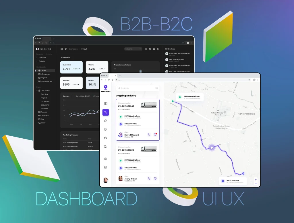
Types of SaaS Dashboards
- Business Intelligence Dashboards – Provide company-wide insights into financial, sales, and operational metrics.
- Marketing Dashboards – Track campaign performance, customer acquisition, and engagement.
- Product Analytics Dashboards – Monitor user behavior, feature adoption, and retention rates.
- Sales Dashboards – Display conversion rates, revenue, and pipeline status.
- Customer Support Dashboards – Track support ticket trends, response times, and customer satisfaction.
A well-designed SaaS dashboard ensures that relevant, accurate, and timely data is presented in a clear and actionable format, empowering businesses to make informed decisions. 🚀
Why Dashboard UX Matters
Business decisions rely on accurate, unbiased insights. A well-designed dashboard must:
- Present relevant, well-organized, and properly formatted data.
- Avoid unnecessary scrolling, as it disrupts data comparison.
- Use whitespace wisely, keeping information accessible and legible.
Core Principles for Dashboard Design
1. Understand Your Audience & Their Needs
- Identify the primary users and the decisions they need to make.
- Analyze where, when, and how the dashboard will be used.
- Define the key metrics that support user decisions.
- Determine the best way to aggregate, organize, and filter data.
2. Structure and Layout Optimization
- More data requires additional filters and views, while less data can be presented as single values.
- Prioritize key metrics: place essential insights in the top left and secondary details in the bottom right.
- Choose an appropriate layout: open, table-based, grouped, or schematic.
- Incorporate customizable presets, views, and guides to enhance usability.
3. Choosing the Right Visualization
- Match the complexity of charts to user expertise—simpler isn’t always better.
- Ensure that data representation is complete, unbiased, and up-to-date.
- Sketching and feedback loops are used to refine the dashboard design.
The Role of Data Integrity
The worst mistake in dashboard design is oversimplifying a complex domain or misleading users with incomplete insights. A dashboard’s value is determined by the actions it prompts. To ensure success:
- Spend time scrutinizing the key metrics needed for actionable insights.
- Involve data owners and developers in sourcing, cleaning, and organizing data early.
- Continuously test dashboards with actual users to validate usability and accuracy.
Key Questions to Ask Stakeholders
Uncover hidden needs and risks by asking:
- 🧭 Purpose: What decisions need better insights?
- 😤 Frustrations: What challenges make these decisions difficult?
- 📊 Sources: How are these decisions currently being made?
- 🗃️ Metrics: What data supports these decisions?
- 🧠 Data Literacy: How much detail is necessary per metric?
- 🚀 Value: How frequently will users rely on this dashboard?
- 🎲 Risks: What constraints or limitations should be considered?
Testing and Iteration
Dashboards should undergo rigorous usability testing. Select key tasks and measure user success. Continuous improvements should aim for at least an 80% success rate—when achieved, users will depend on the dashboard as an indispensable tool.
Seasoned SaaS product designer
I create intuitive and visually compelling dashboards for diverse industries, including healthcare, fintech, logistics, and skilled gaming platforms.
My portfolio showcases designs that transform complex data into user-friendly interfaces, enhancing decision-making and user engagement.
Let’s collaborate to elevate your SaaS product with a dashboard that meets your business objectives and delights your users.
Dashboard UX Resources & Figma Kits
Enhance your dashboard designs with these applicable Figma kits:
- Data Dashboards UX – A collection of data-driven dashboard UI kits to streamline your design process.
- dYdX – A sleek and modern dashboard template for analytics and trading platforms.
- Ethr – A minimalist and clean UI kit for crafting efficient and visually appealing dashboards.
- Orange – A feature-rich dashboard kit optimized for marketing and performance analytics.
- Semrush – A powerful dashboard UI with SEO, content marketing, and data visualization components.
- UKO – A highly customizable UI kit for admin panels, SaaS platforms, and web applications.
- Wireframing Kit – A comprehensive kit to prototype and test dashboard layouts quickly.
Following these best practices, you can create SaaS dashboards that effectively present data and empower users to make confident, informed business decisions.