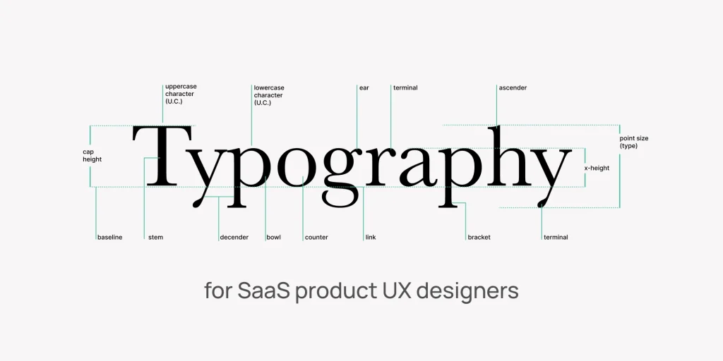
Typography shapes text for readability and emotion: fonts, size, spacing, and hierarchy matter. The best font combinations for SaaS applications enhance both design and user experience.
What is Typography?
Imagine you’re reading a book, a website, or even a street sign. How the letters look—how big they are, how they’re spaced, whether bold or thin, playful or serious—that’s typography.

It’s the art of making text readable, visually appealing, and full of personality.
Why Does Typography Matter?
- First Impressions: Just as your outfit conveys something about you, fonts (or typefaces) set the mood. A sleek, modern font feels professional (think Apple’s website), while a handwritten script feels friendly (like a café menu).
- Readability: Have you ever tried reading tiny, cramped text and given up? Good typography ensures that words are visually appealing.
- Emotion & Branding: A fun, bubbly font (like Comic Sans) feels casual, while a sharp, geometric one (like Helvetica) feels trustworthy and clean.
Key Parts of Typography:
- Fonts (Typefaces): The “style” of the letters (e.g., Times New Roman vs. Arial).
- Size & Spacing: Bigger text grabs attention; tight spacing feels compact, while loose spacing feels airy.
- Hierarchy: Headings, subheadings, and body text should be visually distinct so your eyes know where to focus.
- Contrast: Mixing fonts (like a bold sans-serif with a delicate serif) makes designs more interesting.
Real-Life Example:
- A Legal Document? It probably uses a serious, traditional font (like Garamond).
- A tech startup’s website likely uses a clean, modern font (like Inter or Roboto).
- A Children’s App? It’s probably a rounded, playful font (like Quicksand).
TL;DR:
Typography makes text look good and work well—whether on a billboard, an app, or a cereal box. The right choice can make people trust you, enjoy reading, or even click that “Buy Now” button.
Want to see it in action? Compare a luxury brand’s website (elegant, thin fonts) with a skate shop’s (bold, edgy fonts). That’s typography doing its magic! ✨
As a SaaS UI designer, you understand the importance of font combinations in shaping the user experience.
The right pairing can elevate your design, while the wrong one can break it.
Instead of spending hours experimenting, why not rely on proven combinations that deliver professional and engaging results?
We’ve got you covered, whether you’re aiming for modern sophistication or bold contrast.
Below, we’ll dive into seven expertly curated font pairings that can transform your SaaS UI design and enhance your users’ experience.
Which one will you choose to make your interface stand out?
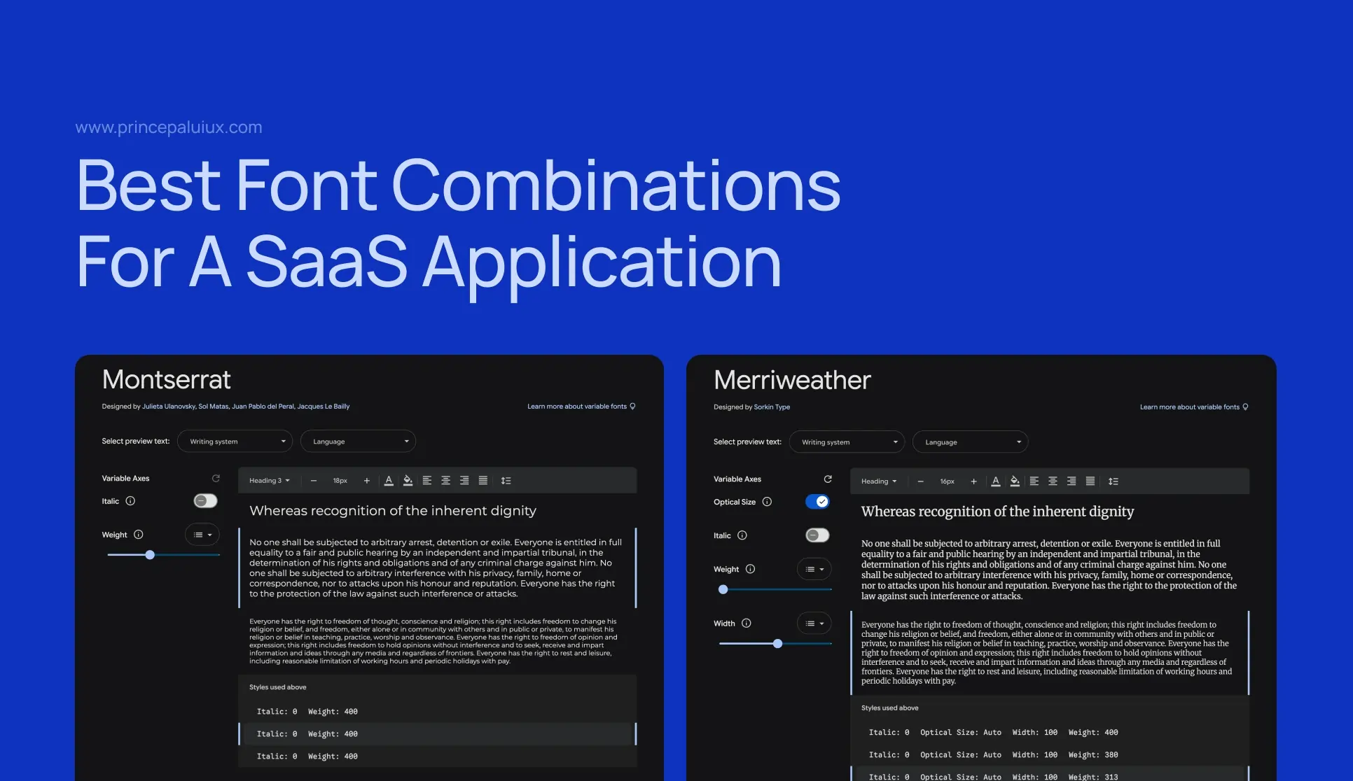
1. Montserrat & Merriweather
This duo combines Montserrat’s clean, geometric sans-serif style with Merriweather’s timeless serif elegance. The contrast between the two creates a sophisticated and modern look, perfect for SaaS interfaces.
To establish a clear hierarchy, use Montserrat for body text and Merriweather for headings. For balance, opt for the lighter weights of Montserrat and the bolder weights of Merriweather.
This pairing enhances readability and adds a touch of refinement to your design.
2. Open Sans & Playfair Display
Open Sans brings a modern, minimalist vibe, while Playfair Display adds a luxurious serif flair. Together, they create a striking, professional, and visually appealing contrast.
Use Open Sans for body text to ensure clarity and Playfair Display for headings to add a touch of elegance. This combination is ideal for creating a clear typographic hierarchy that guides users seamlessly through your interface.
3. Lato & Great Vibes
Lato’s geometric structure pairs beautifully with Great Vibes’ playful, handwritten style.
This combination strikes a balance between professionalism and approachability, making it ideal for SaaS applications that aim to be both friendly and polished.
Use Lato for body text and UI elements, and reserve Great Vibes for accents, such as CTAs or headings, to add a warm, human touch.
4. Inter & Raleway
Inter and Raleway are a match made in modern design heaven. Inter’s clean, legible style works perfectly for body text, while Raleway’s sleek, refined lines make it ideal for headings.
This duo is perfect for creating a minimalist, professional aesthetic that’s both functional and visually appealing. It’s an excellent choice for SaaS platforms that prioritize clarity and simplicity.
5. Arial & Cabin
Arial’s neutral simplicity pairs well with Cabin’s geometric flair, creating a clean and modern look. Use Arial for body text to ensure readability and Cabin for headings to add a touch of personality. This versatile combination works well for SaaS applications requiring a straightforward, user-friendly design.
6. Roboto & Montserrat
Roboto’s mechanical, industrial feel complements Montserrat’s geometric elegance, making this pairing ideal for tech-savvy SaaS platforms. Use Roboto for body text and Montserrat for headings to create a clear hierarchy. The contrast between the two fonts adds visual interest while maintaining a professional tone.
7. Poppins & Oswald
Poppins’ modern, geometric simplicity perfectly matches Oswald’s bold, confident style. This combination injects energy and dynamism into your design, making it ideal for SaaS applications that want to feel fresh and innovative. Use Poppins for body text and Oswald for headings or CTAs to create a bold, impactful look.
8. Nunito & Libre Baskerville
Nunito’s rounded, friendly sans-serif style pairs beautifully with Libre Baskerville’s classic serif elegance. This combination is ideal for SaaS platforms that aim to strike a balance between approachability and professionalism. Use Nunito for body text and Libre Baskerville for headings to create a warm, inviting design.
9. Source Sans Pro & Lora
Why it works: Source Sans Pro’s clean, modern sans-serif style complements Lora’s elegant serif design. This pairing is ideal for creating a balanced, readable interface with a touch of sophistication.
Usage: To add a refined touch, use Source Sans Pro for UI elements and Lora for headings or quotes.
10. Futura PT & Georgia
Futura PT’s geometric, futuristic vibe matches Georgia’s classic serif style. This combination is ideal for SaaS platforms that aim to strike a balance between innovation and timeless elegance. Use Futura PT for headings and Georgia for body text to create a clean, modern look with a hint of tradition.
By experimenting with these combinations, you’ll find the perfect typography to elevate your SaaS UI design and create a seamless user experience.
Where to Download Free, Open-Source Fonts
Are you looking for high-quality fonts without the price tag? These platforms offer free, open-source typefaces for commercial and personal use:
- Google Fonts (fonts.google.com) – Huge library, easy to embed in websites.
- Fontshare (fontshare.com) – Free fonts with premium vibes.
- Open Foundry (open-foundry.com) – Curated, open-source gems.
- Adobe Fonts (Free Section) (fonts.adobe.com) – Filter for “Free” options.
Always check the license (OFL or SIL are safest for commercial use).
What’s a Font?
A font is the style of text you see on screens, books, or signs—it’s the personality of your words. Think of it like clothing for letters:
- Comic Sans = Casual sweatpants
- Times New Roman = A classic suit
- Futura = A sleek, modern jumpsuit
Fonts change how text feels. A playful font makes a kids’ app fun; a sharp, clean font makes a bank look trustworthy.
Font Types, Explained Simply
- Serif Fonts (e.g., Times New Roman, Georgia)
- “Fancy feet”: Little lines (serifs) at the ends of letters.
- Use them for Books, luxury brands, and newspapers (classic vibes).
- Sans-serif fonts (e.g., Helvetica, Arial)
- “Clean and modern”: No extra lines—sleek and simple.
- Use them for Apps, websites, and tech brands (friendly but professional).
- Script Fonts (e.g., Great Vibes, Brush Script)
- “Fancy handwriting”: Curvy, elegant, or playful.
- Use them for logos and invitations (but sparingly, as they can be challenging to read in long text).
- Display Fonts (e.g., Bebas Neue, Impact)
- “Big and bold” means headlines, posters, or ads.
- Use them for Attention-grabbing titles (not body text).
- Monospace Fonts (e.g., Courier, Roboto Mono)
- “Typewriter style”: Every letter takes equal space.
- Use them for Coding, retro designs, and techy feels.
Why Does This Matter?
- Serif = Trustworthy, traditional
- Sans-serif = Clean, modern
- Script = Elegant, personal
- Display = Bold, loud
- Monospace = Techie, retro
Pick the right “outfit” for your words! 👕✨
Here’s a step-by-step AI-powered typography workflow tailored for SaaS UI design
Phase 1: Discovery & Brand Alignment
Tool: Adobe Fonts (Sensei AI)
- Input your brand keywords (e.g., “trustworthy,” “innovative”).
- Let AI suggest fonts matching your personality.
- Pro Tip: Export the top 3 options to Figma/Sketch for quick mockups.
Tool: ChatGPT-4o
- Prompt: “Act as a senior UX typographer. Critique this SaaS UI font stack: [paste your fonts]. Suggest alternatives balancing professionalism and modernity.”
Phase 2: Hierarchy & Pairing
Tool: Fontjoy
- Generate five font pairings with one click.
- Tweak contrast sliders (e.g., “More modern” → leans toward sans-serifs).
Tool: Figma AI (Beta)
- Select a text layer → “Auto-adjust hierarchy” – AI resizes headings/body text proportionally.
Phase 3: Accessibility & Compliance
Tool: Stark Plugin (Figma/Sketch)
- Run “Accessibility Audit” → Fix contrast issues flagged by AI.
- Use “Magic Color Suggestions” to adjust typography colors dynamically.
Tool: WebAIM Contrast Checker
- Upload screenshots → AI predicts readability for users with visual impairments.
Phase 4: Performance Optimization
Tool: Next.js Font Optimization
- If using custom fonts, enable
next/font– AI subset fonts are used to load only the characters used.
Tool: Cloudinary AI
- Upload fonts → Automatically converts to
.woff2and applies compression.
Phase 5: User Testing & Refinement
Tool: VisualEyes
- Upload UI mockups → AI generates attention heatmaps showing if users notice key text.
Tool: Hotjar
- Deploy on staging → Use AI to analyze session recordings for typography-related friction (e.g., users skipping important text).
Phase 6: Handoff & Dev Sync
Tool: Zeplin
- Auto-generates typography specs (sizes, line heights) from Figma → CSS-ready.
Tool: GPT-4o
- Prompt: “Convert these typography styles [paste specs] into a responsive CSS typography scale with REM units.”
Pro Workflow Example
- Morning: Use Fontjoy to pair fonts → Test in Figma AI.
- Afternoon: Audit with Stark → Optimize with Cloudinary.
- Evening: Validate with VisualEyes → Tweak based on heatmaps.
For Advanced Teams:
Integrate Uizard to auto-generate AI-powered UI variations with optimized typography.
Final Thoughts
Choosing the right font combination can make all the difference in your SaaS UI design.
These nine pairings offer a mix of modern sophistication, bold contrasts, and approachable elegance, ensuring your interface is functional and visually appealing.
By incorporating these expert-approved font combinations and AI tools, you will create fantastic SaaS UI designs and enhance the user experience.
