
Typography in SaaS UI Design is more than just picking pretty fonts—it’s crucial in balancing readability, aesthetics, and brand identity.
Table of Contents
- Checklist for Typography in SaaS UI Design
- 1. Typography Fundamentals: Core Principles Every Designer Should Know
- 2. Aligning Typography with UI Goals
- 3. Choosing Readable Fonts: A Data-Driven Approach
- 4. The Delicate Balance: Where Beauty Meets Usability
- 5. Mastering Visual Hierarchy Through Typography
- 6. Maintaining Brand Consistency Through Typography
- 7. Iterative Design: Testing and Perfecting Your Type Choices
- 8. Performance and Loading Optimization
- 9. Localization and Multilingual Support
- 10. Microtypography Enhancements
- 11. Dark Mode and Color Schemes
- 12. Motion and Interactive Typography
- 13. Legal and Licensing Considerations
- 14. Future-Proofing Your Typography
- AI-powered tools to enhance typography in SaaS UI designs
The right typography choices guide users effortlessly through your interface, reinforce your brand personality, and ensure accessibility.
But how do you make the best decisions, and what pitfalls should you avoid?
Checklist for Typography in SaaS UI Design
✅ Readability First – Prioritize clarity over trends.
✅ Brand Alignment – Typography should reflect brand personality.
✅ Accessibility Compliance – WCAG 2.1 AA standards are a must.
✅ Cross-Device Testing – Mobile, desktop, tablet, and different OSes.
✅ Performance Checks – Optimize font loading for speed.
✅ Localization Readiness – Support multilingual users if needed.
✅ Legal Compliance – Proper font licensing for commercial use.
Let’s break it down step by step ↓
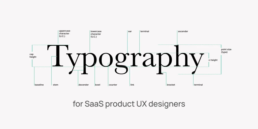
1. Typography Fundamentals: Core Principles Every Designer Should Know
Before diving into font selection, you need to grasp the fundamentals of typography. It consists of seven key elements:
- Typeface vs. Font: A typeface (e.g., Helvetica) is the design, while a font (e.g., Helvetica Bold 12pt) is a specific style and size.
- Size: Impacts readability and hierarchy.
- Line Spacing (Leading): Affects text density and legibility.
- Alignment: Left, right, centered, or justified—each has different use cases.
- Color: Influences contrast and accessibility.
- Style: Bold, italic, or regular—used for emphasis.
Understanding font anatomy (x-height, baseline, cap height) helps pair fonts effectively. Additionally, knowing type classifications—serif (traditional, formal), sans-serif (modern, clean), script (elegant), and display (decorative)—ensures you choose the right fonts for your UI.
2. Aligning Typography with UI Goals
Your typography should serve the user’s needs. Ask yourself:
- What are the primary tasks users need to accomplish?
- How can typography guide them intuitively?
- Does the font style match the brand’s tone (professional, playful, authoritative)?
Accessibility is non-negotiable. Ensure sufficient contrast, scalable fonts, and legible sizes to accommodate all users. A well-structured typographic hierarchy reduces cognitive load, helping users process information faster.
3. Choosing Readable Fonts: A Data-Driven Approach
Readability is king in SaaS UIs. Users should absorb information effortlessly. Here’s how to optimize:
- Body Text: Sans-serif fonts (e.g., Open Sans, Lato) are clean and easy to read.
- Headings: Serif fonts (e.g., Merriweather) or bold sans-serifs create contrast.
- Pairing Fonts: Stick to 2-3 fonts max to avoid visual clutter.
- User Preferences: Consider default system fonts for familiarity.
Avoid overly decorative fonts in functional interfaces—they may look nice but can hinder usability.
4. The Delicate Balance: Where Beauty Meets Usability
The Power of Visual Cohesion in Design
Typography shapes the emotional tone of your UI. A tech startup might use sleek, minimalist fonts, while a financial SaaS may opt for more traditional serifs. Stay aware of cultural associations—some fonts convey trust, others innovation.
Readability First: When to Prioritize Function Over Flair
While creative fonts can enhance branding, they shouldn’t compromise readability. If users struggle to read your content, they’ll disengage. Test fonts in real-world scenarios—small screens, low-light conditions—to ensure they hold up.
5. Mastering Visual Hierarchy Through Typography
A well-defined hierarchy guides users naturally through your UI. Here’s how to achieve it:
1. Strategic Font Scaling for Better Flow
Use a modular scale (e.g., 16px body, 24px subheadings, 32px headings). Ensure responsive scaling for different devices.
2. Creating Contrast That Guides the Eye
Bold for primary actions, regular for secondary text. Italics for subtle emphasis (but use sparingly).
3. The Art of Logical Grouping in UI Elements
Consistent styling for buttons, labels, and error messages. Use color and weight to differentiate interactive elements.
6. Maintaining Brand Consistency Through Typography
Define a typography system early on:
- Primary and secondary fonts.
- Standardized sizes, line heights, and spacing.
- Rules for headings, body text, and UI components.
Ensure your typography aligns with brand guidelines. If your brand is modern, avoid outdated serifs. If it’s traditional, overly futuristic fonts may feel out of place.
7. Iterative Design: Testing and Perfecting Your Type Choices
Never assume your typography works—test it rigorously:
- Cross-Device Testing: Check rendering on mobile, tablet, and desktop.
- User Feedback: Conduct A/B tests on font pairings and sizes.
- Accessibility Checks: Use tools like WebAIM’s Contrast Checker.
Stay updated with typography trends, but prioritize usability over fleeting styles.
8. Performance and Loading Optimization
Web Fonts vs. System Fonts: Custom fonts (Google Fonts, Adobe Fonts) enhance branding but may slow loading. System fonts (Arial, Helvetica) load instantly but limit uniqueness.
Font Loading Strategies: Use font-display: swap CSS to prevent layout shifts while fonts load.
Variable Fonts: A single file with multiple weights/styles, improving performance.
9. Localization and Multilingual Support
Character Set Coverage: Ensure fonts support extended Latin, Cyrillic, CJK (Chinese, Japanese, Korean), or Arabic if needed.
Line Height Adjustments: Some scripts (e.g., Arabic) require more vertical space.
Right-to-Left (RTL) Support: Test bidirectional text rendering.
SaaS Localization Guide: Strategies for Global Dominance →
10. Microtypography Enhancements
Kerning & Tracking: Adjust letter spacing to improve legibility in headlines.
Hyphenation & Justification: Avoid awkward word breaks in justified text.
Smart Quotes & Ligatures: Small refinements that elevate professionalism.
11. Dark Mode and Color Schemes
Contrast Ratios: Text must meet WCAG 2.1 standards (4.5:1 for normal text, 3:1 for large text).
Font Weight Adjustments: Some fonts appear thinner in dark mode—test readability.
Dynamic Typography: Automatically adjust font colors based on background.
12. Motion and Interactive Typography
Hover Effects: Subtle weight changes or underlines for interactive elements.
Animated Text: Use sparingly for notifications or loading states.
Scroll-Based Typography: Dynamic resizing/effects for storytelling.
13. Legal and Licensing Considerations
Commercial vs. Free Fonts: Always check licensing (Google Fonts = free; paid fonts may require subscriptions).
Webfont Embedding Rules: Some licenses restrict usage in SaaS products.
14. Future-Proofing Your Typography
AI & Dynamic Fonts: Emerging tech allows fonts to adapt to user preferences.
Variable Fonts Adoption: More flexibility without performance costs.
Voice & Typography Synergy: How fonts complement voice interfaces (e.g., chatbots).
AI-powered tools to enhance typography in SaaS UI designs

Here’s a curated list covering font pairing, readability optimization, accessibility checks, and performance:
1. AI Font Selection and Pairing
- Fontjoy (fontjoy.com) – Uses neural networks to suggest harmonious font combinations.
- Adobe Fonts (with Sensei AI) – Recommends fonts based on your brand mood and existing design.
- FontPair AI – Automatically generates balanced font duos for headings/body text.
2. Readability and Layout Optimization
- ChatGPT (Advanced Data Analysis) – Upload a UI screenshot and ask for typography critiques (e.g., “Suggest improvements for better hierarchy”).
- Uizard (uizard.io) – AI-generated UI mockups with auto-adjusted typography for clarity.
- Readable.so – Analyze text legibility using AI (color contrast, line length, etc.).
3. Accessibility and Compliance
- Stark (getstark.co) – AI-powered plugin for Figma/Sketch to check WCAG contrast ratios.
- AccessiBe – Scans live UIs for typography-related accessibility issues.
- Contrast Checker by Adobe – AI-suggested color/font adjustments for better readability.
4. Performance Optimization
- Cloudinary AI Font Optimizer – Compresses and delivers variable fonts efficiently.
- Next.js Font Optimization – AI-driven automatic font subsetting for faster loading.
5. Dynamic & Adaptive Typography
- Glyphic AI – Generates context-aware typography for different screen sizes.
- Figma’s AI Auto Layout – Adjusts font spacing/sizing responsively.
6. AI-Powered Prototyping and Testing
- VisualEyes – Uses AI to predict how users will scan your typography (heatmaps).
- Attention Insight – Simulates user attention on text elements.
Pro Tip:
Combine these tools in your workflow:
- Start with Fontjoy/Adobe Fonts for pairing.
- Use Stark for accessibility checks.
- Test with VisualEyes to validate hierarchy.
Bonus: For copywriting, tools like Jasper.ai can generate UI microcopy optimized for readability.
Closing Insights: Typography as a Strategic Design Tool
Typography in SaaS UI design is a blend of art, science, and strategy. Beyond aesthetics, it impacts usability, performance, accessibility, and legal compliance.
Expanding your focus to include these additional factors ensures a polished, functional, and future-ready interface.
What’s Next?
- Experiment with variable fonts.
- Test dark mode readability.
- Audit your current typography for accessibility gaps.
Great typography doesn’t just look good—it works seamlessly for every user. 🎨✨