The quiet notes of a product designer on what I love, what frustrates me, And what design taught me back.
You know that moment when you look back at your career and realize you’ve been doing the same thing for two decades?
That’s where I found myself recently—21 years deep into designing digital products, wondering why I still get excited about pushing pixels around a screen.
Here’s the thing: I thought I was the one shaping the products. Turns out, design has been shaping me all along.
Let me explain what I mean by that.
Table of contents
- 1. The Framework That Changes Everything
- 2. The Art of Saying No (Without Being a Jerk)
- 3. Making Your Thinking Visible
- 4. Consistency: The Boring Superpower
- 5. Controlled Chaos: Breaking the System You Built
- 6. The Long, Difficult Journey to Shipping
- 7. The Legacy Nobody Talks About
- 8. Context is King (And Users Are Terrible Historians)
- 9. Constraint Breeds Creativity (And Twitter Taught Us That)
- 10. Your Users Are Smarter Than You Think (But Also More Distracted)
- 11. The Best Feedback Comes From Watching, Not Asking
- 12. Your Design System Will Fail (And That’s Okay)
1. The Framework That Changes Everything
“If you want to understand people, don’t listen to what they say—watch what they do.”
— Donald Norman
When I started out in SaaS product design, I was obsessed with features. Every stakeholder meeting felt like a wish list session—”Can we add this? What about that?”—and I’d frantically sketch wireframes trying to accommodate everything. Honestly, it was exhausting.
Start With How People Think, Not Screens
Then I discovered something that changed my entire approach: conceptual models.
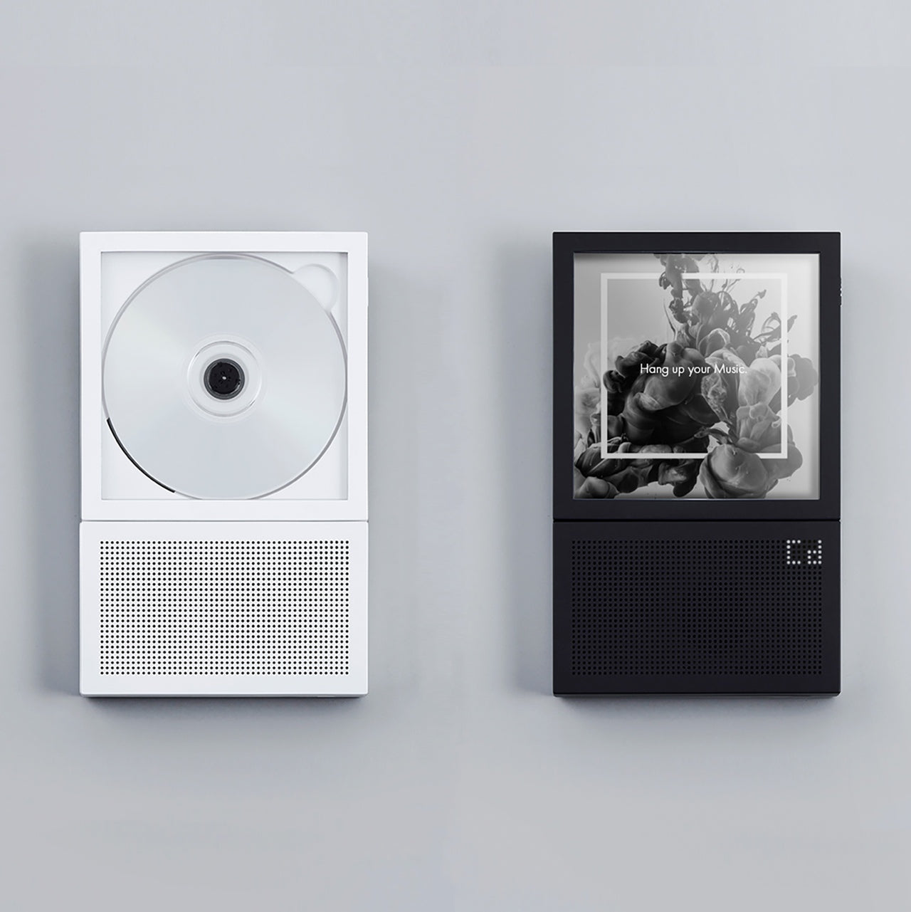
Naoto Fukasawa, the Japanese designer behind that iconic wall-mounted CD player, once said something that stuck with me: “Design needs to be plugged into human behavior.
Design dissolves in behavior.” When I first read that, I didn’t really get it. But after years of watching products succeed or fail, it finally clicked.
Products built on strong conceptual models—frameworks that help users understand what they’re looking at—have this uncanny ability to stay coherent even as features pile on.
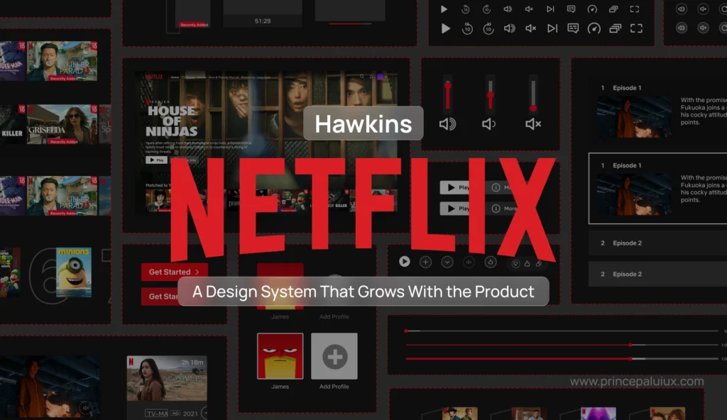
Think about Slack. The conceptual model is simple: it’s an organized conversation. Everything they’ve added since launch (threads, huddles, canvases) makes sense because it fits that mental model.
Breaking Your Own Rules (On Purpose)
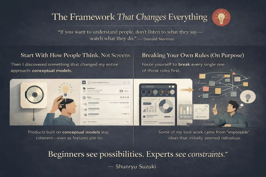
Here’s something nobody tells junior designers: when you’re generating ideas, you need to ignore what’s possible.
Your brain—especially if you’ve been doing this for a while—will automatically set up invisible guardrails.
“Oh, we can’t do that because engineering would hate it,” or “That won’t scale,” or “Legal will never approve.”
Force yourself to break every single one of those rules first.
Some of my best work came from ideas that initially seemed ridiculous. A few years back, we were redesigning an enterprise analytics platform.
The conventional approach would’ve been dashboards, filters, the usual suspects. Instead, we explored this wild idea: what if data exploration felt more like browsing Instagram Stories? Swipe through insights, tap to dig deeper, double-tap to bookmark.
Did we ship exactly that? No. But that “impossible” idea led us to an unexpected place—a gesture-based interface that users actually enjoyed using (rare for enterprise software, trust me).
“You’re never bad at something, you’re just new to it.” I remind myself of this constantly, especially when exploring unfamiliar territory.
2. The Art of Saying No (Without Being a Jerk)
“Simplicity is about subtracting the obvious and adding the meaningful.”
— John Maeda
If there’s one superpower every SaaS designer needs, it’s the ability to say no. And I mean constantly.
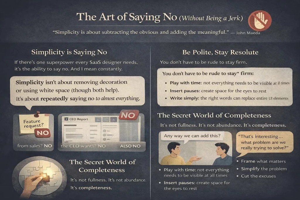
Simplicity isn’t about removing decoration or using white space (though both help). It’s about repeatedly saying no to almost everything.
That feature request from sales? No. That extra column the CEO wants? No. That “nice-to-have” that marketing mentioned in passing? Also no.
But—and this is crucial—you don’t ever have to be rude when you say no. At work and in life.
I learned this the hard way. Early in my career, I had this reputation for being “difficult.”
I’d shut down ideas aggressively, thinking I was protecting the product’s integrity. Spoiler: I was just protecting my ego.
The shift happened when I started framing rejections differently. Instead of “That won’t work,” I’d say,
“That’s interesting—let’s explore what problem we’re actually trying to solve here.”
Most of the time, once we dug into the real problem, there was a simpler solution that didn’t involve cluttering the interface.
The Secret World of Completeness
“Simplicity is about subtracting the obvious and adding the meaningful.”
— John Maeda. You’ve probably heard that quote a million times. But have you actually felt it?
There’s this exact moment—this specific iteration in your design file—where you suddenly realize what the product was meant to be all along.
It’s not fullness or abundance. Its completeness. Like a puzzle where the final piece slides perfectly into place.
That feeling is honestly addictive. It’s why I’m still doing this after 21 years.
Train your eye to spot redundancy everywhere. Look at your screen right now. Find elements serving similar purposes.
Either pull them apart so they’re clearly distinct, group them together, or merge them into a single item. That’s the path to simplicity—it’s unglamorous work, but it compounds.
Here’s what helped me:
- Not everything needs to be visible at all times (the beauty of digital products is that we can play with time)
- Create space for the eyes to pause—consuming visual information is choreography
- Words matter more than you think (the right copy can replace entire UI elements)
- If you’re using “and” or “also” to explain what your feature does, something’s wrong
Georg Olden, who did graphics for CBS back in the day, understood this perfectly. His work was stripped down to essentials, yet somehow more expressive than the cluttered alternatives.
3. Making Your Thinking Visible
“The ability to explain something clearly is proof that you truly understand it.”
— Albert Einstein
You know what’s wild? Most of our design decisions are completely invisible to stakeholders.
They see the final interface and think, “Okay, blue button, makes sense,” without realizing you spent three days considering 17 different approaches, testing them with users, analyzing heatmaps, and wrestling with edge cases.
Framing is your chance to make that thinking visible.

I think of it like Tadao Ando’s Church of the Light in Osaka. It’s this dark, austere space with wooden benches—pretty unremarkable until you see the back wall.
There’s a cross-shaped opening that lets light pour in, and suddenly the entire space transforms. The framing creates the magic.
The Placebo Effect of Good Framing

Here’s something I’ve tested dozens of times informally: if you present the same design to two groups—one with thoughtful framing, one without—the framed group is way more likely to support your idea. Same exact pixels, completely different reception.
Framing works like a placebo, honestly.
There are hundreds of ways to frame your work: conceptual names, short sentences, moodboards, stories, videos, metaphors, frameworks, and powerful quotes.
I once presented a complex B2B workflow redesign using a cooking metaphor (mise en place, specifically).
Sounds cheesy, right? But it helped stakeholders understand why we were reorganizing information architecture the way we were.
Most ideas die because of a lack of framing. When you don’t give people enough context to process what you’re sharing, you’re basically asking them to judge a book by its cover—except the cover is a bunch of rectangles and text fields.
Find what motivates your decision-makers. Stakeholders are just humans with their own hopes, fears, and motivations.
One VP I worked with cared deeply about reducing support tickets.
Another was obsessed with activation metrics. Once I understood their drivers, I could frame my presentations accordingly—not manipulatively, but by highlighting the aspects most relevant to them.
4. Consistency: The Boring Superpower
“Consistency is what transforms average into reliable.”
— James Clear
Let me be real with you: consistency is probably the least sexy topic in design. Nobody gets excited about it. There are no awards for “Most Consistent Button Styles.”
But consistency is by far the most important technical skill for product designers. If you’re not obsessed with it, you’ll struggle to deliver quality work. Period.
I learned this while watching products scale. We had this design system at my last company—nothing fancy, pretty standard component library.
But we were religious about maintaining it. Every new feature had to use existing patterns unless there was a compelling reason to deviate.
Fast forward two years, and we’d shipped probably 40 major features across multiple product lines. Users kept telling us how “easy to learn” the platform was.
They’d master one area and intuitively understand others because patterns are repeated.
Engineering loved it because it let them ship faster. Sales loved it because demos were smoother.
That’s consistency compounding.
The Details Nobody Notices (Until They Do)
Proofread everything. Your font sizes, your components, your spacing, your styles, your words, your presentations, your emails. Seriously, everything.
The world will try to convince you that being detail-oriented is a bad thing—that you’re too “in the weeds” or you’re slowing things down. Ignore it. Be as detail-oriented as you can, all the time.
You cannot command respect from your team if you’re not exceptional at your craft and if you’re not paying attention to every single detail in your work and in theirs. That might sound harsh, but it’s true.
When you find inconsistencies in other people’s work, let them know. Ideally, in private.
They might be a little embarrassed first, but they’ll thank you later.
I’ve built some of my strongest professional relationships by being the person who catches the small stuff before it ships.
But—there’s always a but—don’t let consistency limit you. Designing for the current context is more important than obsessing over consistency for its own sake. Sometimes, breaking the system creates the most memorable moments.
5. Controlled Chaos: Breaking the System You Built
“You can’t make something memorable by playing it safe.”
— Paula Scher
The vast majority of SaaS work is systematic. We create components, establish patterns, and document everything.
That’s necessary—it’s how we scale. But it’s when we intentionally break the system that products become memorable, relatable, special.
When and Why to Break Your Own Rules
Beware of being locked into a system. I see this constantly with SaaS products that follow existing patterns so strictly that they struggle to differentiate from competitors.
Every B2B analytics tool starts looking the same after a while because everyone’s following the same playbook.
Know when and why to break the rules. Rationalize it to yourself first. Why are you deciding not to follow patterns at this particular point? You’ll want a strong case when you share those ideas with your team.
Ask yourself wild questions: What if you completely changed the background color now? What if you made the type 10x bigger? What if you shortened content by 90%? What if you reversed the order of your flow?
These questions lead to delightful, unexpected results. Not always. But often enough that it’s worth asking.
It’s okay to detach instances every now and then. (If you know, you know.)
Transgressions are a product of love, never about breaking the system due to a lack of discipline or oversight. That’s irresponsible.
It’s about loving and understanding the system so well that you feel an urge to push it further.
Here’s the truth: no user will remember your design system. They’ll remember the experiences your product enabled them to have.
That onboarding flow made them feel smart. That moment when data visualization clicked. That feature saved them three hours every week.
6. The Long, Difficult Journey to Shipping
“You don’t learn from experience. You learn from reflecting on experience.”
— John Dewey
That hits different when you’re six months into a redesign that keeps getting delayed.
Designing is changing. Most of us became designers because we believe in making things better. We believe change is possible—that we can improve how things serve humans.

But honestly? The work isn’t done when your Figma file is pristine. The journey to shipping is long and arduous.
You’ll persevere through multiple layers of reviews, compromises, technical constraints, and shifting priorities.
The 95 Presentations Problem
You will repeat the same presentation 95 times before the product launches. That’s not your fault. That’s not anyone’s fault.
It’s just how organizations work—different stakeholders, different contexts, different questions.
Do every presentation with the same passion and intentionality as the first one. I know it’s exhausting. I’ve definitely had moments when I’m thinking, “If I have to explain this navigation pattern one more time…”
But here’s what helped me: each presentation is an opportunity to refine my framing, to discover new objections, to understand what resonates.
Change will happen along the way. The delta between what you designed and what gets shipped will always exist.
Learn to live with it. Learn to keep pushing even when things change. Know what the purest idea behind your design is—that’s the only thing you can’t afford to lose.
Figure it out. The photography budget will always be $0. The timeline will always be shorter than ideal. T
he feature you were excited about won’t be part of MVP. These constraints aren’t bugs—they’re features of the design process.
You’ll need a bit of anger, honestly. Find what your enemy is on every project; it’ll give you motivation to keep pushing.
Often, that enemy is simply mediocrity. The “good enough” that isn’t actually good enough. The “users won’t notice anyway” attitude. Fight that.
Avoid making the same mistakes repeatedly. Try to make new mistakes whenever possible. That’s growth.
7. The Legacy Nobody Talks About
“The best work happens when people feel safe enough to be honest.”
— Amy Edmondson
Design is a team sport. Projects change, products get redesigned, jobs come and go. People and the memories they create together? Those stay.
I’ve worked on products that no longer exist. Features that got deprecated. Entire companies that shut down.
But I still talk to the people I worked with. We still grab coffee and laugh about that impossible deadline or that stakeholder who wanted everything in chartreuse.

The Audacity of Joy
Have the audacity to seek joy at work. A positive attitude towards yourself and others will make work feel less like work.
Ignore titles when you introduce yourself. I stopped saying “I’m a Senior Design Director” years ago.
Now I just say, “I’m Prince Pal, I design digital products.” This flattens conversations and ensures people are heard because they have something relevant to say, not because of their seniority.
Courtesy costs nothing. Nothing. Say please and thank you. Respond to messages even when you’re busy. Show up on time. It’s basic stuff, but it matters.
Give credit even where credit isn’t due. Credit is a designer’s currency. I’ve seen careers accelerate or stall based on how people handle attribution. Be generous.
When you present work, name everyone who contributed. When someone compliments your design, point to the developer who brought it to life or the researcher who validated the approach.
Criticize in private, praise in public. You’ll get way better results by elevating good behavior than by punishing bad behavior.
I learned this: managing teams—public criticism (even constructive) makes people defensive. Private conversations create space for actual improvement.
Never underestimate the power of being silly. When you make a silly joke, you lower walls and invite people in.
Some of my best creative sessions started with someone making a ridiculous suggestion that made everyone laugh—and then we realized there was actually something there.
Stop Asking, Start Giving
Stop asking for a seat at the table or to be involved in certain conversations.
The so-called “table” doesn’t exist. Instead, find ways to add so much value that no one will forget to invite you next time.
Stop asking people for anything. Start giving more than asking. People will naturally gravitate toward you.
Digital products have short lifespans. That redesign you spent a year on? It’ll get replaced in three years, probably less.
Your real legacy as a designer is the impact you have on people around you, how much you help them grow, and how you make them feel when working together.
That, ultimately, is the product of your work.
8. Context is King (And Users Are Terrible Historians)
The value of design thinking is in the abstraction. Ask the question behind the question.
— Ellen Lupton
Here’s something that took me embarrassingly long to understand: users are absolutely terrible at telling you what they need.
Not because they’re dumb—they’re not. But because they don’t see what you see.
I remember working on a SaaS project management tool a few years back. We ran user interviews, and everyone kept asking for more filtering options.
“We need to filter by date range, by assignee, by priority, by status, by custom fields…” The list went on forever.
We could’ve just built all those filters. Shipped a dropdown-heavy interface and called it a day.
But we dug deeper. “Tell me about the last time you needed to find something and couldn’t.” That’s when the real stories emerged.
Turns out, they didn’t actually want more filters. They wanted to find that one critical task buried under hundreds of others.
The context was “I’m panicking because something’s urgent and I can’t locate it.” The solution?
A smart search that understood natural language queries and recent activity patterns.
Ask the Question Behind the Question
When someone requests a feature, they’re usually describing a solution to a problem they haven’t articulated.
Your job isn’t to build their solution—it’s to understand their problem so well that you can find the right solution.
Stop taking feedback at face value. Every feature request is a symptom. Diagnose the disease.
I’ve started asking “Why?” at least three times in every conversation. “We need a bulk edit feature.” Why? “Because we’re editing multiple items.” Why? “Because they all need the same change.” Why? “Because we screwed up the initial setup and now we’re fixing it.”
Ah. Now we’re getting somewhere. Maybe the real problem is the initial setup process, not the lack of bulk editing.
Context shapes everything. The same user in the same product will have completely different needs at 9 AM versus 5 PM.
Understanding temporal, emotional, and organizational context—that’s where great product design lives.
Design for the Situation, Not Just the Screen
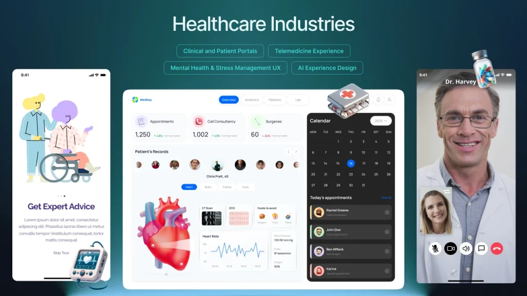
I worked with a healthcare startup that designed a medication-tracking app. On paper, the primary use case was “log when you took your meds.” Simple enough, right?
But the context was more complex. Some users took medication at the same time every day (easy, predictable).
Others had variable schedules (nurses, shift workers). Some were caring for elderly parents with dementia (they needed to log meds for someone else).
Some were managing chronic pain with as-needed medications (unpredictable timing, emotional component).
One interface couldn’t serve all these contexts equally well. So we built adaptive flows that detected patterns and adjusted accordingly.
The shift worker got a different experience from the retiree. Same product, different contexts, different designs.
Here’s what this looks like in practice:
- Design for the user’s mental state, not just their task list
- Consider what happened before they opened your product (and what they’ll do after)
- Time of day matters more than you think
- Stress levels change everything
- Previous interactions create expectations
The moment you start designing with context in mind instead of just features, everything shifts.
You stop asking “what should this button do?” and start asking “what is this person trying to accomplish right now, and what’s the easiest path to get there?”
Users won’t remember your interface. They’ll remember whether your product understood their situation.
9. Constraint Breeds Creativity (And Twitter Taught Us That)
Constraints are not the enemy of creativity—they’re the birthplace of it.
— Unknown
I used to think constraints were obstacles to overcome. Limited budget? Frustrating. Tight timeline? Stressful. Technical limitations? Annoying. No access to custom illustration? Disappointing.
Then I watched Twitter (before it became X, back when it was still relatively sane) prove that 140 characters could spawn entire industries, political movements, and new forms of storytelling. The constraint wasn’t a bug—it was the entire point.
The Magic of Being Forced to Choose

Constraints force you to make actual decisions instead of hedging your bets. When you can do anything, you often end up doing nothing particularly well.
When you can only do three things, you’d better make sure those three things are the right things.
I worked on a mobile app redesign under severe performance constraints. The app had to work on low-end Android devices in emerging markets with spotty 3G connections.
We couldn’t use heavy animations, large images, or complex interactions.
At first, the team was bummed. “How are we supposed to compete with slick iOS apps when we can’t even use proper transitions?”
But those constraints forced us to focus on content and clarity. We stripped away every unnecessary element.
We optimized our information architecture ruthlessly. We made typography do the heavy lifting instead of relying on visual flourishes.
The result? An app that loaded instantly, felt responsive on any device, and had the clearest user experience of anything we’d ever built.
Users in markets with better infrastructure loved it too because it was so damn fast and straightforward.
Embrace your constraints:
- Small teams mean faster decisions and tighter execution
- No budget for custom photos? Use illustration, or better yet, just great typography
- Can’t hire specialized roles? Generalists build more cohesive experiences
- Short timeline? Focus kills feature creep better than anything else
- Technical debt? Sometimes working within legacy systems teaches you more about users’ actual workflows than a greenfield project
The companies I’ve seen struggle most are the ones with unlimited resources.
No constraints means no forcing function to make hard choices. Every idea seems viable.
Every feature request gets built.
The product becomes a bloated mess that tries to serve everyone and delights no one.
The Instagram Example

Remember when Instagram launched? It was photo filters and a feed.
That’s it. No stories, no reels, no shopping, no DMs at first. Just photos with filters.
The constraint was deliberate—Kevin Systrom and team knew they couldn’t compete with Facebook’s features, so they didn’t try. They did one thing exceptionally well within severe constraints.
That constraint created focus. That focus created quality. That quality created growth.
What constraint can you impose on yourself that would force better decisions?
10. Your Users Are Smarter Than You Think (But Also More Distracted)
Don’t make me think—or at least, not about the wrong things.
— Steve Krug (paraphrased)
This is going to sound contradictory, but stay with me: users are simultaneously smarter and less attentive than most designers assume.
They’re smart enough to learn complex interfaces if the value is clear. Look at Figma, Notion, or any professional tool—these products have steep learning curves, yet millions of people master them happily.
Why? Because the payoff justifies the investment.
But they’re also distracted, multitasking, half-watching Netflix while using your product, getting interrupted by Slack notifications every three minutes.
They’re not going to read your carefully crafted onboarding tooltips. They definitely won’t watch your tutorial video.
Respect Their Intelligence, Protect Their Attention
I learned this while working on enterprise software. We kept dumbing things down, assuming users wouldn’t understand advanced features.
We’d hide powerful functionality behind layers of menus because “it might confuse people.”
Then we’d watch users struggle to accomplish basic tasks because we’d oversimplified to the point of making things harder.
They weren’t confused by complexity—they were frustrated by condescension.
One of the best pieces of feedback I ever got was from a user who said, “I’m a portfolio manager. I deal with millions of dollars in assets daily. I think I can handle a dropdown menu with more than three options.”
Point taken.
Here’s the balance:
Don’t hide powerful features because you think users can’t handle them. They can. But make the common paths ridiculously easy so distracted users don’t have to think about them.
Think progressive disclosure, not dumbing down. Simple by default, powerful when needed.
Slack does this well—anyone can send a message (dead simple), but power users can create workflows, set reminders, use slash commands, customize notifications, and integrate with dozens of tools.
Design for Interruption
Your users aren’t sitting in a quiet room, fully focused on your product. They’re:
- Getting interrupted by their boss
- Switching between six different tabs
- Trying to remember what they were doing before the meeting
- Rushing to finish before their kid’s soccer game
Design for that reality. Autosave everything. Make it easy to pick up where they left off. Don’t punish them for closing a tab mid-task. Show them what they were working on when they return.
I worked on a content creation tool where we added a “recent activity” panel that showed exactly where users left off, even if they didn’t save.
Completion rates jumped 40% because people could easily recover from interruptions.
Respect their intelligence by:
- Offering advanced features without apology
- Trusting them to explore and learn
- Providing depth for those who want it
- Not assuming they’re idiots
Protect their attention by:
- Making the main path obvious
- Reducing decisions for common tasks
- Forgiving mistakes and interruptions
- Not requiring them to remember things between sessions
Your users can handle complexity. They just can’t handle complexity and bad design at the same time.
11. The Best Feedback Comes From Watching, Not Asking
People don’t know what they want until you show it to them.
— Steve Jobs(probably said this, even if the exact quote is disputed)
User interviews lie. Not intentionally, but they do. People will tell you they want one thing and then behave completely differently when you give it to them.
I spent years conducting interviews, taking diligent notes, building features users explicitly requested, and then watching those features go unused.
“You said you wanted this!” (I never said that out loud, but I thought it plenty.)
Then I started watching users instead of just listening to them. Game changer.
Observation Beats Conversation
We were redesigning a dashboard for a sales CRM. In interviews, sales reps told us they wanted to see all their opportunities at a glance.
“Give us a big table with all the data,” they said. So we mocked up a comprehensive table view with all the requested columns.
Put it in front of them for usability testing, and what happened? They immediately filtered it down to show just five or six opportunities. Every single time.
They said they wanted to see everything. They actually wanted to see their top priorities without extra steps.
Watching revealed the truth. They weren’t lying in interviews—they genuinely believed they wanted a complete view. But behavior doesn’t lie.
Now I build observation into every project:
- Screen recordings of real sessions (with permission, obviously)
- Analytics on actual click patterns and user flows
- Heatmaps showing where attention actually goes
- A/B tests that measure behavior, not sentiment
- Shadow sessions, where I literally watch over someone’s shoulder as they work
Words are cheap. Time is expensive. If users say they love a feature but never use it, believe the behavior.
The Five-Second Test

Here’s a quick technique I use constantly: show someone your design for five seconds, then hide it and ask what they remember.
What they remember is what’s actually communicating. What they don’t remember is visual noise that needs to be eliminated or emphasized.
I did this with a landing page recently. We had this beautiful hero section with a headline, subheadline, three bullet points, and a CTA.
After five seconds, most people remembered… the stock photo. Not the headline. Not the value proposition. The stock photo of a smiling person in an office.
That stock photo got deleted immediately.
Watching people interact with designs in real-time shows you where they hesitate, where they get confused, and where they feel confident.
Those micro-moments of friction are invisible in interviews but obvious when observing.
The rule: Trust what people do more than what they say. And trust what they don’t do even more.
12. Your Design System Will Fail (And That’s Okay)
All models are wrong, but some are useful.
— George Box
Let me tell you about the best design system I ever built. We spent six months on it. Every component is documented.
Comprehensive guidelines. Sketch libraries, then Figma libraries. Governance processes. A dedicated Slack channel. The works.
It lasted about eight months before it started falling apart.
Not because it was bad—it was actually quite good. But because organizations evolve faster than design systems can keep up, teams will always prioritize shipping over system maintenance.
Design Systems Are Living Things (That Die Without Care)
Here’s what happens in every company I’ve worked with:
Months 1-3: Everyone’s excited. Components get used correctly. The system feels fresh and empowering.
Months 4-6: Exceptions start appearing. “We need this button style for just this one flow.” “Can we break the grid here?” “This component almost works, but not quite.”
Months 7-12: The system fragments. Some teams follow it religiously. Others have drifted into their own patterns. New hires aren’t trained properly. Documentation goes stale.
Month 13+: Either someone gets dedicated time to revive the system, or it becomes “those Figma files we don’t really use anymore.”
I used to fight this. I’d write stern messages about adherence to the system. I’d reject designs that didn’t follow guidelines. I’d be the designer who cared too much about the sacred system.
Then I realized: the system serves the product, not the other way around.
Build Systems That Bend Before They Break
Now I build design systems differently. Instead of trying to anticipate every future need (impossible), I focus on:
Strong foundations, loose implementations.
Define core principles (spacing scale, color philosophy, typographic hierarchy) but stay flexible on specific applications.
Version control that acknowledges reality.
When the system needs to evolve, version it clearly. “Component v1 is legacy, v2 is current, v3 is experimental.” Don’t pretend everything stays perfect forever.
Escape hatches for edge cases.
Sometimes you genuinely need to break the system. Build that into the culture. Have a process for exceptions that doesn’t require three meetings and a design review.
Gardeners, not police.
Design system maintainers should be enablers, not enforcers. Help teams extend the system rather than punishing them for working around it.
I worked at a company where the design system team literally called themselves “Cops” internally. Guess how enthusiastically other teams adopted their components? Exactly.
The System That Succeeded By Admitting Failure
The most successful design system I’ve seen was at a fintech company.
They did something smart: every quarter, they’d audit what actually shipped versus what the system supported.
When they found gaps (and they always did), they’d either:
- Add the new pattern to the system if it was being used consistently
- Deprecate the system pattern if nobody is using it
- Merge similar-but-different patterns into one unified approach
They treated the system as a reflection of reality, not a prescription for it. When reality changed, the system changed. No shame, no blame, just evolution.
Your design system will drift. Plan for it. Build processes that recognize and incorporate drift rather than fight it. The goal isn’t a perfect system—it’s a useful one that helps teams ship better products faster.
If your design system requires perfect adherence to work, it’s too fragile. Build something resilient enough to survive real-world use.
What I Learned By Designing
So after 21 years, what have I learned? That I’m not just a designer of products—I’m a product of design.
These twelve practices took me years to learn, and honestly? I’m still learning them.
Every project teaches me something new about context, constraints, users, feedback, and systems.
The beautiful thing about design is that there’s always another layer to understand.
Just when you think you’ve figured it out, a new project reveals how little you actually know.
Design has changed how I view the world, make decisions, and interact with people.
It taught me to look for patterns.
To question assumptions.
To seek beauty everywhere, not just on screens.
To believe that things can always be better while accepting that perfection is an asymptote we approach but never reach.
It taught me that simplicity requires ruthlessness.
That framing can make or break an idea.
That consistency compounds over time.
That controlled chaos creates magic.
That change is hard but necessary.
That joy matters more than we admit.
These practices aren’t revolutionary.
They’re not going to disrupt the industry or whatever.
But they’re mine—accumulated through countless iterations, failed experiments, difficult conversations, and small victories.
If you’re on a similar path, I hope some of this resonates.
If you’re just starting out, I hope it gives you permission to break some rules, to seek joy in the work, to care about the details even when others don’t.
Because here’s the thing about design: it’s not just what we make. It’s who we become while making it.
And honestly? I wouldn’t have it any other way.
- Elevate others.
- Celebrate others.
- Seek joy in being together.
- Stay curious.
- Question your assumptions.
- Let the work teach you.