Do you know one of the quickest ways to improve collaboration with product managers and engineers? Improving your design handoff files. It’s simple, doesn’t eat up much time, and the rewards are massive:
- Engineers will understand your designs (gasp!).
- Less back-and-forth and fewer late-night “What did you mean by this?” messages.
- Engineers feel like they’re on track, not wandering in the dark.
- The end product looks much like what you designed (win-win!).
In my book, the Ultimate UI UX Handbook is a telltale sign of design maturity. It shows that you’re thinking beyond your screens and considering the whole ecosystem of people involved.
Here’s what goes into crafting a top-notch handoff:
Keeping files organized for your team
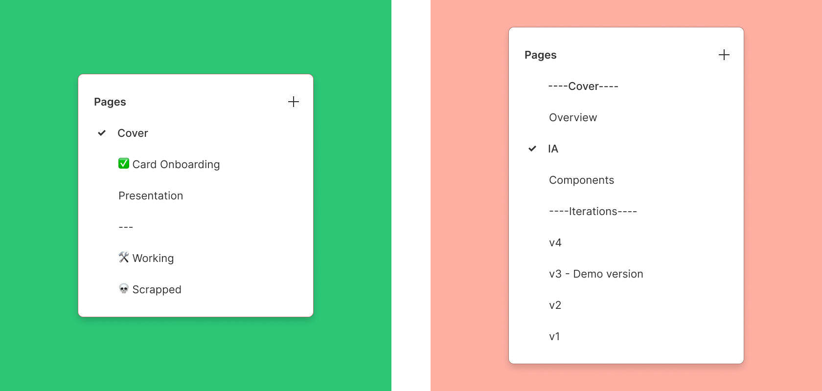
Naming your pages to indicate what’s ready for implementation is a game changer. Every designer I’ve talked to uses file pages to keep things organized: one for work-in-progress, another for feedback-ready designs, and a final one for what’s good to go for development.
Plus, they leave room for all those iterations in between. And here’s a fun tip: you can use emojis in your page names!
So why not get creative? 🏗️ for work-in-progress, 💭 for feedback, and 🚢 for the stuff that’s ready to ship!
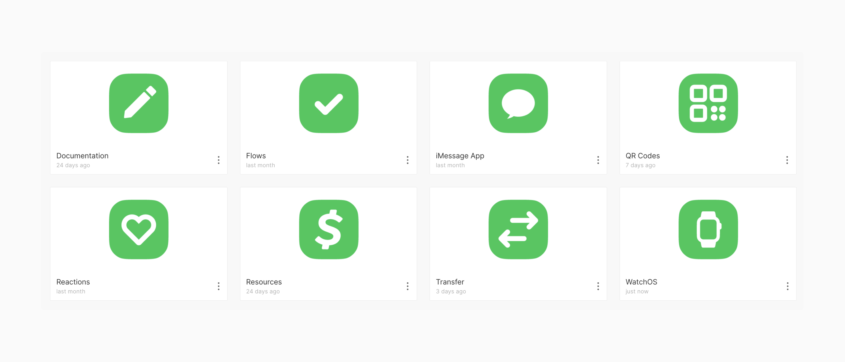
Create project thumbnails so that projects are easily navigated from recent or search.
Using components for a clean handoff
Every designer creates dedicated pages for frames ready to share, placing instances of design components there. This way, any changes made on the original frame (in a less organized space) automatically update the clean, organized page for developers and non-designers to view. It’s an excellent time-saver and makes file navigation more accessible for everyone.
Components, Styles, and documentation
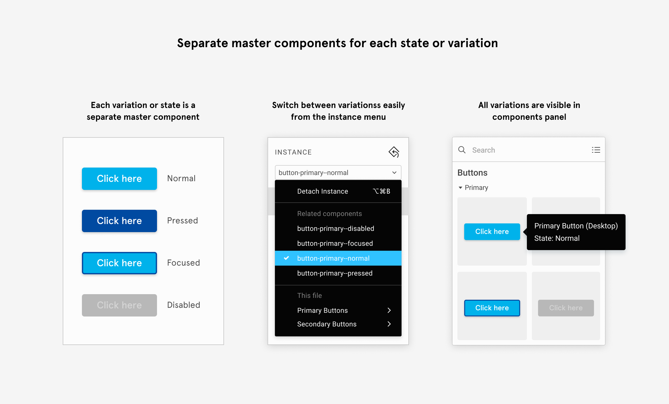
- Components: In Figma, components ensure consistency across your design and make updates more accessible for developers. Once an element is created, any changes to the master component will automatically reflect across all instances. This saves time and reduces the risk of errors in the handoff, allowing developers to reuse design elements and keep everything aligned easily.
- Styles: Applying shared styles for elements like colors, typography, and spacing provides a single source of truth for design specifications. By defining these styles early, designers can ensure a consistent visual language throughout the project, and developers can quickly reference these standards, reducing miscommunication and speeding up implementation.
- Documentation: Adding clear, concise documentation directly within Figma files (through comments, annotations, or dedicated sections) helps developers understand the design’s purpose and functionality. It gives context to design decisions, clarifies interactions, and provides guidance for any tricky edge cases—making the handoff smoother and minimizing back-and-forth questions.
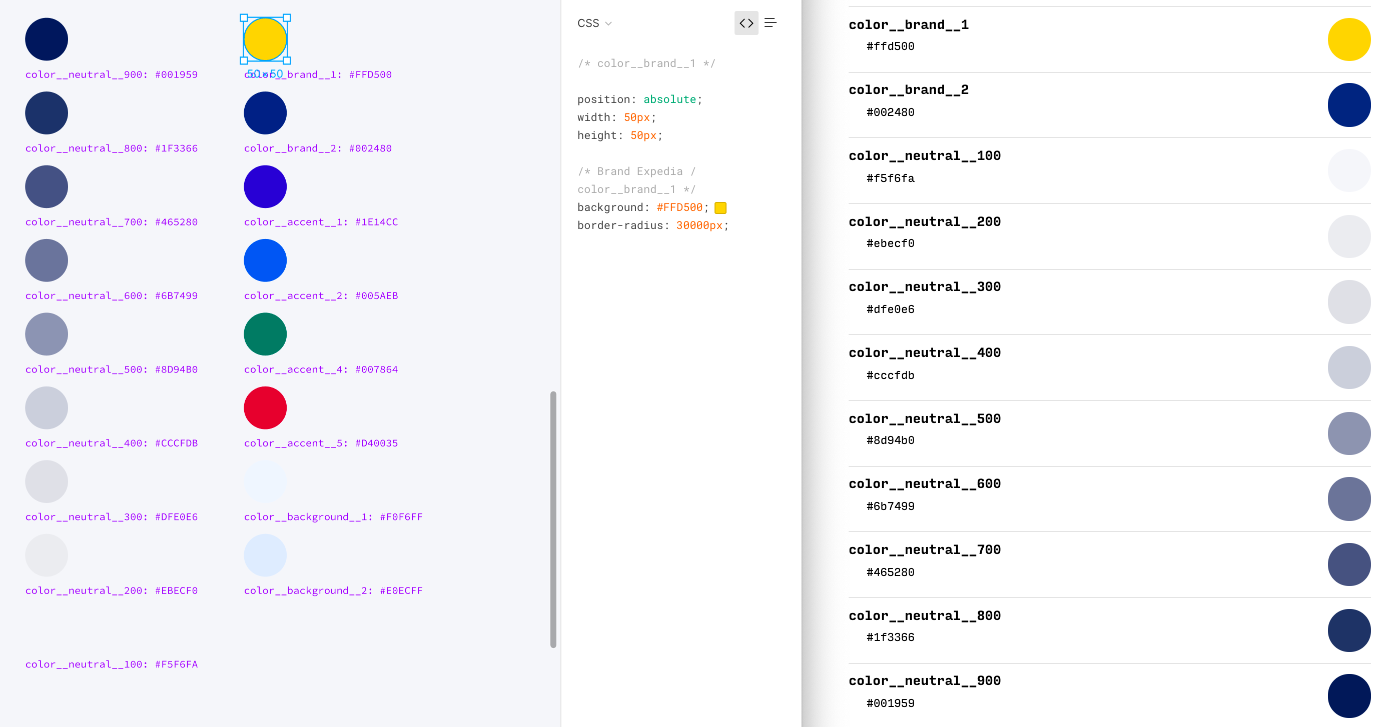
Naming Styles gives work more context.
In addition to components, all three design teams heavily rely on Figma styles to maintain interface consistency. By assigning clear, meaningful names to color, typography, and effect styles—like tokens or variables—developers can easily match design elements in Figma with their counterparts in the codebase. This simple step ensures smoother collaboration and tighter alignment between design and development.
Include a prototype
Figma’s prototype feature allows designers to create interactive, clickable designs that mimic the final user experience. By linking frames and adding transitions, designers can directly demonstrate user flows, animations, and interactions within Figma.
These prototypes are invaluable for developers during the design handoff. Instead of deciphering static screens, they can see exactly how the product should function, including behaviors like hover states, modal transitions, and navigation flows.
This reduces ambiguity, minimizes back-and-forth questions, and helps ensure that the final product aligns closely with the intended user experience. In short, prototypes make the design vision more precise and actionable for developers.
Of course, not every project needs the whole work. A tiny feature tweak? Keep it light. A big, game-changing update? Go all in.
In this cheat sheet, I’ve compiled my top tips to create the “perfect” handoff file.
Bonus: I’ve even whipped up a Figma Annotation and Handoff Kit to make your life easier. Check the comments for the link. 👇
—
If you found this helpful, go ahead and share it on social media ♻️
PS: By handoff, I’m not talking about just passing the design over (collaboration is critical from problem to solution). I’m referring to a well-organized Figma design file, the single source of truth for developers to follow during implementation.