Akiba One – Fintech + Regulatory Compliance App Case Study

Overview
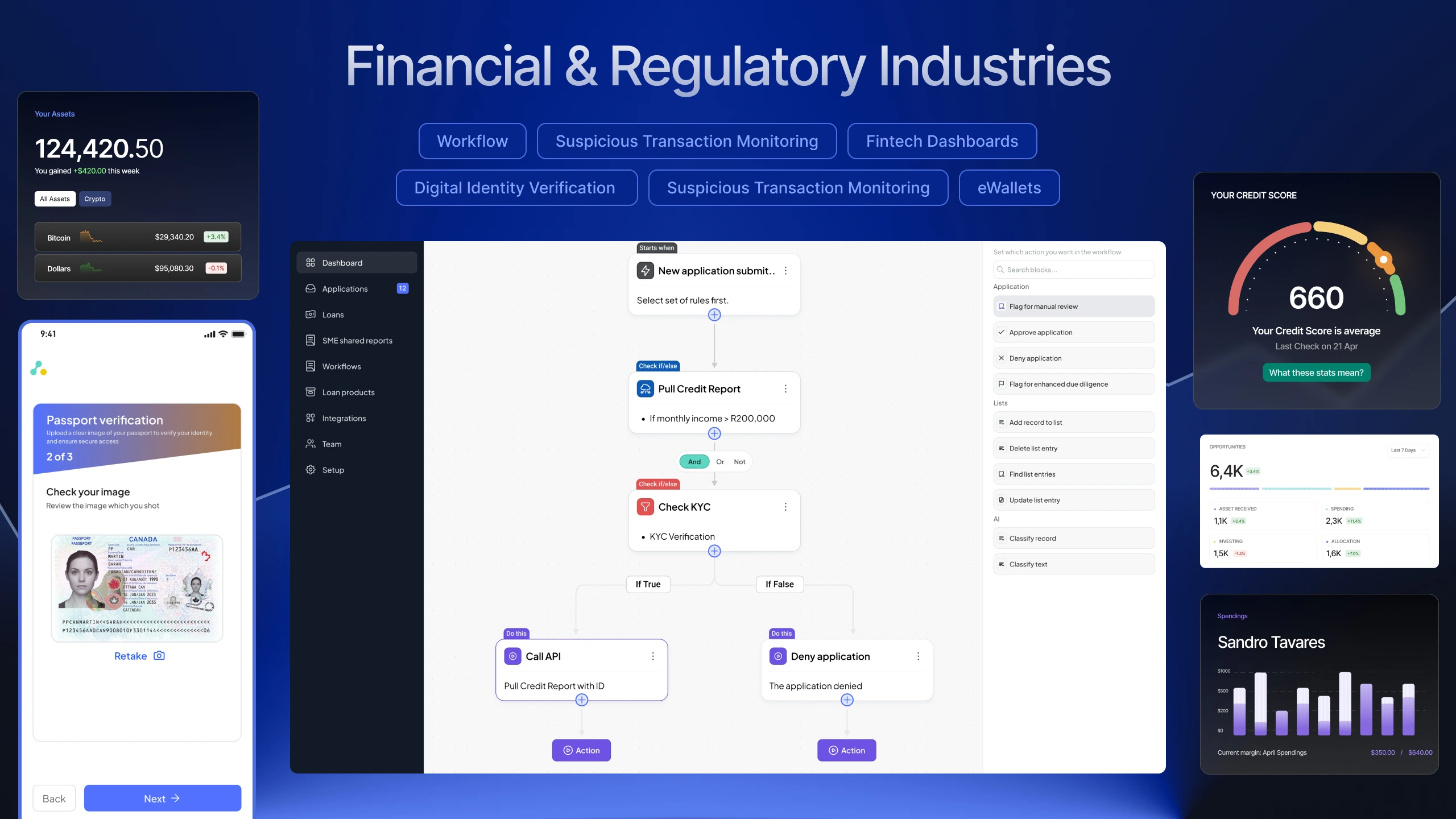
Akiba One — Simplifying Enterprise Fintech Through Workflow Automation & System Design
AkibaOne is an enterprise fintech SaaS platform built for financial institutions across Africa to automate credit decisioning, reduce fraud, and streamline compliance operations, using alternative data sources such as telco activity, mobile money behavior, and digital identity signals.
I worked directly with Tebogo Mokwena, who hired me on Contra and the Akiba Digital team for approximately six months, where I led the rebranding and product redesign of AkibaOne.
My role focused on transforming highly complex financial workflows into a scalable, enterprise-grade user experience that felt intuitive even for non-technical operational teams.
The challenge wasn’t simply making the platform look modern. It was about reducing cognitive overload, improving trust, simplifying automation logic, and creating a system that could scale across multiple fintech workflows without losing clarity.
Project Details
ROLE
UI/UX Designer
TIMELINE
Dec 2024 – May 2025
INDUSTRY
Fintech / Enterprise SaaS
FOCUS
Design System, Workflow Automation, KYC Verification, Enterprise UX
PLATFORM
Web Application

The Problem Statement
Understanding the Problem
Designing for enterprise fintech is fundamentally different from designing a typical SaaS product.
Every workflow affects:
- Compliance,
- Financial approvals
- Fraud prevention
- Identity verification
- Operational risk
Even a small UX mistake can create confusion that impacts real financial outcomes.
The platform had three major UX problems that needed immediate attention. Designing for enterprise fintech means designing for zero margin for error. I focused on solving three distinct UX challenges:
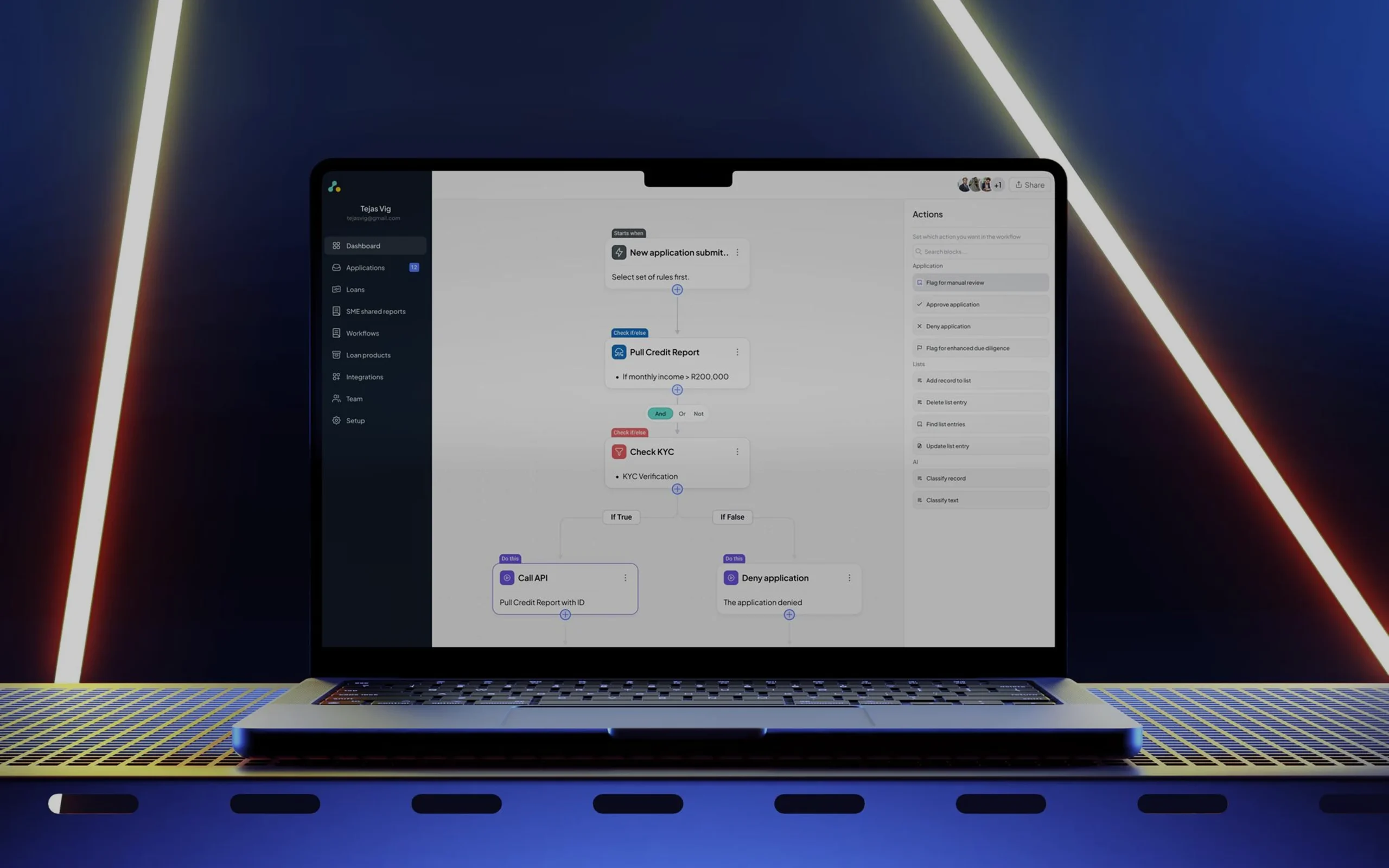
1. Complex Financial Logic Was Difficult to Operate
The platform allowed institutions to automate operational workflows, but configuring those workflows required heavy technical understanding.
Operational teams needed to:
- Create loan approval logic
- Configure KYC checks
- Connect APIs
- Define conditions
- Automate actions
- Manage branching decisions
The issue was that many users were not developers.
They needed a visual system that allowed them to create sophisticated decision trees without touching code.
2. KYC Verification Had High User Drop-Off
Identity verification is one of the biggest points of abandonment in fintech products.
Users were struggling with:
- Passport scanning
- Unclear validation feedback
- Failed image captures
- Uncertainty during submission
The experience needed to feel fast, trustworthy, and guided without compromising compliance requirements.
3. The Platform Lacked Visual Consistency
AkibaOne had multiple modules handling dense financial data, but there was no strong visual system tying everything together.
This created:
- Inconsistent interactions
- UI fragmentation
- Slower engineering implementation
- Unnecessary usability friction
The platform needed a structured enterprise-grade design language that communicated:
- Trust,
- Intelligence
- Reliability
- Operational precision
My Approach
Before designing screens, I focused heavily on systems thinking.
For a platform this complex, jumping directly into UI design would have led to surface-level solutions that failed to address deeper usability problems.
I started by understanding:
- How financial decisions were processed
- How workflows branched
- How APIs connected
- Where users became confused
- Where operational friction occurred
This helped me design around user logic instead of purely around interface aesthetics.

Rebranding & Building the Design System
The first major step was establishing a complete visual foundation for the platform.
For enterprise fintech software, trust is not optional.
The interface itself must immediately communicate:
- Credibility
- Stability
- Precision
- Security
I redesigned the visual identity around a structured, component-driven system, using a trustworthy blue-centered palette with clean spacing, hierarchy, and modular layouts.
The design system included:
- Buttons and interaction states
- Text field behaviors
- Form validation patterns
- Authentication code states
- KYB timeline indicators
- Modal systems
- Notification behaviors
- Tables
- Filters
- Dropdowns
- Reusable workflow components
This system has significantly improved:
- Design consistency
- Engineering handoff
- Scalability
- Development speed
Instead of repeatedly solving the same UI problems, the team can now build faster with reusable patterns.

Mapping the Decision Engine
One of the most important parts of the project was redesigning the platform’s workflow automation engine.
Before designing the interface, I mapped the platform’s core operational logic into four foundational building blocks:
Triggers
Events that initiate workflows.
Rules
Conditional logic that evaluates scenarios.
API Integrations
External data checks and financial signals.
Actions
Automated outcomes based on logic decisions.
The challenge was translating highly technical backend logic into a visual mental model that operational teams could instantly understand.
I transformed these abstract concepts into modular visual blocks that users could arrange and connect naturally.
This dramatically reduced the learning curve for non-technical teams.

Post-Development UX Audit
One thing I strongly believe is that design does not end at Figma handoff.
After the engineering team implemented the Workflow Builder, I conducted a detailed post-development UX audit to ensure:
- Interaction consistency
- Usability quality
- Edge-case handling
- Implementation accuracy
This helped identify:
- Interaction mismatches
- Visual inconsistencies
- Spacing issues
- Uability gaps before broader rollout
For enterprise SaaS products, these small details matter enormously because users interact with the platform daily for operational decision-making.
Designing the Workflow Automation Builder
The Workflow Builder became the centerpiece of the AkibaOne experience.
I designed a node-based visual interface that allowed users to create complex decision trees through drag-and-drop interactions on a clean dot-grid canvas.
The experience focused heavily on clarity and reducing cognitive load.

Reducing Cognitive Load
Instead of forcing users to interpret technical terminology, I introduced contextual micro-labels directly above workflow nodes.
Examples included:
- “Starts when”
- “Check if/else.”
- “Do this”
These small UX decisions dramatically improved scanability and helped users immediately understand the purpose of each block before reading deeper details.
Visual Branching & Flow Clarity
Financial workflows often contain complicated branching scenarios.
For example:
- If KYC passes → continue
- If KYC fails → reject
- If the fraud score is high → manual review
- If API fails → retry verification
I designed the branching system so users could visually understand these paths without feeling overwhelmed.
The interface handled:
- Conditional logic
- Branching outcomes
- API sequencing
- Action routing is intuitive and visually organized rather than technically intimidating.
Searchable Actions Panel
To improve workflow construction speed, I designed a searchable right-side actions panel where users could quickly:
- Add nodes
- Search integrations
- Configure actions
- Expand workflows dynamically
This reduced friction during workflow creation and improved discoverability across the platform.
Video Walkthrough & Product Communication
To help stakeholders fully understand the workflow builder, I also created and edited a complete product walkthrough video with voiceover narration.
The video demonstrated:
- Workflow creation
- Node configuration
- Branching logic
- Testing environments
- Workflow publishing
This became an important communication asset for explaining complex functionality in a much more digestible way.
Designing the Passport Verification Experience
Alongside the enterprise workflows, I also designed the consumer-facing passport verification flow.
KYC experiences are naturally high-friction because users are asked to:
- capture documents,
- position IDs correctly,
- deal with camera permissions,
- and trust the platform with sensitive data.
My goal was to make the experience feel guided and reassuring.

Real-Time Guidance
I designed the camera interface with:
- Dynamic document boundaries
- Real-time visual feedback
- Alignment assistance
- “Hold still” prompts
When the passport was aligned correctly, the bounding box turned green to reassure users that the system had successfully recognized the document.
This reduced uncertainty and improved capture quality.
Confidence Before Submission
I also introduced a dedicated review screen that allows users to inspect their image before submission.
This included:
- Image previews
- retake functionality
- Confirmation feedback
This small UX improvement helped reduce:
- User frustration
- API failures
- Failed OCR scans

Results & Impact
The redesign transformed AkibaOne from a technically dense operational system into a scalable enterprise fintech platform with significantly improved usability and workflow clarity.
Key Outcomes
Improved Operational Efficiency
Non-technical teams could independently create and manage decision workflows without relying heavily on developers.
Reduced Cognitive Complexity
Visual workflows and modular logic blocks made complex financial automation easier to understand.
Stronger Risk Mitigation
The testing environment reduced deployment risks and improved workflow reliability.
Better Platform Consistency
The design system established a scalable foundation across the entire product ecosystem.
Faster Engineering Execution
Reusable components and structured UI patterns accelerated development velocity and reduced UI inconsistencies.
Reflection
This project pushed me far beyond traditional UI design.
It required:
- Systems thinking
- Enterprise UX strategy
- Workflow architecture
- Cognitive load reduction
- A deep understanding of operational fintech environments.
Working directly with Akiba Digital gave me the opportunity to design for real-world financial workflows where usability directly impacts operational efficiency and trust.
The biggest lesson from this project was simple:
- Complex systems do not need to feel complicated
- With the right UX architecture, even highly technical financial workflows can become understandable, approachable, and scalable
Collaboration & Client Relationship
I collaborated directly with Tebogo Mokwena, who hired me through Contra to lead the rebranding and UX redesign of AkibaOne.
The engagement focused on transforming a technically dense fintech infrastructure product into a scalable enterprise platform with a cleaner visual identity, simplified workflow automation, and friction-reduced verification experiences.
Working closely with the founder enabled fast iteration cycles, deeper product understanding, and strategic UX decisions aligned with the real operational challenges faced by financial institutions across African markets.
Testimonial
Prince played a key role in modernising and standardising our design system, bringing clarity, consistency, and a modern touch to our product. His attention to detail, collaborative approach, and user-first mindset helped us build a scalable system that’s improved both our user experience and development speed. A pleasure to work with and highly recommended!
