Most usability rules we still quote were written when software behaved like a very obedient intern.
You clicked a button, and it did the thing. You filled out a form, and the data was saved. Predictable. Deterministic. Almost comforting.
AI ruined that comfort. And that’s not a complaint—it’s just reality.
I’m Prince Pal, and this perspective comes from 12+ years as a UX generalist and SaaS product designer, plus plenty of hands-on time building AI-powered SaaS products with tools like ChatGPT, Gemini, Claude, Nano Banana, Midjourney, DALL-E 3, Aiode, Suno, Runway, Pika and Figma.
Along the way—and backed by ongoing AI/UX research—I’ve watched AI systems guess, hesitate, improvise, and occasionally deliver the most confident wrong answer you’ve ever seen.
This article lives right at that intersection of research, real-world design, and learning the hard way.
The goal isn’t to replace Jakob Nielsen’s heuristics. It’s to translate their spirit into a space where systems guess, hesitate, improvise, and sometimes confidently say the wrong thing.
So yeah, we needed new principles.
Let me explain.
The quiet but massive paradigm shift
Back in 1994, Nielsen’s usability heuristics were shaped around command-based interaction. Users told systems what to do, and systems followed instructions like a checklist.
Generative AI flipped that model.
Now we’re in the territory of intent-based interaction. You say what you want, not how to get it. The system figures out the path. Sometimes beautifully. Sometimes… not so much.
According to research from Nielsen Norman Group, this is the first genuinely new UI paradigm in roughly 60 years. That’s not hype. That’s tectonic.
The challenge?
Outcomes are probabilistic
Latency varies
Trust is fragile
Users feel unsure who’s “driving.”
Classic heuristics don’t break here—but they bend. Hard.
How these Usability AI Principles were stitched together
The synthesis started with Nielsen’s original 10 heuristics and ran them through two modern lenses:
The trick wasn’t copying rules. It was mapping human needs (clarity, control, confidence) to AI reality (non-determinism, opacity, delay).
Same questions. New answers.
The 12 Usability AI Principles (explained without sounding robotic)
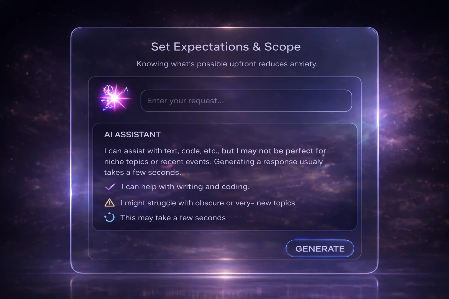
1. Set Expectations Early: Let Users Know What the AI Can (and Can’t) Do
Because surprise is fun—confusion isn’t.
When AI feels like a black box, users start guessing. Guessing creates anxiety.
Good AI systems don’t pretend to know everything. They say things like:
What can they help with
what they might struggle with
How long could a response take
Latency matters here. Even a simple “This may take a few seconds” calms people down. It’s the digital equivalent of eye contact.
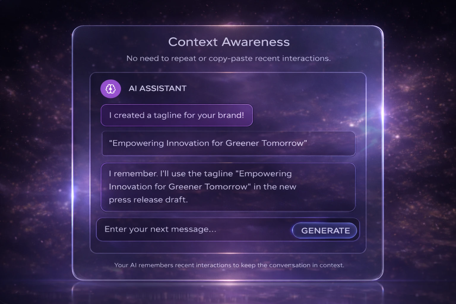
2. Designing with Memory: Using Context to Deliver Relevant AI Responses
Generic answers feel polite—and useless.
AI doesn’t automatically know your role, your urgency, or your past decisions. When it ignores context, outputs turn bland fast.
Strong systems quietly remember:
Recent actions
Preferences
Situational clues
Not in a creepy way. In a “this feels helpful” way. Honestly, context is the difference between advice and noise.
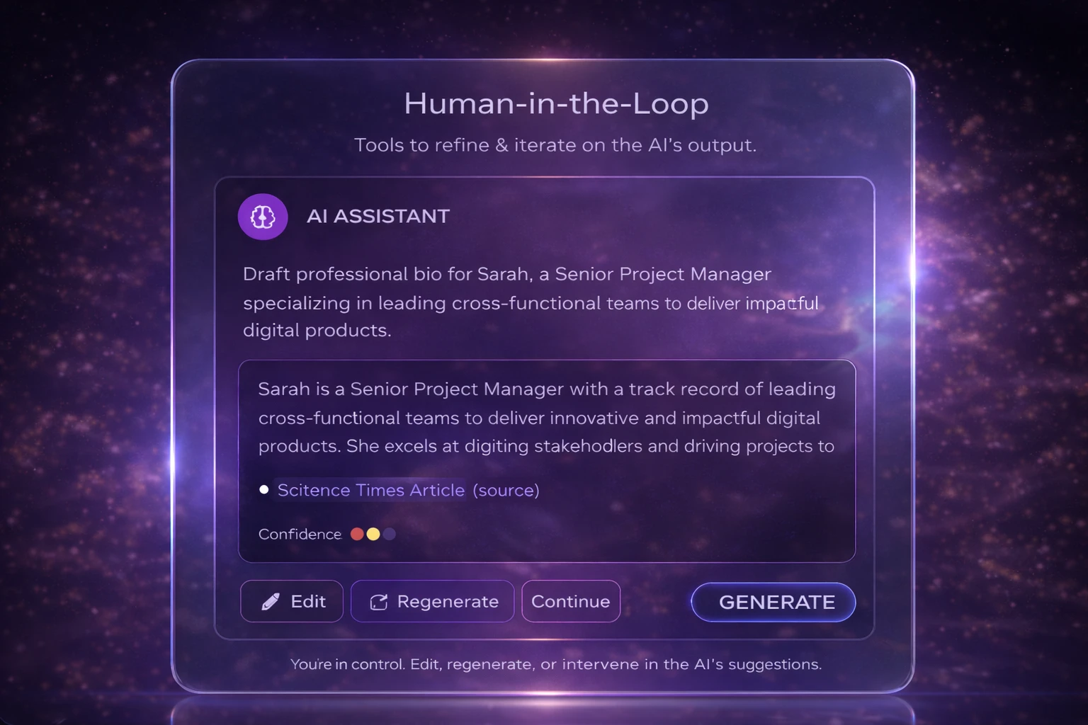
3. Human-in-the-Loop: Keeping Users in Control of AI Decisions
Autopilot is great—until it isn’t.
People don’t want AI to take over. They want it to assist, suggest, and step aside when needed.
The best designs always leave room to:
Edit
Override
Steer
Control doesn’t slow users down. It builds trust. Funny how that works.
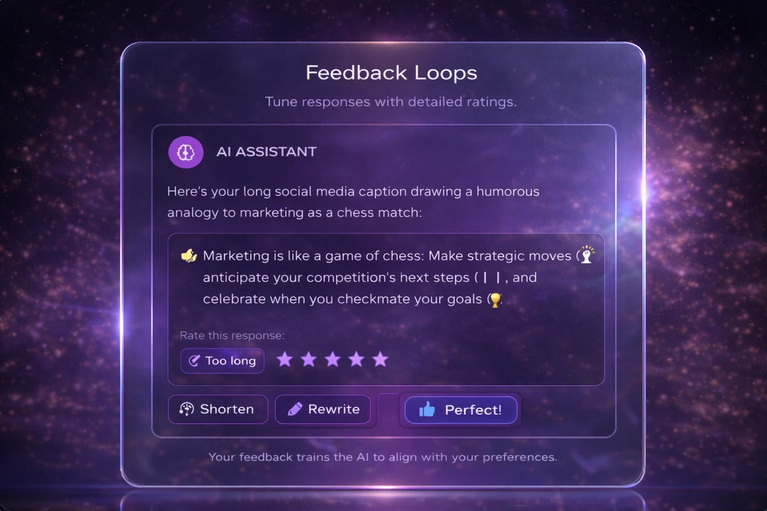
4. Learning Together: How Feedback Shapes Better AI Responses
Consistency is overrated; responsiveness isn’t.
AI won’t give the same answer twice. That’s not a bug—it’s math.
Instead of forcing consistency, good systems show they’re listening:
“Was this helpful?”
“Want to refine this?”
“Try another version?”
Iteration feels natural. Like a conversation. Because that’s what it is.
5. Mitigating Hallucinations: Helping Users Verify AI Output
AI will be wrong. Plan for it.
You can’t prevent every mistake. Pretending otherwise just makes things worse.
Smart designs:
Flag uncertainty
Cite sources when possible
Make corrections easy
Think seatbelts, not perfection. Nobody expects zero risk—just reasonable care.
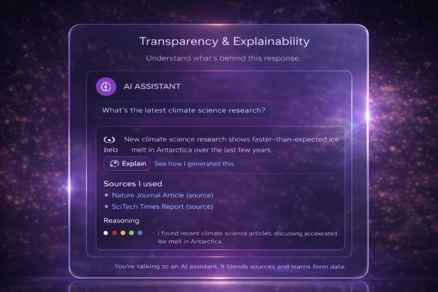
6. Designing for Clarity: Explaining AI Behavior and Sources
Prompt gymnastics shouldn’t be a skill.
When users must remember exact phrasing, the system has failed them.
Instead:
Show why an output happened
Surface assumptions
Reveal key inputs
Even partial explanations help. People don’t need the full algorithm—just enough to stay oriented.
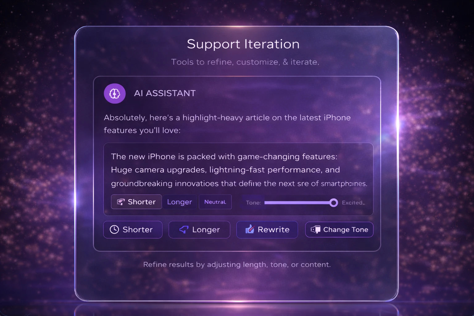
7. Built for Iteration: Designing for Refinement, Not Perfection
First drafts are rarely the best drafts.
Beginners need guardrails. Experts want fine-tuning.
Good AI tools support both:
Offering quick refinements
Allowing parameter nudges
Encouraging exploration without penalty
Iteration isn’t inefficiency. It’s how humans think.
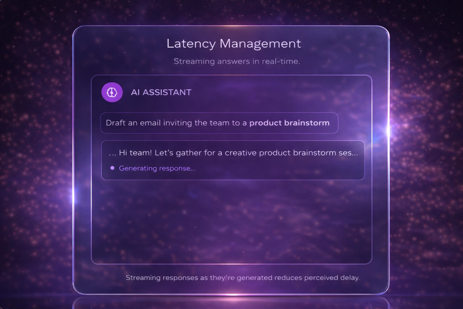
8. Don’t Leave Users Hanging: Designing for AI Response Time
Waiting feels longer when nothing happens.
AI responses aren’t instant—and that’s okay. Silence isn’t.
Progress indicators, partial responses, or even light copy (“Still thinking…”) keep users grounded. Time perception is psychological. Design can help.
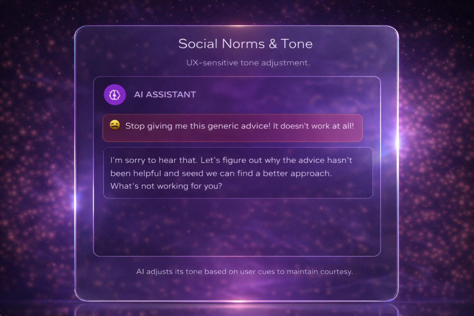
9. Designing AI with Emotional Awareness and Respect
AI has vibes. Ignore them at your own risk.
Tone shapes trust faster than accuracy.
An overly confident wrong answer feels worse than a cautious one. Politeness, humility, and cultural sensitivity aren’t fluff—they’re usability features.
People judge systems like they judge people. Instantly.
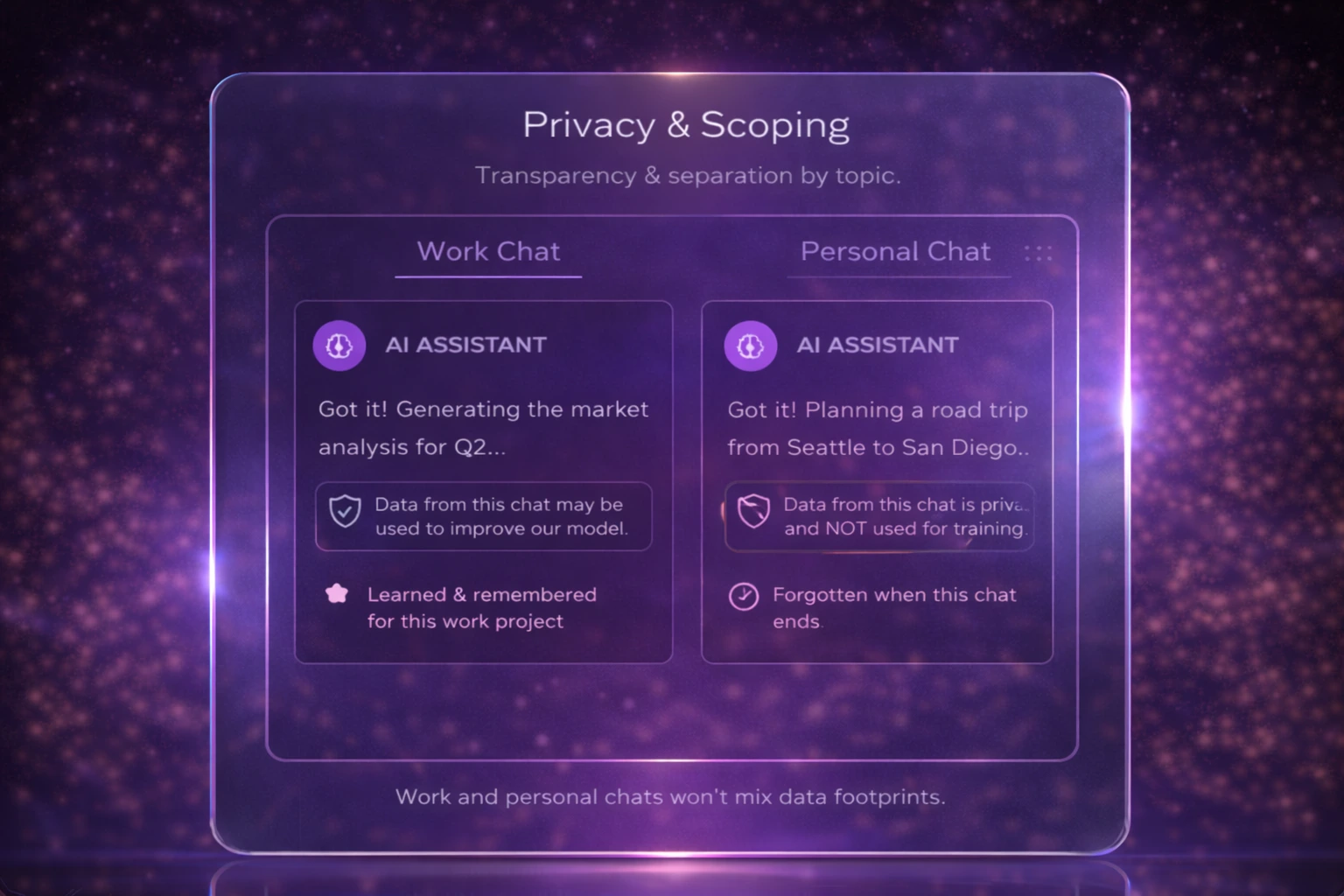
10. Clear Boundaries: Designing AI That Respects Privacy
Just because AI can ask, doesn’t mean it should.
Users want clarity on:
What data is used
What’s remembered
What stays private
Clear boundaries reduce hesitation. And hesitation kills adoption faster than bugs ever will.
11. Confidence Calibration
AI should sound as confident as the evidence allows—no more, no less.
Overconfident AI misleads. Underconfident AI frustrates. The sweet spot is calibrated certainty:
Hedging when the signal is weak
Clarity when evidence is strong
Avoiding absolute claims without support
Fluency ≠ correctness. Design must acknowledge that.
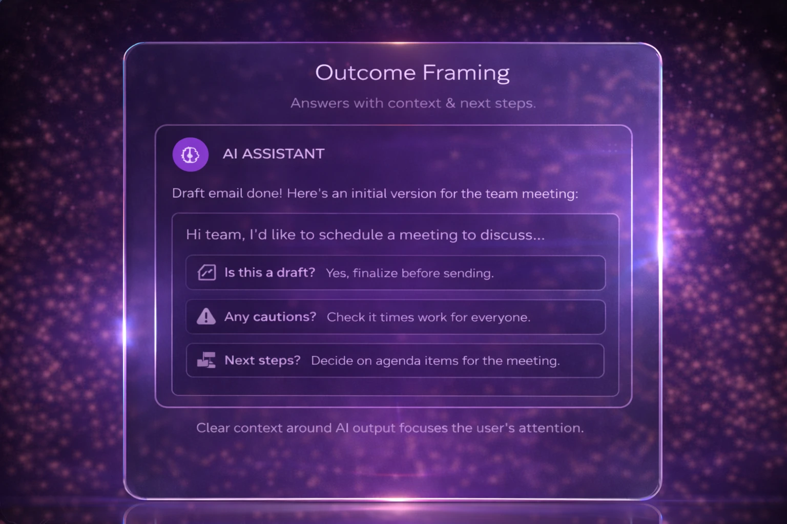
12. Outcome Framing
AI shouldn’t just deliver output—it should help users understand what that output is for.
Light framing answers:
Is this final or a draft?
Where should I be cautious?
What’s the logical next step?
This reduces cognitive load and prevents misuse without adding friction.
Why do these AI Principles Models hold together
The original heuristics focused on predictable systems. This model focuses on probabilistic partners.
It recognizes that AI:
Guesses
Iterates
Hesitates
Learns imperfectly
And it treats users not as operators, but as collaborators.
Usability for AI isn’t about removing thinking; it’s about enabling it. It’s about supporting judgment.