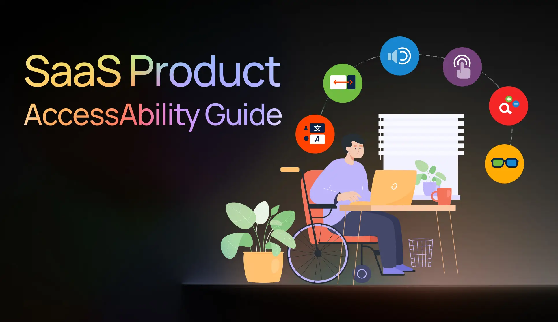
Summary – This guide reframes accessibility as a smart SaaS product strategy⟶ design to lower cognitive load, use clear hierarchy, scannable copy, and consistent patterns so tasks feel effortless.
Let’s be honest — most of us don’t think about accessibility until it becomes personal.
Maybe a parent starts struggling with small fonts.
Perhaps a friend can’t use a color-heavy app.
Or maybe we realize that one day, each of us will rely on accessible design ourselves.
That’s precisely where AccessAbility begins — with empathy and realism. The guide isn’t just another set of compliance checklists; it’s a need for thinking human-first.
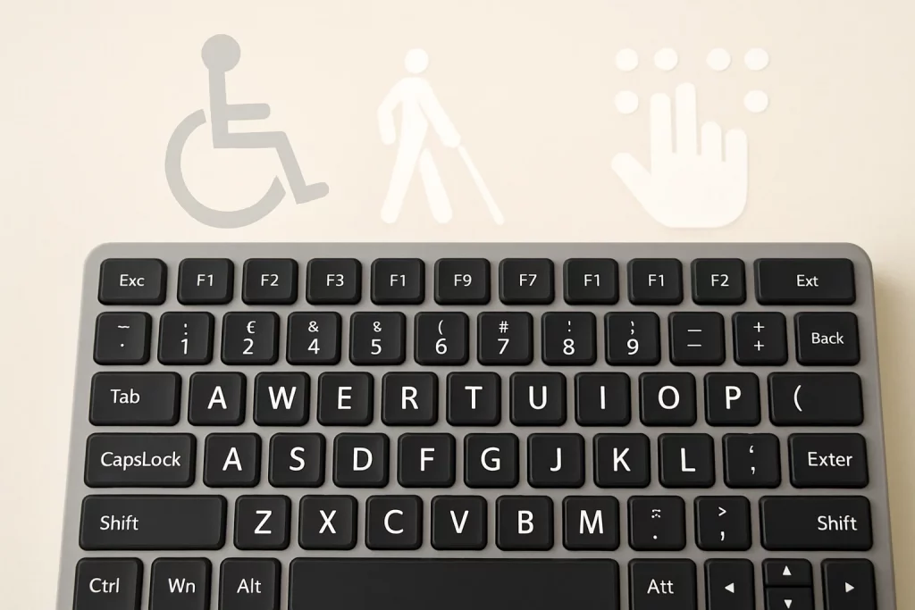
🌍 1. Accessibility Is for All, Not a Few
This AccessAbility guide starts with a reminder that accessibility isn’t a special feature or an afterthought.
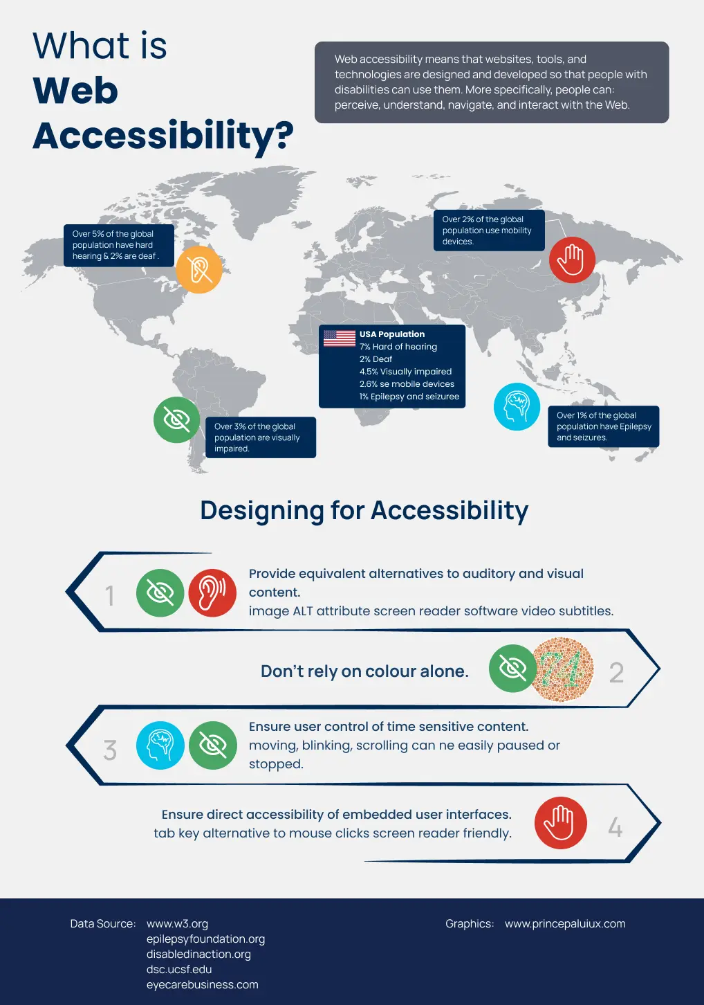
It’s for everyone. Over 15 percent of people already live with some form of disability — and that number will only grow as the population ages.
But “disability” here is a broad term. It includes people with sensory impairments, cognitive challenges, motor limitations, temporary injuries, or simply the effects of aging.
Designing for accessibility, therefore, means planning for the complete spectrum of human experience.
🌱 2. Accessibility Starts with Mindset, Not Software
Three questions every designer should pause on:
- How do we plan a project to be accessible from the start?
- What does accessibility mean across media — digital, print, and environment?
- And how do we turn empathy into concrete design decisions?
The message is clear: accessibility is not a feature — it’s a philosophy of inclusion.
When you design for outliers — the old, the color-blind, people with low vision, hearing loss, cognitive limitations — you’re also planning for your future self. That’s powerful.
Accessibility isn’t a cost — it’s an investment in better communication and social responsibility.
🧭 3. Planning & Management: Set Realistic Expectations
This guide keeps things practical. Not every project can reach perfect accessibility — and that’s okay.
Designers are encouraged to focus on progress over perfection: meet legal minimums first, then gradually enhance features.
It’s also essential to manage expectations; accessibility standards are constantly evolving, and what’s compliant today may change tomorrow.
Communicate honestly, document everything, and treat accessibility as an ongoing journey.

👁️ 4. Designing for Outliers
One of the best sections in this guide focuses on Design for Outliers.
It explains that accessibility is an extension of design fundamentals — grids, hierarchy, whitespace, and consistency.
These familiar tools help reduce cognitive load—the mental effort required to comprehend content.
Here’s how designers can reduce that load:
- Group related elements logically.
- Chunk long paragraphs into smaller pieces.
- Maintain hierarchy and strong visual anchors.
- Avoid forcing users to recall information — never require them to flip back to legends or cross-reference tables.
This section also reminds us that humans perceive through multiple channels — sight, sound, touch, and cognition.
So accessibility means multi-sensory communication: readable text, clear visuals, descriptive audio, and tactile or haptic support when needed.
Cognitive Load – Make brains work less, not harder.
Our brains can only juggle so much at once.
When a screen asks people to remember too many things, jump around, or decode a messy layout, it burns mental energy—that’s cognitive load.
Great design reduces that load, allowing people to focus on the task rather than the interface.
Here’s how to keep it light:
- Group-related stuff. Put things that belong together… together. It helps meaning click faster.
- Chunk the content. Break long walls of text into short sections with clear subheads.
- Show a clear hierarchy. Make what’s most important look most important. Let the eye scan from big ideas to details.
- Add anchors. Use headings, tabs, and jump links to enable easy navigation and quick access to desired locations.
- Be consistent—same patterns, same labels, exact placements. Consistency reduces “wait—how does this work?” moments.
- Use a grid. A solid grid keeps spacing, alignment, and flow predictable, which calms the experience.
And a big one: don’t make users cross-reference.
If someone has to look back and forth between a legend, a table, or another page to understand what they’re seeing, you’ve just increased their mental load.
Keep explanations where they’re needed, right when they’re needed.
🗣️ 5. The Language of Inclusion – Writing for accessibility
Language Usage feels surprisingly relevant in the age of AI and translation tools.
The golden rule: write for clarity first, creativity second.
Write So Everyone Scans It
- Organize with a clear, predictable structure.
- Use a simple, linear flow of ideas.
- Break long text into short sections with meaningful subheads.
- Add plain-language summaries for complex topics.
Short is nice
- Prefer shorter words if the meaning stays the same.
- Cut any word that doesn’t add value.
- Less noise = lower cognitive load.
Plain Language, Powerful UX
- Skip idioms and cute phrasing.
- Write as if it will be run through machine translation and must still make sense.
- Clarity beats cleverness.
Less Jargon, More Clarity
- Don’t lean on acronyms, jargon, or scientific terms.
- If you must use them, define on first use and keep definitions close to the text.
Words That Work for All
- Words like “to/too/two” or “bare/bear” can cause confusion for text-to-speech users.
- Make meaning crystal clear from context.
- If clarity isn’t possible, rephrase—or call it out and spell it.
Clarity First: Writing for Accessibility
- Exact spelling, different pronunciation/meaning (e.g., bass fish vs. bass guitar).
- Ensure context removes ambiguity.
- If not, rephrase or annotate pronunciation.
Say It Simple, Say It Right
- Avoid dropping in foreign words unless no true equivalent exists.
- Mixed languages can trip up non-native readers and screen readers.
Check your references
- Pop-culture nods can be exclusionary and age poorly.
- Only use them if the meaning is evident from context or if you explain them.
Readable by Design
- If a term might be unfamiliar—or a common word is used in a particular way—define it right where it appears.
Please keep it on the level
- Aim for a lower-secondary reading level when possible.
- If content must be advanced, provide a plain-language summary or a simplified alternative.
And one more gem:
“Write as if it will be processed by Google Translate — and still make perfect sense.”
That’s accessibility wisdom at its best.

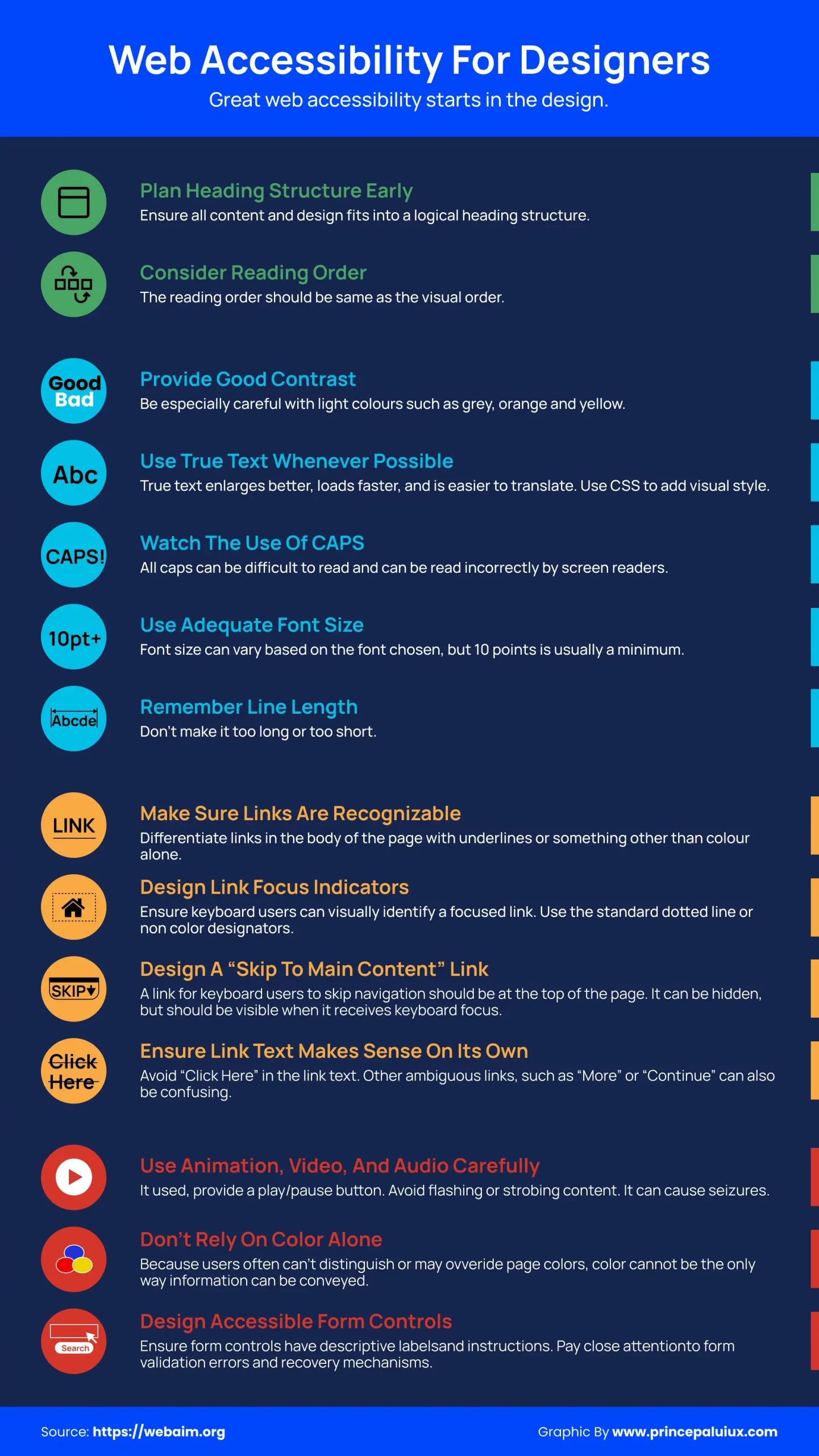
🎨 6. Color and Contrast – Seeing Clearly
Colour isn’t just aesthetics — it’s information.
Let’s break down colour into hue, saturation, and tonal value, then connect each to how humans actually perceive them.
It warns against relying on hue alone — red and green might look identical to someone with color blindness.
It also explains tonal contrast beautifully:
If your design doesn’t work in grayscale, it doesn’t work.
You can check your work through:
- Greyscale previews.
- Color blindness simulators (such as Adobe Color’s color contract checker tool).
- Contrast analyzers that check WCAG ratios — like TPGi’s Colour Contrast Analyzer.
Even minor tweaks — such as using off-black text on a warm cream background — can make a significant difference to comfort and readability.
🔠 7. Typography – Where Form Meets Function
Typography gets half the love letter in this book.
It starts with the basics:
Typography is the visual form of written language. Its job is to make reading effortless.
Let’s dive deep into what affects legibility and readability:
- Familiar fonts (Arial, Verdana, Times New Roman, Helvetica) improve reading speed.
- Balanced stroke contrast (between 1.5:1 and 3:1) keeps characters crisp.
- Moderate x-heights (about 67–75% of cap height) make lowercase letters clearer.
- Open apertures (like in Calibri or Benton Sans) prevent letters from closing in visually.
- Avoid fonts where “I”, “l”, and “1” look identical.
It even notes that dyslexia-friendly fonts, such as OpenDyslexic, have mixed scientific support — so test them in real-world contexts.
And the practical side:
- Use left-aligned text (not justified).
- Avoid long line lengths beyond 90 characters.
- Keep line spacing 125–150% of font size.
- Limit all-caps, italics, and underlining — they reduce reading speed.
- Never layer text on busy backgrounds.
Typography, at its heart, is empathy in motion.
The more readable your text, the more respected your reader feels.
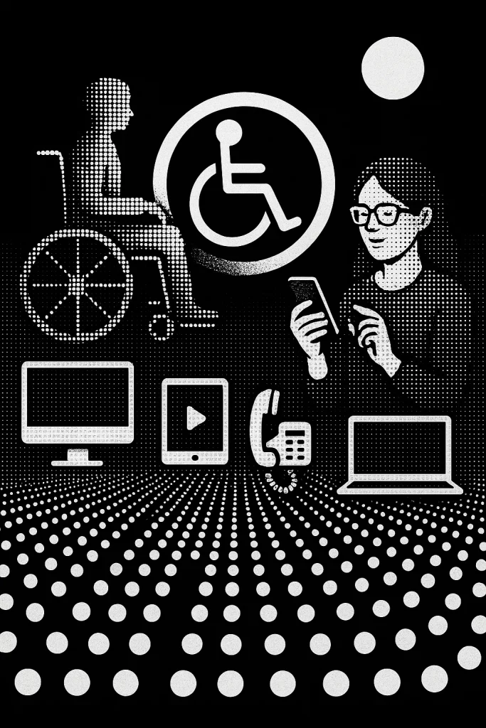
💻 8. Digital Accessibility – Beyond the Screen
This section turns technical — but in the best, most relatable way.
It emphasizes that digital media can be more accessible than print, but only when it’s designed intentionally.
Here’s what that means:
- Websites must work seamlessly with assistive technologies, including screen readers, refreshable Braille displays, and keyboard navigation.
- Every piece of content should have a semantic structure — including headings, paragraphs, alt text, and meaningful HTML tags — that conveys hierarchy and relationships.
- Never use symbols for visual style alone (e.g., don’t replace “×” with an “x” character — it breaks screen readers).
- Write alt-text that’s concise, descriptive, and focused on function, not fluff.
How to write good alt-text:
Start with purpose (“Logo for IBM”), add detail if it’s informative, stay objective, and always end with a period for clear voice synthesis.
Time-based media (keep it clear, keep it usable)
Time-based media is anything that changes as it plays—think audio and video.
Because meaning unfolds over time, you’ll want to add a few extras so everyone can follow along.
For pre-recorded video with audio, include captions (timed to the speech and sounds) and audio description for essential visuals.
Auto-captions are a helpful start, but they rarely meet WCAG’s idea of “equivalent content.” Human review matters.
If you’re streaming, consider using live captions as well. They won’t be perfect, but they dramatically improve access in the moment.
For speech-based audio (like podcasts or voiceovers), keep background sounds out of the way.
As a general rule, they should be at least 20 dB quieter than the speaker. If you want louder ambient audio, give listeners a toggle to turn it off.
And always provide transcripts (for audio) and captions (for video).
They help people who are deaf or hard of hearing, non-native speakers, anyone in a noisy or quiet place—honestly, everyone.
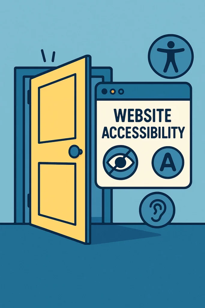
🌐 9. The Principles of Web Accessibility
This part connects design practice with legal frameworks.
Under Ontario’s AODA, websites must follow WCAG 2.0 Level AA standards, which revolve around four universal principles:
- Perceivable – Information must be visible or audible to all.
- Operable – Navigation and controls must be usable with a keyboard or assistive technology.
- Understandable – Content must be transparent and predictable.
- Robust – It must work across various platforms, browsers, and devices.
From contrast ratios to semantic HTML, from ARIA labels to skip links, aligns modern web practices with these timeless ideas: inclusion, usability, and dignity.
📊 10. Testing for Accessibility
You can test in two ways:
- Automated testing tools (like WAVE, Axe, or Lighthouse) — fast but incomplete.
- Manual and user testing — real people with assistive tools (screen readers, magnifiers, voice commands) interacting with your work.
The most powerful advice here:
“If you want to know whether your design is accessible — ask the people who use it.”
It’s that simple.
📄 11. Office Documents & PDFs
Even everyday files, such as Word documents and PDFs, must adhere to accessibility principles.
Learn how to:
- Use real headings, not just bold text.
- Add alt-text to images.
- Ensure logical reading order.
- Avoid scanned text that screen readers can’t read.
- Check for tagged PDFs that maintain structure.
Accessible PDFs — by using semantic tagging, descriptive metadata, and tools like Adobe Acrobat Pro’s accessibility checker.
🖨️ 12. Print & Physical Media
Accessibility doesn’t stop at the screen.
The print section reminds us that tactile, spatial, and environmental design matter just as much:
- Use matte finishes to minimize glare for individuals with low vision.
- Choose contrasting inks and backgrounds.
- Consider Braille, large print, or raised lettering for signage.
- Maintain reachable heights for buttons and displays.
Even elements like door signs, museum exhibits, and wayfinding systems must adhere to accessible proportions, color contrast, and typographic clarity.
The environmental graphics section features real-world examples — such as the Canada Science and Technology Museum — where interactive installations utilize large touch panels and accessible lighting to engage everyone, regardless of ability.
❤️ Final Reflection
AccessAbility is more than a design rule — it’s a mindset shift for modern design.
This guide proves that accessibility doesn’t dilute creativity; it amplifies it.
When we plan for diversity, simplify for clarity, and test for inclusion, we’re not just meeting a legal standard — we’re designing with empathy.
And that, truly, is the highest form of design excellence.
Resources — quick picks for continued learning
What it is: Curated books, guides, sites, and tools to level up inclusive design—functional at any experience level.
Publications — must-reads (1-line why)
- The Design of Everyday Things — Don Norman. Timeless principles linking usability to everyday behavior.
- Designing Information — Joel Katz. Illustrated primer on clear, human-centered information design.
- Don’t Make Me Think, Revisited — Steve Krug—a short, friendly crash course in web usability.
- Elements of Typographic Style — Robert Bringhurst. The definitive, detailed guide to professional typesetting.
- Information Design: Research & Practice — Black et al. Advanced, multi-disciplinary perspectives (incl. multi-modal access).
- Thinking with Type — Ellen Lupton. Approachable, visual intro to typography fundamentals.
- Typography Guru: Letter & symbol misrecognition — Bohm. What characters get confused and why—great for UI text.
- Typography Guru: What makes letters legible? — Herrmann. A succinct tour of legibility under visual strain.
- Web Content Accessibility Guidelines (WCAG). The core global recommendations for making web content accessible.
- A Web for Everyone — Horton & Quesenbery. A people-first guide to inclusive UX for diverse audiences.
Websites — go-to hubs
- Adobe Accessibility. Tutorials and resources for building accessible media with Adobe tools.
- Inclusive Design Research Centre (IDRC). Research, patterns, and tutorials on adaptive tech.
- WebAIM. Articles, guides, and services—super practical for day-to-day web accessibility.
- W3C WAI. Strategies, standards, and docs from the source.
Tools — fix and test faster
- Axe DevTools. Browser + mobile tooling for automated accessibility checks.
- Colour Contrast Analyser (TPGi). Desktop contrast checker with color-blindness simulation.
- Infusion (Fluid Project). Components to let users customize a site’s visual presentation.
- Kontrast. A browser plugin to test and tweak contrast live on the page.
- Firefox Accessibility Inspector. Visualize how your DOM maps to accessibility trees.
- NoCoffee Vision Simulator. Chrome plugin to simulate low-vision scenarios.
- NVDA Screen Reader. Free Windows screen reader—essential for real testing.
- Pope Tech. Site-wide scanning and reporting built on WAVE’s engine.
- Tanaguru Contrast Finder. Suggests the closest color pairs that pass WCAG.
- W3C CSS Validator. Flags CSS issues that can affect accessibility and robustness.
- W3C Markup Validator. Checks HTML/XHTML/SMIL/MathML for syntax problems.
- WAVE (web). Page-level analysis with in-context annotations of issues.
- WAVE (browser extensions). Same power, but works on intranets and behind logins.