Design systems have emerged as a crucial solution, offering structured frameworks that unify branding, improve collaboration, and enhance user experiences across digital products.
In today’s fast-paced digital landscape, organizations face an ever-growing challenge: maintaining consistency, efficiency, and creativity in design.
This article provides a roadmap for organizations looking to implement and scale their design systems effectively.
Who is this design system guide for?
While crafting this, I focused on two key audiences:
- Design leaders and practitioners seeking actionable insights to elevate design within their organizations.
- Product executives, innovation leaders, and business owners aim to enhance and accelerate digital transformation efforts.
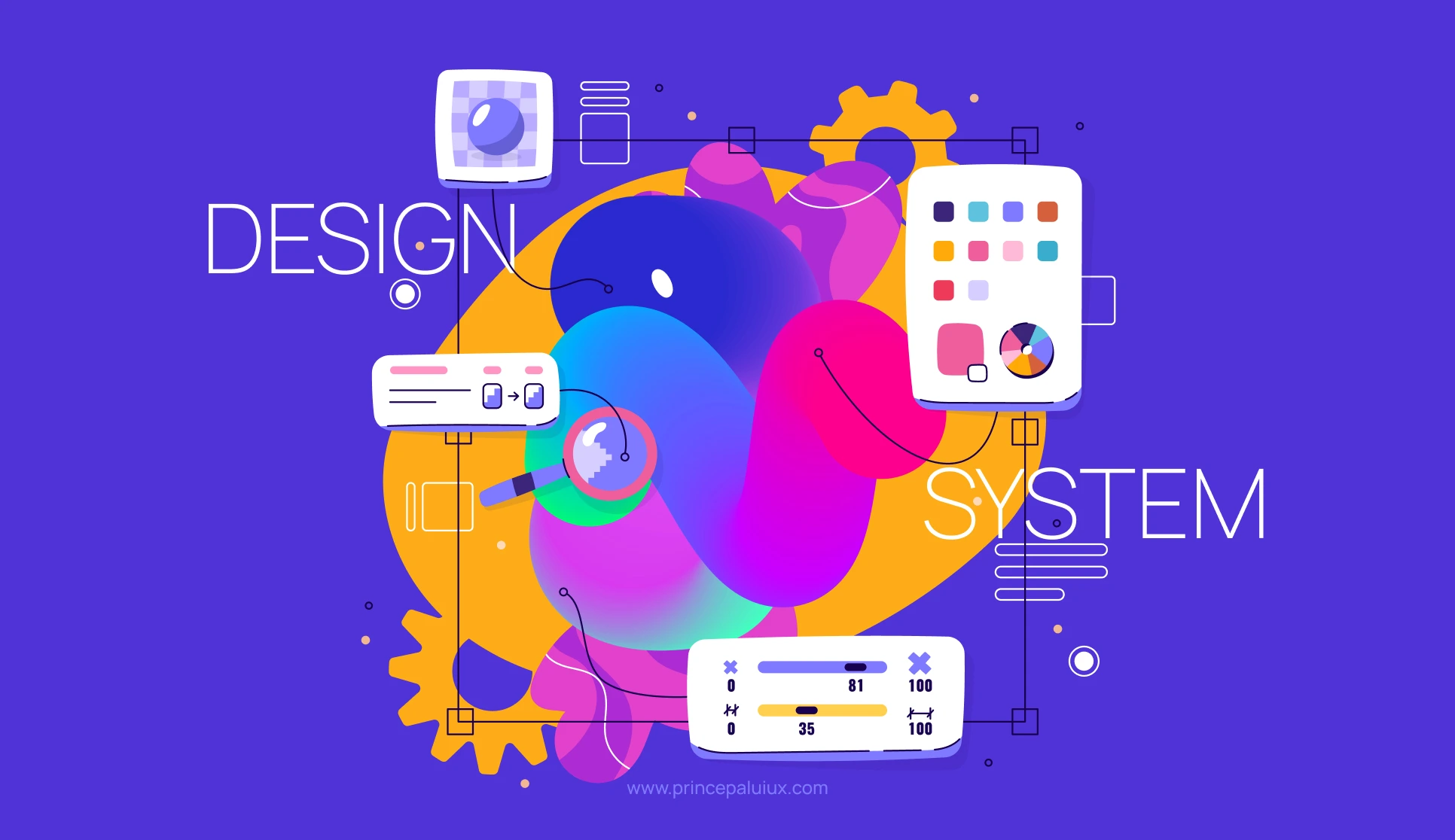
What is a Design System?
A design system is more than just a collection of UI components; it is a living ecosystem that integrates guidelines, reusable assets, and tools to ensure consistency and efficiency in digital product development. As industry leaders define it:
“It’s an operating system but for user experiences.” – Jeoff Wilks, IBM
“I think it’s really about the
long-term vision of products.”
– J F Grossen, VP of Design,
Global, HERE Technologies
Key Benefits of a Design System:
- Ensures a cohesive and recognizable brand identity across all touchpoints.
- Drives cultural transformation within organizations.
- It saves time and reduces costs.
- Enhances consistency across products and platforms.
- Minimizes maintenance efforts.
- Streamlines communication and collaboration.
- Improves user experience through standardized, intuitive interactions.
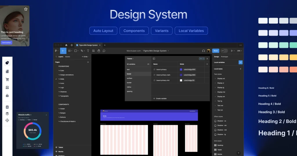
Essential Components of a Comprehensive Design System:
- Core principles and overarching goals.
- Brand identity assets and visual guidelines.
- Functional design and code patterns.
- UX, UI, and technical guidelines.
- Tools such as UI kits and pattern libraries.
- Practical examples and industry best practices.
Using a Design System for Complex, Multi-Level Applications
For designers and developers working on complex, multi-level applications, a design system provides:
- Modular Components: These break down interfaces into reusable elements, making maintaining consistency across different application levels easier.
- Scalability: Ensure the system can support multiple products with different requirements while maintaining cohesion.
- Version Control & Governance: Track design and development updates to prevent inconsistencies in large-scale applications.
- Cross-Platform Synchronization: Using the same design language, align design and development efforts across web, mobile, and enterprise platforms.
- Customization and Extensibility: Flexibly modify components for different use cases within predefined guidelines.
- Collaboration Tools: Use shared libraries, documentation, and collaboration platforms to streamline communication between design, development, and business teams.
The Impact of a Design System
Design systems bring transformative value to organizations by enhancing efficiency, fostering collaboration, and ensuring brand consistency. The primary benefits include:
- Consistency Across Products: Establishing a cohesive brand identity and seamless user experience across multiple platforms.
- Efficiency and Cost Savings: Reducing duplication of work, speeding up development cycles, and lowering long-term maintenance costs.
- Improved Collaboration: Encouraging cross-functional teamwork among designers, developers, and business stakeholders.
- Enhanced User Experience: Standardized patterns improve usability and accessibility.
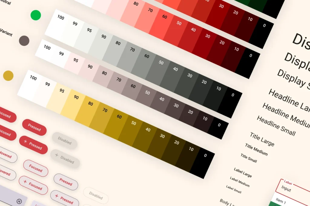
60-30-10 Rule in a Design System
The 60-30-10 Rule is a classic design principle used in color theory to create balanced and visually appealing compositions. It suggests that:
- 60% of the design should use a dominant color (foundation color, background, or primary UI elements).
- 30% should use a secondary color (complementary or supporting elements).
- 10% should use an accent color (calls to action, highlights, or attention-grabbing elements).
How It Helps in a Design System
- Maintains Visual Hierarchy – Ensures consistent color application across all UI components, improving user experience.
- Enhances Brand Identity – Helps define a cohesive color strategy that aligns with branding guidelines.
- Improves Accessibility – It ensures contrast and readability across digital interfaces when applied correctly.
- Streamlines Decision-Making – Reduces inconsistencies by providing clear guidance on color distribution in UI elements.
- Creates Scalability – Establishes a flexible yet structured approach to applying colors across different applications and platforms.
By integrating the 60-30-10 Rule into a design system, teams can maintain a cohesive and aesthetically pleasing UI while ensuring product adaptability. 🚀
Implementing a Successful Design System
A successful design system requires strategic planning, collaboration, and continuous refinement. In this article, I outline key factors for successful implementation:
- Human-Centric Approach: Involve designers, developers, marketers, and executives to ensure system-wide adoption.
- Integration into Daily Operations: Make the design system an integral part of workflows to maximize its impact.
- Handling Contributions & Scaling: Encourage team contributions and build feedback loops to refine the system continuously.
- Strong Communication Strategy: Clear documentation and regular training sessions help in adoption.
- Custom Fit for the Organization: Every organization has unique needs; tailor the design system accordingly.
Success Stories
In this article, I present case studies of major corporations that have successfully implemented design systems:
- Atlassian Design Language: Leverage Atlassian’s comprehensive design language to craft clear, cohesive, and visually compelling experiences.
- Audi UI: Designed to deliver diverse solutions while ensuring a seamless, cohesive user experience across apps, vehicles, and beyond.
- Human Interface Guidelines: Access comprehensive UI resources and expert guidance to design seamless, high-quality apps for Apple platforms.
Design System created by Me
1. Packt
Packt is a UK-based publishing company. They will then be able to design a detailed design system using Figma and Bootstrap.
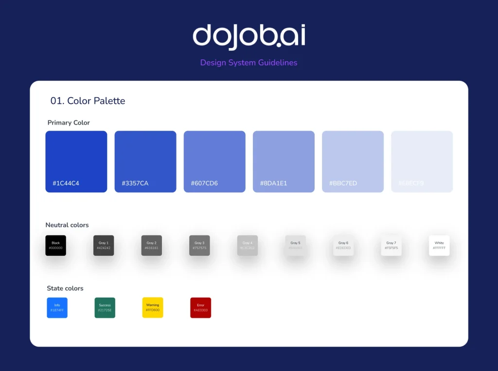
2. DoJob.ai
DoJob AI application’s fundamental design system for a generative app
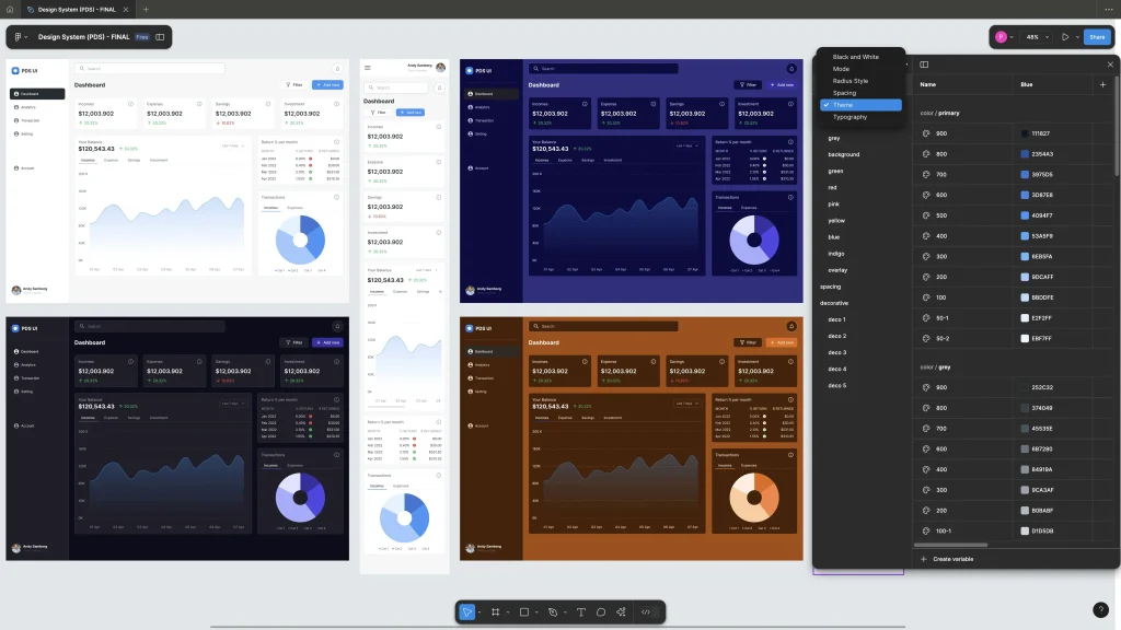
3. Power Design System (PDS)
PDS is designed for an agency that provides dashboards using PowerBI and Tableau. The client wants this design system fully loaded with local variables, a vast library of drag-and-drop components, and breakpoints.
Design System as a Service

I specialize in providing design system services that help businesses streamline their digital products and ensure consistency, scalability, and efficiency.
I have successfully implemented design systems for mid-level enterprise companies such as Dental.com, Packt, and Virtual Dental Care, improving their digital experiences and enhancing collaboration across teams.
My expertise extends beyond enterprises—I am also equipped to help startups and SaaS companies build and integrate robust design systems that align with their brand vision and product goals.
The Future of Design Systems
As technology evolves, design systems must adapt to emerging trends such as voice interfaces, virtual reality, and AI-driven design. Organizations must remain agile and ensure their design systems continue to evolve with industry advancements.
The Role of Artificial Intelligence—And Our Role in Shaping It
Smarter Decision-Making
We envision a world where AI, algorithms, and machine learning expand our perception, helping us uncover insights and challenge ingrained biases.
As we rapidly generate and analyze alternative solutions, our models must become more inclusive to serve diverse audiences effectively.
With AI-driven personalization adjusting designs in real-time based on past behavior, current context, or even user mindset, ethical considerations must evolve alongside technology.
Ultimately, intelligence alone isn’t enough. We must ensure AI systems are not just “smart” but also “kind,” shaping them with care and responsibility to anticipate how they will impact our world.
AI Tools for Design Systems
1. AI-Powered Design & Prototyping
- Figma AI (via Plugins like Magician, Locofy, or Diagram AI) – Automates UI design, generates icons and enhances workflows.
- Uizard – AI-powered UI design tool that converts sketches and text prompts into wireframes and prototypes.
- Galileo AI – Creates high-fidelity UI designs from simple text descriptions.
- Relume AI – Assists in generating website wireframes and components.
2. AI for Design System Automation & Maintenance
- Anima – Bridges design and code, automatically converting Figma designs into responsive HTML, CSS, and React.
- Specify – Automates design token management, keeping design systems synchronized across tools.
- Supernova – Helps manage and document design systems with AI-powered insights.
- Dyspatch – AI-driven design system manager for email and content teams.
3. AI for Branding & Asset Management
- Adobe Sensei – Enhances brand consistency by automating asset tagging, smart cropping, and color matching.
- Canva AI (Magic Design) – Generates branded templates and layouts based on user input.
- Brandmark AI – AI-powered branding tool for generating logos, color palettes, and typography suggestions.
4. AI for Code & Design Handoff
- Locofy – Converts Figma or Adobe XD designs into production-ready code (React, Vue, HTML, CSS).
- Zeplin AI – Automates design-to-dev handoff, generating structured style guides and design tokens.
- Penpot AI – Open-source design system tool with AI-powered collaboration features.
Conclusion
A well-implemented design system is a game-changer for organizations looking to scale digital experiences effectively.
Businesses can unlock innovation and drive digital transformation by fostering consistency, improving efficiency, and encouraging collaboration.
This guide is for companies that aim to harness the full potential of design systems in their journey towards a more connected and user-centric future.