Summary – eBay’s design culture evolved through leadership support, visible studios, and shared stories—using engagement, collaboration, and momentum as early signals of meaningful, lasting change.
Table of contents
- Why Starting From Scratch Wasn’t as Scary as It Sounds
- Evo as evolution, not reinvention
- One source of truth (and yes, it actually stays true)
- Bringing the Band Together (Even When They Didn’t Know They Were in a Band)
- The Secret Weapon: A Custom Figma Plugin That Changed Everything
- Accessibility isn’t an afterthought here
- Measuring the Impact of Cultural Change
- When the Numbers Start Telling a Story
- The Human Side of Systems Thinking
- What This Means for Everyone Else
- The Evolution Continues
- Why This Actually Matters (And Not Just to eBay)
You know that feeling when you open a design system and immediately want to close it? Yeah, eBay knew it too. And honestly, they got tired of it.
Most companies treat design systems like reference manuals—necessary evils that sit in digital corners collecting metaphorical dust.
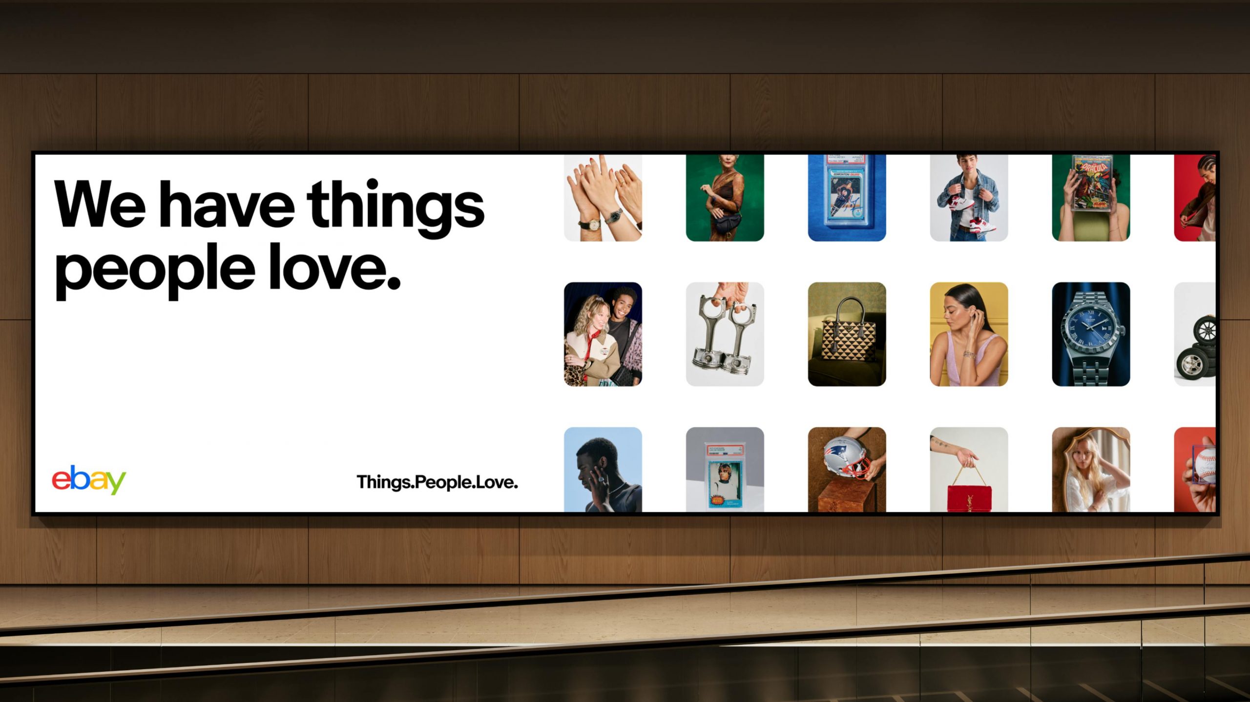
But when eBay decided to modernize its almost three-decade-old marketplace with a new design system called Evo, it made a choice that changed everything. They didn’t just want another resource.
They wanted something that would make designers, developers, and product teams genuinely excited to come to work.
Sounds ambitious, right? Maybe even a little unrealistic?
Let me explain why it wasn’t.
The Mess That Started It All
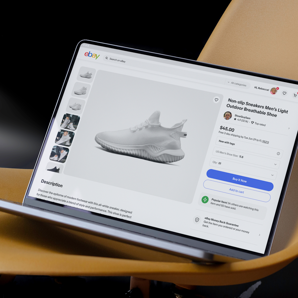
Picture this: You’re a designer at one of the world’s largest online marketplaces. You need to check a component specification.
Where do you look? Well, that depends. Are you checking the design version? That’s in Figma—somewhere. Need the code? Different place entirely. Accessibility guidelines? Good luck, because those are scattered across yet another platform.
“Our previous setup buried critical information in different places,” Cordelia McGee-Tubb, Staff Design Technologist on eBay’s OneExperience team, recalls with the weariness of someone who’s lived through this chaos.
She’s not exaggerating either. Before Evo’s documentation—dubbed the “eBay Playbook“—launched, the company’s design system existed in fractured pieces across multiple tools and platforms.
Designers maintained their version in Figma files. Developers kept separate documentation.
Accessibility experts had their own guidelines for living somewhere else. And updating anything? That was its own special kind of nightmare.
Designers would painstakingly update static Figma files, then submit tickets—actual tickets—to get each change uploaded. The process could take days.
Here’s the thing about fragmented systems: they don’t just slow you down. They actively work against consistency.
When information lives in silos, people make decisions based on incomplete pictures. Components get built differently across teams.
Brand standards drift. The whole reason you have a design system in the first place—creating cohesive experiences—starts breaking down.
Tyler Moore, Senior Director of Design at eBay, puts it beautifully: “I threw a pebble into this little pond. Over time, it turned into waves that people wanted to ride.”
But before those waves could form, they needed to rebuild the pond entirely.
Why Starting From Scratch Wasn’t as Scary as It Sounds
Before Evo, eBay’s system existed… kind of everywhere.
Design lived in Figma.
Code lived somewhere else.
Accessibility guidance was elsewhere entirely (and you had to know where to look).
Updating anything meant manual effort, back-and-forth tickets, and patience. Lots of patience. Designers updated static files. Developers maintained parallel docs. Nothing moved fast, and nothing felt connected.
Cordelia McGee-Tubb put it plainly: Critical information was buried. Not missing—just scattered. And scattered systems don’t age well, especially when teams scale and products evolve.
Instead of patching the cracks, the OneExperience team stepped back and said, “Let’s rebuild this properly.“
Evo as evolution, not reinvention
Evo is short for “evolution,” and that choice matters. This wasn’t about wiping the slate clean. It was about modernizing a nearly 30-year-old marketplace without losing its soul.
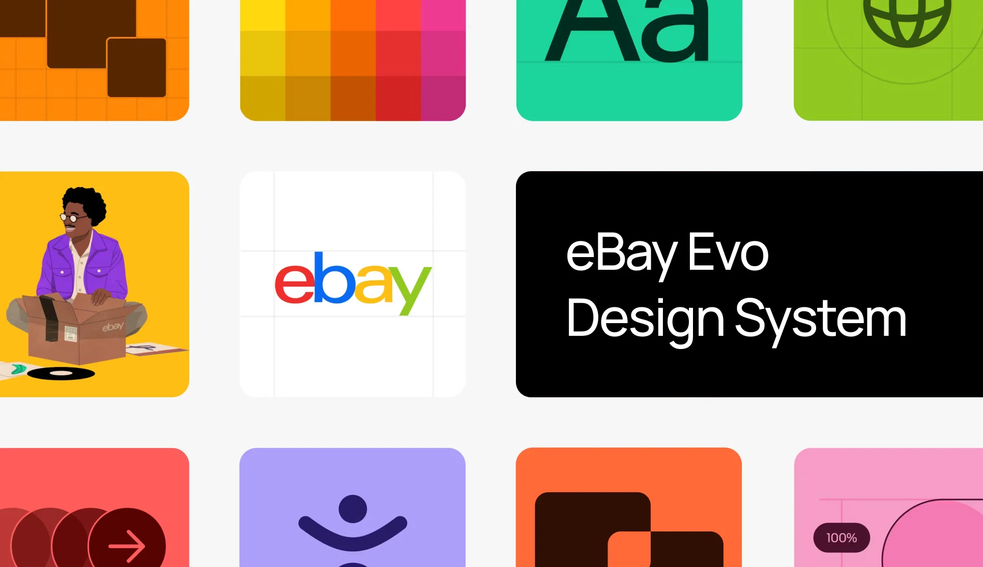
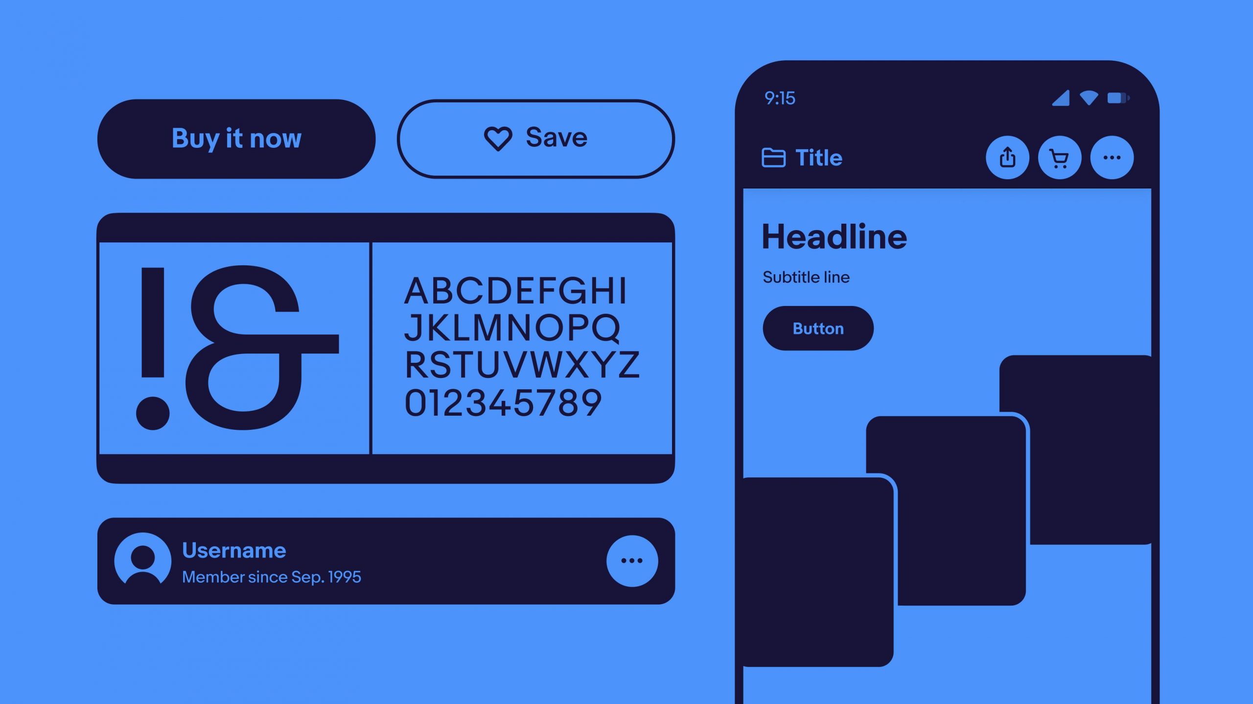
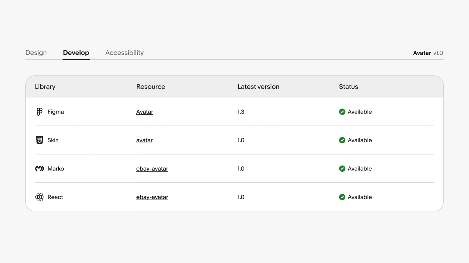
At the center of it all sits the eBay Playbook—over 300 pages that bring brand, design, accessibility, and engineering together in one shared space. Not separate destinations. Not parallel universes. One place.
You can feel the intention here. Evo isn’t product-first or brand-first. It’s experience-first. The idea is simple: customers don’t see org charts, so why should systems reflect them?
One source of truth (and yes, it actually stays true)
Here’s the thing that quietly changes everything: automation.
The Playbook isn’t updated manually. It’s fed directly from Figma. Components, guidelines, accessibility notes—they start in design, get validated, and are published without anyone touching a CMS.
What used to take days now takes minutes.
Ryan Tinsley mentions that updates will go live in under two minutes. That speed doesn’t just save time. It changes behavior. When updates are easy, teams stop avoiding documentation. They start trusting it.
And trust is the real currency of any system.
Bringing the Band Together (Even When They Didn’t Know They Were in a Band)
The fresh start gave eBay’s OneExperience team a chance to rethink not just what documentation should contain, but who it should serve and how.
For years, brand guidance lived separately from product documentation. Makes sense on paper, right? Brand materials for the marketing folks; design system materials for the product teams. Except people don’t work in neat little boxes.
Designers need to understand brand principles. Brand teams need to know what components exist. Product managers need to grasp both.
The new Playbook demolished those walls entirely.
Instead of separate destinations, they created a shared space where brand, design systems, and technology converge. It’s not just about housing everything under one URL—though that helps.
It’s about fundamentally reconceiving documentation as a holistic resource that acknowledges the messy, interconnected reality of how teams actually collaborate.
“For me, the thing that is really impactful is the holistic view of the system and the interdisciplinary nature of it,” Cordelia emphasizes.
“We’re really bringing together design, engineering, accessibility, and documentation in a way that we hadn’t before. That helps each team understand their stakeholders better and just makes a more consistent product.”
One of the most clever pieces? Component status tracking.
Previously, this was stored in a manually updated table in Figma. You can imagine how well that worked. The information became outdated almost immediately.
Someone would update a component in code but forget to update the table. Or vice versa. Teams couldn’t reliably know whether a component existed in their framework, whether it matched the Figma version, or if the documentation reflected the latest changes.
The new system pulls real-time status using library metadata. They built a custom Component Status API that monitors design system components across all their libraries—Figma, native libraries, open-source web component libraries, everything.
Each library registers component names and versions, creating a complete picture of implementation status across platforms.
“A lot of our developers have been using our Component Status API to figure out, ‘Hey, does the component exist in the framework I build in? Is it up to date with the Figma version? Is it up to date with the Playbook documentation? Cordelia explains. “That’s been a huge win.”
Huge win might actually be understating it. When you eliminate the question of “where is the right version,” you eliminate hours of confusion and miscommunication.
Multiply that across hundreds of team members and thousands of components, and you’re looking at massive efficiency gains.
But efficiency wasn’t even the main goal. The main goal was more fundamental: enabling people to do great work without fighting their tools.
The Secret Weapon: A Custom Figma Plugin That Changed Everything

During our Zoom conversation, Ryan and Cordelia demonstrate the engine behind their documentation revolution—a custom Figma plugin that’s part automation tool, part quality guardian, and entirely game-changing.
Here’s how it works: Every component, every guideline, every accessibility note in eBay’s Playbook starts in Figma. Updates happen in Figma.
And through their custom exporter, those changes get linted, validated, and published without anyone manually touching the content management system.
The speed is almost comical compared to the old process. “We can make an update in Figma and have it live on our Playbook site in under two minutes,” Ryan explains, and you can hear the satisfaction in his voice.
Two minutes versus multiple days isn’t just faster—it’s a fundamentally different relationship with documentation.
When updating documentation is quick and painless, it stops being a chore and becomes part of the normal workflow.
You make a design change, you update the docs, you move on. The friction disappears.
But speed is only half the story. The real innovation is in how the system maintains quality while moving fast.
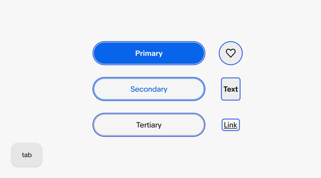
The OneExperience team built a toolkit of Figma components that serve double duty.
They’re the building blocks of the Playbook’s UI and provide WYSIWYG components for each documentation page. Its documentation is made of the same material it’s documenting—meta in the best possible way.
Their Design Technology team used Figma’s Dev Mode extensively to inspect these components, build them to specification, and ensure proper mapping of Figma properties in their custom linting and export plugin.
“UI developers at eBay use Dev Mode quite a bit to inspect component styles and translate that to code,” Ryan notes. “We’re seeing promising results testing components with Code Snippets and Code Connect, and have a vision for deeper integration.”
They even consulted Figma variables when setting up their CSS variables, creating a direct bridge between design tokens and implementation. It’s the kind of tight integration that sounds obvious in retrospect but requires intentional architecture to achieve.
The result? A system where design and development aren’t just aligned—they’re literally speaking the same language.
Accessibility isn’t an afterthought here
Most people think of linters as those annoying tools that yell at you about semicolons and spacing. eBay’s custom linting system is more like a meticulous editor that catches both typos and deeper structural issues before they become problems.
“Our plugin scans all the pages within a file,” Cordelia explains, walking through the technical details with the enthusiasm of someone who genuinely loves automation.
“It uses the name of the frame to figure out the breadcrumb for the site and which tab it belongs to. Then it checks that we’re using components correctly and not detaching them. If we find any issues, it’ll flag them before export.”
The genius is in what it prevents. Detached components are a design system’s worst enemy because they break the connection between documentation and reality.
Someone makes a local change, forgets it’s detached, and suddenly you’ve got an inconsistency that can ripple through the entire system.
By catching these issues automatically, the linter serves as both a safety net and a quality springboard. You can move quickly because you’re confident the system will catch mistakes before they go live.
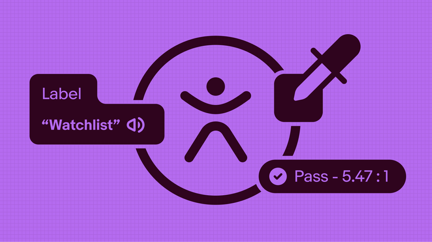
The accessibility integration particularly shines here. The linter tracks alt text for images across the entire site, ensuring accessibility isn’t an afterthought but a built-in requirement.
These checks are integrated directly into Figma components as properties that flow through to the CMS.
Think about the traditional accessibility workflow: Designer creates something, hands it off to a developer, developer implements it, accessibility specialist audits it, issues get filed, and everything gets updated. Rinse and repeat, often weeks after the initial design.
Compare that to eBay’s approach: Accessibility requirements are baked into the component properties from the start. The linter checks them automatically. Issues get caught before anything ships.
The accessibility specialist’s expertise is embedded in the system, scaling their impact across every page and component.
It’s not just more efficient—it’s fundamentally more inclusive by default.
Measuring the Impact of Cultural Change
The cultural shift around design at eBay didn’t happen overnight. It unfolded over several years, starting with a simple goal in the first phase: build momentum and get people excited about design.
At that point, the company wasn’t overly focused on rigid success metrics. Instead, it paid close attention to softer signals—especially employee engagement—to understand whether the change was taking hold.
Early signs were encouraging. One of the strongest signals was leadership involvement. John Donahoe, personally championing the design initiative, sent a clear message: design thinking wasn’t a side project; it was central to eBay’s future.
The launch of design studios across eBay campuses, along with the stories shared through the Design Playbook, gave teams something tangible to rally around. These weren’t abstract ideas—they were visible, lived experiences.
Long term, eBay knew success would show up in bigger outcomes: stronger product innovation, better customer experiences, and the ability to attract and retain top talent.
But in the early stages, the design task force led by Howard focused on more immediate indicators.
They tracked the number of designers they connected with, the number of stories they published, and the extent of eBay’s participation in external events, panels, and conferences.
To maintain internal momentum, the team also introduced “beat” reporters within each design group. Their role was to capture what was happening inside the studios, write about it, and bring people together through in-person community events.
Over time, these small human signals confirmed something important: the culture around design was genuinely starting to change.

When the Numbers Start Telling a Story
Since launching the Playbook, eBay has seen tangible improvements in how teams work with their design system.
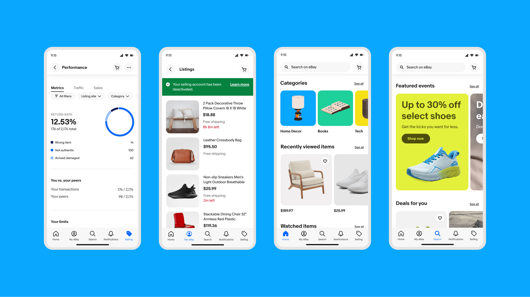
“Teams are enhancing the visual quality of their work by leveraging our updated foundations and referencing the latest documentation,” Ryan notes.
“This establishes a stronger baseline for getting started and ensures consistency in both UX functionality and overall layout design.”
But some of the most telling metrics aren’t quantitative—they’re qualitative shifts in how people engage with the system.
Ryan and Cordelia note that their regular design office hours have changed significantly. Before the Playbook, these sessions were basically troubleshooting appointments.
People would show up stuck, confused, and unsure where to find basic information. The conversations were reactive, focused on solving immediate problems rather than exploring deeper questions.
Now? “The office hours we have now versus before the Playbook are just night and day,” Ryan says. “People always know what to reference and how to show the brand in a way that aligns with best practices.”
The conversations have evolved from “where do I find this” to “how should I approach this pattern” and “what’s the reasoning behind this principle.” It’s the difference between help desk support and design mentorship.
That shift represents something profound: when documentation is good enough, it handles the basic questions itself, freeing up expert time for the complex, nuanced discussions that actually advance craft and thinking.
The team has extensive qualitative data on the system’s impact and the acceleration introduced by both Evo and the Playbook. They’re also exploring more quantitative tracking methods.
“We’re excited about Figma’s newly increased analytics capabilities,” Cordelia shares. “That provides a valuable quantitative lens into the health and reusability of our system.”
The combination of qualitative and quantitative data will provide them with an increasingly sophisticated understanding of how the system performs and where improvements are needed.
But even without perfect metrics, the evidence is clear: the Playbook has fundamentally changed how eBay’s teams work.
The Human Side of Systems Thinking
There’s something worth pausing on here—something that gets overlooked in a lot of design system conversations.
eBay didn’t just build better documentation. They changed the emotional relationship their teams have with that documentation.
Most design systems inspire feelings ranging from mild frustration to active dread. They’re seen as bureaucratic necessities, hoops to jump through, constraints that limit creativity rather than enable it.
Designers complain about them. Developers work around them. Everyone tolerates them at best.
The eBay Playbook is different because the team deliberately designed it for delight alongside utility.
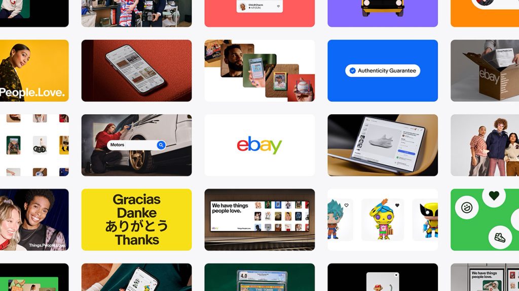
They commissioned risograph animations and illustrations from Kelli Anderson, adding artistic flourish to what could have been dry technical pages. They thought about color, motion, and personality. They made it beautiful not because beauty was required, but because it encourages engagement.
They also made it genuinely helpful in ways that go beyond just having the right information.
The interface is intuitive. The search actually works. The examples are clear and relevant. The writing is accessible without being condescending.
These might sound like small things, but they add up to an experience that respects people’s time and intelligence. And when you respect people’s time and intelligence, they return the favor by actually using what you’ve built.
“We’re just thrilled that people are using it and excited about it,” Ryan says, and that genuine enthusiasm comes through.
By eliminating bottlenecks and making documentation as dynamic as the design process itself, the OneExperience team achieved something unexpected: they made documentation enjoyable.
What This Means for Everyone Else
eBay’s journey offers lessons that extend far beyond e-commerce design systems.
First, the obvious stuff: invest in automation, eliminate silos, make updates painless. These are table stakes if you want documentation that stays current and useful.
But there are deeper lessons too.
Start with clear goals that go beyond just “having a design system.” eBay wanted its teams to feel inspired and excited. That’s a very different goal than “ensure consistency” or “reduce design debt,” and it led to very different decisions about what to build and how.
Bring disciplines together from the start rather than creating handoff points. The holistic approach—design, engineering, accessibility, documentation, working as one team—prevented the fragmentation that kills so many design systems.
Make it work with existing workflows instead of requiring people to change how they work. The tight Figma integration lets designers update documentation using the tools they already use every day, in formats they’re already comfortable with.
And perhaps most importantly: care about the details that make systems pleasant to use, not just functional.
The color-coded alt text system, the thoughtful information architecture, the beautiful illustrations—none of these were strictly necessary, but all of them contributed to creating something people genuinely want to engage with.
The Evolution Continues
The OneExperience team isn’t resting on what they’ve accomplished. They’re continuing to refine their tooling while expanding system coverage, exploring new ways to make the Playbook even more useful and delightful.
“We’re just getting started,” Cordelia says. “Every time we solve one challenge, teams bring us new ideas for what else we could improve.”
It’s a virtuous cycle that’s worth understanding. Better tools enable better documentation. Better documentation leads to better products. Better products inspire teams to push the system further. Which creates demand for even better tools.
This kind of momentum is rare. It requires initial investment—both time and resources. But it also requires a fundamental shift in how you think about documentation.
Most organizations treat documentation as a necessary evil, something to minimize rather than optimize. eBay treated it as a product in its own right, deserving of the same care and attention they’d give to customer-facing features.
That mindset shift makes all the difference.

Why This Actually Matters (And Not Just to eBay)
When eBay announced Evo in November 2024, they weren’t just updating their visual language.
They were making a statement about what’s possible when you take documentation seriously as a discipline worthy of innovation and craft.
The marketplace is almost 30 years old. Many companies that age are drowning in technical debt, struggling with legacy systems, and hamstrung by decisions made decades ago.
The idea of fundamentally rethinking how you document and maintain design standards might seem impossible, or at least inadvisable.
eBay proved otherwise.
They showed that you can rebuild from the ground up while maintaining a massive global platform.
That you can bring together disparate teams and create genuine alignment.
That you can make documentation something people look forward to using rather than something they avoid.
The ripple effects of this work will extend far beyond eBay’s walls. Other organizations are already watching, learning, and adapting these approaches to their own contexts.
The custom tooling, the holistic thinking, the emphasis on making systems delightful—these ideas will propagate through the industry.
But more than specific tactics or tools, eBay has shifted expectations about what design system documentation can and should be.
It can be beautiful. It can be fast. It can be comprehensive and accessible, and technically sophisticated and genuinely enjoyable to use—all at once.
These aren’t competing priorities; they’re complementary elements of a well-designed system.
When documentation delights rather than frustrates, consistency naturally follows. Teams use the system because they want to, not because they’re forced to.
Quality improves because people have easy access to best practices. Onboarding gets faster because new team members can find answers independently.
The technical implementation matters, sure. The custom plugins, APIs, and linting systems are impressive engineering achievements.
But the real innovation is simpler and more profound: they cared enough to make it good.
The Pebble and the Waves
Remember Tyler Moore’s metaphor about throwing a pebble into a pond? It captures an essential aspect of how change occurs in large organizations.
You start with something small—an idea, a prototype, a different approach to a longstanding problem. If it’s good and genuinely solves real pain points, it creates ripples. Those ripples spread. People notice. They want in.
Pretty soon, you’ve got waves that people want to ride.
That’s what happened with eBay’s Playbook. It started with a team frustrated by scattered documentation and inefficient workflows.
They built something better. And now, teams across the organization are riding those waves to create more consistent, more accessible, more delightful experiences for millions of eBay users worldwide.
The work continues. There are always more components to document, more patterns to establish, more integrations to explore. But the foundation is solid, and the momentum is real.
More importantly, they’ve proven something valuable: documentation doesn’t have to be the boring part of design systems.
It can be where the magic happens—where consistency becomes effortless, where accessibility becomes automatic, where teams find the inspiration and resources they need to do their best work.
You know what? That’s worth getting excited about.
And if you’re working on a design system—whether at a company with eBay’s scale or something much smaller—there’s a lesson here worth internalizing. Your documentation is more than a reference guide.
It’s an experience. It’s a tool that enables people. It’s the difference between a design system that struggles to adopt and one that becomes integral to your organization’s operations.
Make it good. Make it fast. Make it delightful. Make it something people actually want to use.
Because when you do, the waves you create might be bigger than you ever imagined.