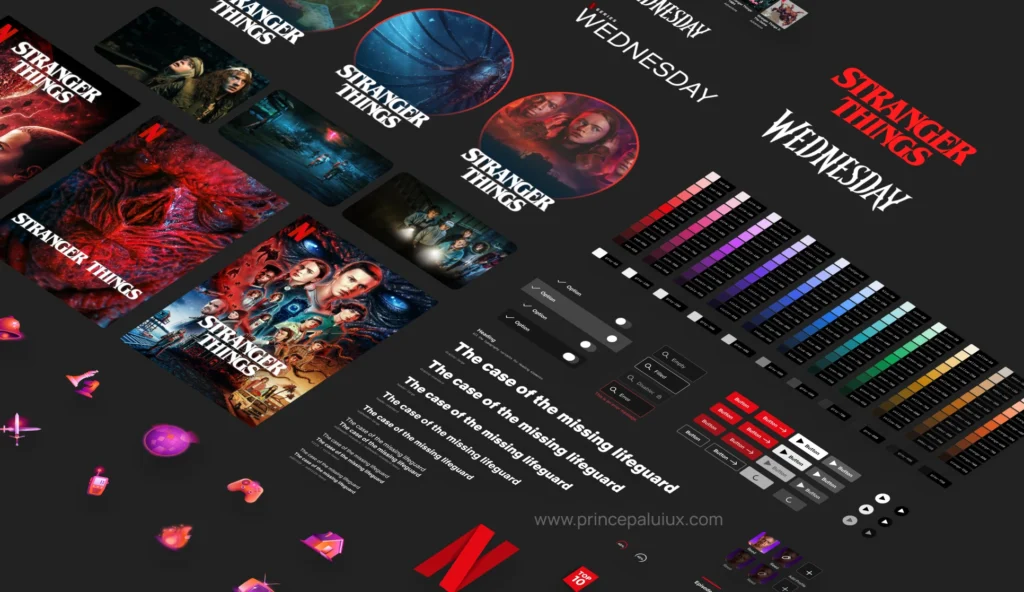
Summary: Netflix’s design system, Hawkins, balances consistency with creative freedom across platforms. It’s flexible, evolving with product needs, and driven by collaboration—not just components.
As a SaaS product designer who’s always been drawn to clean, intuitive design, I couldn’t help but be intrigued by Netflix’s internal design system—Hawkins.
There’s something about the way it balances structure with flexibility that really stood out.
In this article, I’ll unpack the thinking behind Hawkins and take a closer look at how it helps teams at Netflix design smarter, faster, and more consistently across their massive platform.
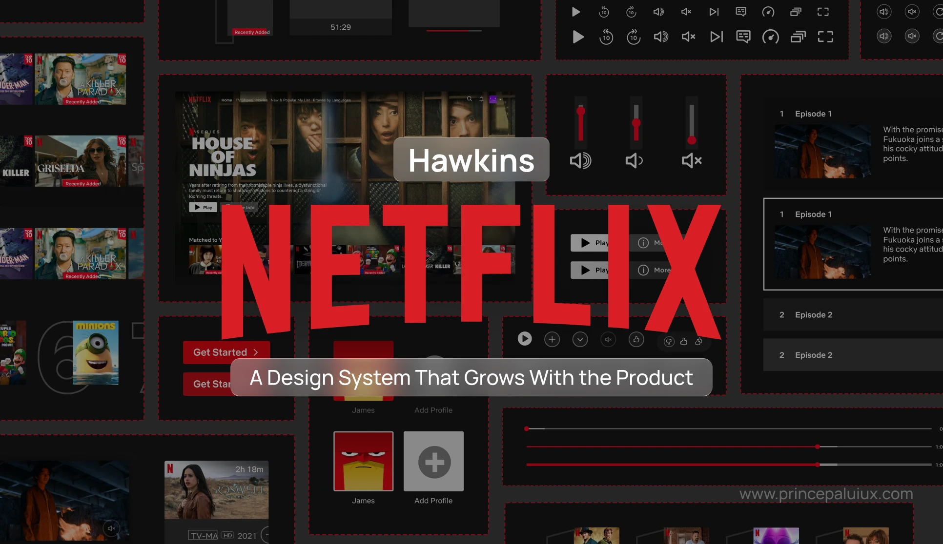
Behind Hawkins: How Netflix Designs at Scale Without Losing Its Soul
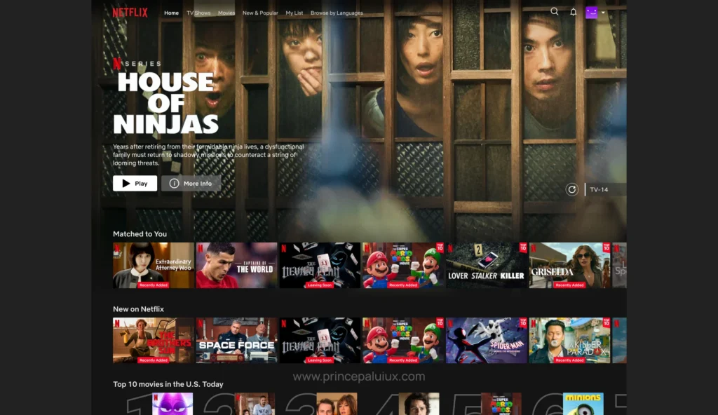
Design systems are rarely as glamorous as the products they support. But when you’re Netflix—serving experiences across TV, mobile, and web to millions globally—you need more than just reusable buttons and a color palette. You need something resilient. Adaptable. Thoughtfully chaotic in just the right way.
That’s where Hawkins comes in.
What is a Design System?
A design system is a collection of reusable components, guidelines, and standards that help teams build consistent, efficient, and cohesive digital products.
It typically includes:
- UI components (buttons, forms, cards, etc.)
- Design tokens (colors, spacing, typography)
- Usage guidelines (when and how to use things)
- Code components (for developers to implement designs)
- Documentation (explaining patterns, accessibility, and best practices)
Think of it like a shared language between designers and developers. Instead of reinventing the wheel every time, a design system offers ready-made, well-tested parts—so teams can move faster and maintain consistency across platforms.
To complement the deep dive into design systems, I’ve embedded a calming Spotify playlist designed to help you focus, meditate, or unwind. Whether you’re sketching components or taking a mental break, let these peaceful sounds ease you into a better headspace.
Why Design Systems Matter (More Than You Might Think)
As products grow—more apps, more screens, more teams—things can start to feel… disconnected. One team builds a button this way, another does it that way. Over time, users feel that inconsistency. And internally? It gets messy.
That’s where a design system comes in. It’s not just a library of components—it’s a shared foundation. A kind of blueprint for how your apps should look, feel, and behave. When it’s done right, it brings cohesion across your entire product suite. Suddenly, everything feels like it belongs to the same family—even if different teams built them.
For users, that consistency means less friction. If they know how to fill out a form or find information in one app, chances are they’ll feel at home in the next one. Fewer surprises. Fewer support tickets. Less training is required.
For designers and developers, it’s a common language. No more endless debates over what shade of blue to use or how error messages should appear. It’s all there—documented, tested, agreed upon. New team members can get up to speed faster because the rules of the game are already in place.
And for engineers? Honestly, this might be the biggest win. You build a button once. A table once. A form once. When something improves—better accessibility, faster performance, a visual tweak—every product that uses it gets better instantly—one fix, many wins.
That’s what Netflix realized with Hawkins. Across the Studio ecosystem, there were dozens of opportunities where a design system could lighten the load. Fewer bugs. Faster development. Happier users. And maybe, just maybe, a little more sanity for everyone building the experience.

I’m Prince Pal. I help growing products and teams build thoughtful, scalable design systems that bring consistency without killing creativity.
I craft systems that align design and development—so teams move faster, users feel at home, and your brand stays strong across every touchpoint.
A Design System That Grew Sideways
Hawkins wasn’t born as a grand, top-down initiative with big announcements and neatly labeled folders. Like many good things in tech, it started quietly—almost as a whisper—on the Professional side of Netflix: the internal tools that power content ops, marketing, and engineering. It was a grassroots effort, evolving out of necessity.
At some point—perhaps when the internal system finally found its rhythm—someone (or probably a group of someones) looked over at the Consumer experience and thought, “Wait, shouldn’t we be sharing some of this?”
That’s when Hawkins began growing sideways. Today, it operates on two tracks:
- Professional, the behind-the-scenes tools.
- Consumer, the side users see: apps on Android, iOS, TV, and Web.
Two paths, one spine. Both share the same design DNA through tokens, assets, icons, illustrations—small but mighty elements that help everything feel… Netflix-y, even when the context shifts wildly.
Tools, but Also People
Netflix has a solid team of Design Engineers—folks who don’t just implement designs but shape how they’re built. Together, they’ve crafted custom tooling to meet Netflix’s particular needs. That said, the team isn’t immune to the pull of the usual suspects.
- Figma is still the home base for design libraries.
- Storybook helps visualize components in action.
- There’s a Hawkins API, a few custom plugins, and explorations into more robust CMS options for documentation.

But tooling is only part of it. The team meets regularly—sometimes too regularly.
There are weekly syncs, engineering stand-ups, design huddles, and office hours. They also hang out on Slack, where questions fly in constantly. It’s not perfect, but it works (most of the time).
That Tricky Line Between Consistency and Creativity
This might be one of the hardest things about design systems: getting everyone aligned without making them feel boxed in. Hawkins tries to walk that line.
Here’s how they think about it:
- If you’re designing something new, start with Hawkins components.
- If that doesn’t work, use Hawkins tokens to at least match the feel.
- And if you’re doing something that feels truly custom, talk to the team. That way, they can learn, adapt, maybe even evolve the system.
The idea is not to shut down innovation—but to give it a framework. One that flexes, but doesn’t snap.
Jen Yee (Lead Product Designer) and Luca Orio (Design Manager) from Netflix reveal how systems and freedoms can coexist and how your design community can thrive at any stage. Letting go of consistency and control might sound scary, but embracing a culture of context and trust is the key to supporting an ecosystem where collaborative creation can truly fuel innovation.
Roadmaps Are… Aspirational

You’d think a company like Netflix would have a rigid design system roadmap. They do. Kind of. But reality, as always, interferes.
Yes, there are goals and priorities, but they change. A new feature drops—a platform shifts. Suddenly, the system team is adjusting. They’ve learned not to cling too tightly. Rigid systems break. Hawkins bends.
Still, they do their best to stay focused—and check in periodically to make sure they’re not lost in the weeds.
Metrics? Working On It.
Design systems tend to lag in measurement. Hawkins is no different. Right now, adoption is the metric getting the most attention—but even that’s layered.
- Leadership wants adoption to show ROI.
- Feature teams want adoption to see how aligned they are.
- The design system team wants both—to decide where to invest their energy.
But adoption is only part of it—engagement, contribution, satisfaction—those matter too. The team is slowly exploring ways to capture those signals. Nothing conclusive yet. But the intention is there.
The Mistake We All Make
If they could rewind and change something, it would probably be this: validating new components before shipping them out broadly.
There’s a tendency (and it’s understandable) for system designers to ship components that seem solid on paper. Or in Figma. Or even in Storybook. But once they hit the wild—integrated into live products—they can sometimes underperform, even backfire.
And when metrics drop, so does confidence in the system.
The better approach? Co-create with feature teams. Test in the real world early, even if it means revisiting your design two or three times. It’s harder up front, but smoother long-term.
The Future Isn’t Platform-Specific
Looking ahead, Hawkins (and design systems in general) may be heading toward platform-agnostic libraries. Rather than creating parallel versions for iOS, Android, Web, and TV, there’s a growing belief that systems should be responsive across dimensions like:
- Input types (touch, remote, mouse)
- Screen sizes
- Orientation
In other words: design for context, not codebase.
Components vs. Connections
If there’s one slightly spicy take worth mentioning, it’s this: Building components is overrated.
That’s not to say components don’t matter. Of course they do. But the magic happens in the relationships—between designers, between teams, between vision and reality.
A well-documented button won’t fix misalignment. A shared understanding might.
Don’t Copy. Adapt.
This might ruffle some feathers, but here it is: Don’t blindly mimic Google’s Material or Apple’s HIG. They’re fantastic resources—no doubt. But they’re designed for platforms, not products.
Netflix is a product. Your team probably is, too. So focus less on industry FOMO and more on what your business and users need. That’s the real win.
🧰 Bonus: A Treasure Trove of Free Design System Resources
UIUXshowcase’s free directory offers real-world design systems, templates, and style guides—perfect for anyone building or refining their own.

Final Thought? No One Has It Figured Out
Seriously. No one.
Even the slickest-looking systems—the ones getting claps on LinkedIn—have their cracks behind the scenes. So when you read articles like this one (yes, this too), take it all in thoughtfully, but not blindly.
Design systems are complex. They’re messy. And they require more listening than talking.
But when they work—when they truly empower teams without holding them back—it feels a bit like magic. Or maybe just good design.