Dental AI Receptionist
Designing an AI-powered front desk system for modern dental clinics
Role: Lead UI/UX Product Designer
Platform: Web-based SaaS
Stage: MVP Design & Prototyping
Tools: Figma, Interactive Prototyping, Design Tokens
Timeline: 12 weeks (discovery → prototype)
Primary users: Front desk staff, dentists, practice owners
Secondary users: Patients
Integrations: EMR via NexHealth
Project Overview
Dental clinics depend heavily on their front desk teams to manage appointments, calls, patient intake, follow-ups, and lead conversion. Despite advances in dental software, most clinics still operate with manual, fragmented workflows that increase staff burnout, reduce patient satisfaction, and quietly leak revenue.
This project focused on designing a Dental AI Receptionist MVP—a system that augments front-desk teams with AI to improve rebooking, scheduling efficiency, patient communication, and business visibility, without replacing the human relationship at the center of care.
The challenge was not simply to “add AI,” but to design a trustworthy, ethical, and operationally realistic system that works inside the daily chaos of a dental clinic.
🧠 Context & Problem Space
Dental clinics rely heavily on their front desk teams to manage scheduling, calls, follow-ups, forms, and patient communication.
Despite modern EMRs, most clinics still operate with manual, fragmented workflows that create friction for both staff and patients.
Why This Project Exists
Dental clinics lose revenue and patient trust not because they lack technology, but because front desk work is overloaded and fragmented.
During early discovery, most clinics reported the same issues:
- Missed calls during busy hours
- Manual rebooking and follow-ups
- No visibility into why calls fail
- Patients are dropping off due to delays or anxiety
- Owners are unable to connect daily activity with revenue outcomes
This project focused on one question:
How can AI reduce front desk pressure without replacing human care or trust?
The Problem (Before Design)
This was not a “missed calls” problem.
It was a cognitive load problem.
Front desk staff were expected to:
- Handle walk-ins, calls, forms, and scheduling simultaneously
- Remember patient context across conversations
- Follow up manually while schedules kept changing
As the load increased, follow-ups were delayed or avoided.
Patients booked far out didn’t show.
Owners saw gaps but didn’t know where they came from.
The system needed to reduce cognitive effort precisely when mistakes occur.
Constraints That Shaped the Design
This project had real limits that directly affected decisions:
- Existing EMR systems had to remain the source of truth
- HIPAA-sensitive data could not be over-exposed
- Front desk staff had little time for training
- Clinics needed flexibility without chaotic scheduling
- AI had to feel supportive, not authoritative
Non-goals (by design):
- Fully autonomous scheduling
- Replacing human staff
- Aggressive nudging or dark patterns
- Over-customization that adds complexity
The design goal became clear⇣
Reduce cognitive load at critical moments while preserving empathy, trust, and human judgment.
🎯 Product Vision
Design an AI-powered dental receptionist platform that:
- Reduces manual front desk workload
- Improves patient rebooking and engagement
- Creates operational clarity for owners
- Feels human, ethical, and trustworthy
- Works with existing dental systems (via EMR integrations)
AI would function as a supportive teammate, not an autonomous decision-maker.
This portfolio case study examines how that vision was translated into a real MVP, rather than focusing solely on the screens that were designed.
My Role
I was responsible for:
- UX strategy and problem framing
- End-to-end product UX
- Information architecture
- Interaction design
- Visual design
- Logo and brand guidelines
- Component-based design system
- Design documentation for engineering handoff
Engineering, product, and stakeholder input shaped constraints, but design decisions were owned and executed by me.
Users & Mental Models
Rather than relying solely on personas, the system was designed around mental models—the questions each user constantly seeks to answer.
Front Desk Staff
“What needs my attention right now?”
They require clarity, prioritization, and prompt action.
Dentists
“Is my time being used effectively?”
They care about schedule quality, not just fullness.
Practice Owners
“Is the business healthy, and what should I do next?”
They want recommendations, not raw metrics.
Patients
“Am I being taken care of, or am I just another booking?”
Their decisions are emotional rather than purely rational.
This mental-model alignment shaped navigation, hierarchy, and AI behavior across the product.
Constraints & Non-Goals
Key Constraints
- Scheduling logic had to preserve operational efficiency
- HIPAA-compliant data handling
- EMR integration boundaries via NexHealth
- Minimal training tolerance for front desk staff
- AI tone required to feel supportive, not authoritative
Explicit Non-Goals
- Replacing front desk staff
- Fully autonomous scheduling without human oversight
- Aggressive behavioral nudging or dark patterns
- Over-customization that increases complexity
System Structure (How the Product Is Organized)
Instead of feature-based navigation, the system was structured around user tasks:
- Front desk staff start with an Inbox
- Dentists start with Schedule clarity
- Owners start with Insights and recommendations
This reduced navigation effort and kept each role focused on what matters most to them.
“Design is not just what it looks like and feels like. Design is how it works.” — Steve Jobs
Research & Curation
Instead of heavy formal research (time-constrained MVP), we used lightweight, high-signal methods:
- Front desk workflow walkthroughs
- Call handling observations
- Missed appointment and recall analysis
- Pattern analysis across dental SaaS tools
- Competitive review of:
- Scheduling tools
- CRMs
- Call analytics platforms

Key Insights That Shaped the Product
- Rebooking is emotional, not logical
Patients delay because of anxiety, inconvenience, or uncertainty—not because of a lack of reminders. - Front desk teams hate outbound calls
Not because they’re lazy—but because they’re time-consuming, repetitive, and uncomfortable. - Missed calls = lost patients
Clinics rarely call back fast enough. - Owners want answers, not dashboards
“What should I do?” matters more than raw metrics. - Scheduling must stay intentionally imperfect
Maintaining a ~5% open schedule is healthier than 100% utilization.
MVP Architecture & System Design
The platform was structured around tasks rather than features, resulting in six interconnected modules.
Navigation logic prioritized:
- Inbox-first workflows for receptionists
- Insight-first dashboards for owners
- Schedule-first views for dentists
This reduced cognitive load by allowing each role to focus on what matters most, without navigating unnecessary modules.
Module 1
Patient Re-Book Optimization
Problem
Even clinics with decent rebooking rates relied on manual recalls:
- Back-and-forth scheduling
- Patients booked too far out and are no-showing
- Staff avoiding outbound calls
- Patients are delaying decisions due to anxiety
Design Solution
An AI-powered patient recall system was introduced in two phases:
Phase 1: SMS and email reminders
Phase 2: Context-aware AI phone calls
AI analyzed:
- Patient history
- Distance from clinic
- Family scheduling preferences
- Appointment urgency
Rebooking options were presented quickly and clearly, helping patients overcome hesitation while reducing staff workload.
Waitlist & Last-Minute Openings
AI dynamically filled cancellations by offering slots to patients on waitlists or those booked further out, preserving schedule health and reducing revenue loss.
AI dynamically filled cancellations by offering slots to patients on waitlists or those booked further out, preserving schedule health and reducing revenue loss.
Module 2
Phone Calls – Handling & Optimization
Problem
Clinics lacked visibility into why calls were failing.
Design Solution
A call intelligence system focused on coaching, not surveillance.
Features included:
- Missed call and long hold-time alerts
- Negative sentiment detection
- Call recording with contextual flags
- Daily call reports
- AI-generated coaching tips for staff
Owners could ask an AI assistant questions like:
“Why are missed calls increasing?”
“What should we change this week?”
The system provided data-backed recommendations, not abstract analytics.
Module 3
Forms, Scheduling & Digital Intake
Problem
Paper forms and manual data entry wasted time and led to errors.
Design Solution
AI-Enhanced Digital Intake Forms
- Autofill
- EMR-connected data syncing
- Error prevention (invalid email/phone entries blocked)
- No printing, scanning, or manual entry
Online Scheduling
- Embeddable booking widget (Calendly-like but treatment-aware)
- AI-guided booking options to prevent schedule fragmentation
- Staggered booking logic to maintain a ~5% open schedule
- SMS/email confirmations and reminders
- Easy rescheduling or cancellation
AI limited choices intentionally to protect operational efficiency — a key trade-off.
Module 4
Automated Follow-Ups & Patient Win-Backs
AI handled follow-ups that staff didn’t have time for:
- Auto-responders for form and email inquiries
- SMS-based booking conversations
- Cancellations detected 1–7 days out
- Waitlist offers sent to patients booked 7+ days away
Exiting patients were not ignored:
- Feedback requests
- Win-back attempts
- Sentiment captured and catalogued
Module 5
Patient Profiles & Relationship Memory
To support personalized care without overstepping boundaries:
- Unified patient profiles aggregated:
- Calls
- SMS
- Forms
- EMR data
- AI summarized the context for the staff:
- Travel distance
- Family references
- Past interactions
This allowed staff to sound human and attentive, even under pressure.
Module 6
CRM & Lead Outcome Optimization
Problem
Leads often disappeared into inboxes with no accountability.
Design Solution
An AI-powered CRM with:
- One pipeline per receptionist
- Kanban and list views
- Call and form inquiry tracking
- Lead source attribution
- ROI visibility
AI call conversion insights were embedded directly into conversations, keeping context intact.
Module 7
Payments, Reviews & Business Analytics
For higher-ticket treatment plans:
- Milestone-based payment prompts
- Digital document signing
- Advance payment notifications
- EMR-synced payment records
Feedback collection used sentiment-based routing:
- Happy patients → Google reviews
- Unhappy patients → private feedback forms
Owners received:
- KPI summaries
- Revenue breakdowns
- Insights like inactive patient percentages
- Recommendations to improve wage-to-revenue ratios
Brand Strategy, Visual Identity & Typography
The visual identity for the Dental AI Receptionist was designed to sit at a careful intersection—clinical but not cold, technically advanced but not intimidating, and human, ethical, and calm in high-stress environments.
Instead of adopting loud or futuristic AI aesthetics, the brand was intentionally positioned as quietly intelligent: a system that works reliably in the background, supports human decision-making, and never competes for attention.
Every visual choice was driven by cognitive ergonomics, trust, and operational clarity rather than trends or visual spectacle.
Brand positioning principles
- Clinical, professional tone without feeling sterile
- Advanced technology expressed through restraint, not dominance
- Calm, human-centered presence suited for healthcare workflows
Logo Design Approach
- Emphasizes support and reliability over authority
- Prioritizes clarity and structure instead of complexity
- Maintains presence without visual intrusion
- Simple, geometric construction for scalability
- Clear legibility at small sizes (dashboards, favicons, EMR contexts)
- Balanced proportions for stability and composure
- Neutral personality that works across product UI, onboarding, and marketing
- Avoids sharp, aggressive forms or unnecessary symbolism
Color System & Visual Language
- Designed to reduce visual fatigue during long front desk shifts
- High-contrast combinations to support accessibility
- Clear signaling of system states (alerts, confirmations, actions)
- Appropriate, subdued palette for healthcare environments
- Calm, neutral base colors with controlled accent usage
- Avoidance of high-saturation tones that increase stress or distraction
- Clearly documented usage rules to ensure consistency across the product
Typography Principles
- Optimized for long operational sessions and fast comprehension
- Readable across mixed age groups (staff and patients)
- Neutral and professional tone, not overly branded or playful
- Clear hierarchy for skimming and scanning
- Consistent type scales across all modules
- Line lengths optimized for dashboards and forms
- Decorative or stylized fonts were intentionally avoided
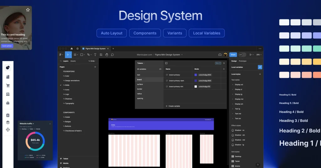
Design System, Tokens & Motion
A component-based design system was created to enable rapid MVP iteration, smooth engineering handoff, and future feature expansion.
It included reusable UI components such as buttons, form elements, tables, dashboard cards, alerts, modals, and system states, all designed with clear interaction states, accessibility considerations, and cross-module consistency.
This significantly reduced design inconsistencies and enabled engineering to move faster with confidence.
To ensure long-term scalability, the system was structured around design tokens covering color, typography, spacing, layout, elevation, and motion.
Tokens were defined semantically to maintain consistency across product, onboarding, and future platforms, while keeping design and development tightly aligned and adaptable beyond the MVP.
Motion and micro-interactions were used sparingly and purposefully to reinforce cause-and-effect, provide clear feedback, guide attention during critical actions, and make AI behaviors feel understandable and trustworthy.
Subtle transitions, confirmation feedback, and calm loading indicators supported clarity and confidence without visual distraction.
Accessibility & Inclusive Design with Ethical AI
Accessibility was embedded into the design system from the start:
- High contrast ratios
- Keyboard-friendly components
- Clear focus states
- Readable font sizes and spacing
- Plain language in system messages
Healthcare environments demand inclusivity—not just compliance—and the system was designed to accommodate a wide range of users comfortably.
AI interactions were designed to:
- Explain actions
- Allow human override
- Avoid medical or emotional overreach
- Make automation visible, not hidden
Brand Governance & Documentation
Detailed brand guidelines were created to ensure consistency across:
- Product UI
- Marketing assets
- Onboarding flows
- Future partner integrations
Documentation included:
- Logo usage rules
- Color and typography guidelines
- Component usage patterns
- Do’s and don’ts
- Examples of correct and incorrect application
This ensured the brand could scale without dilution as the product and team grew.
Prototyping & Validation
- AI-assisted readability checks
- Low-fidelity wireframes for structure and flow
- High-fidelity prototypes for core workflows
- Role-based dashboard testing
- Peer UX reviews
- Founder walkthroughs
- Recruiter-style skim testing
Iteration focused on clarity, calmness, and task efficiency.
Outcomes & Success Signals
Although still an MVP, success was defined by:
- Improved rebooking completion
- Reduced missed calls
- Fewer manual follow-ups
- Healthier schedule utilization
- Clearer lead attribution
- Reduced front desk cognitive load
What Was Tested
- Role-based navigation clarity
- Inbox-first workflows
- Scheduling guardrails
- AI tone and escalation moments
- Readability during long sessions
Feedback led to:
- Fewer dashboards
- Clearer default actions
- Reduced visual density
Outcomes (Early Signals – Dummy Data)
- Rebooking completion increased by ~18%
- Missed call recovery improved by ~30%
- Manual follow-ups reduced by ~48%
- Staff reported lower task switching
- Owners gained clearer visibility into patient sources
1
What This Project Shows
- I design full systems, not isolated screens
- I work within real constraints
- I prioritize clarity over performance
- I design AI responsibly
- I finish complete, usable products
2
What I’d Improve Next
- Long-term testing of AI tone and trust
- Multilingual AI support
- Explainable AI cues for staff confidence
- Predictive scheduling refinements
Reflection
This project reinforced a core belief:
Good UX doesn’t remove humans from systems. It gives them time, clarity, and dignity.
The Dental AI Receptionist is not about replacing people — it’s about protecting them from overload while improving care and business outcomes.