Case Study
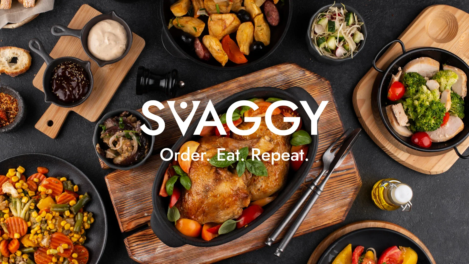
Svaggy Food Delivery App UI/UX Design
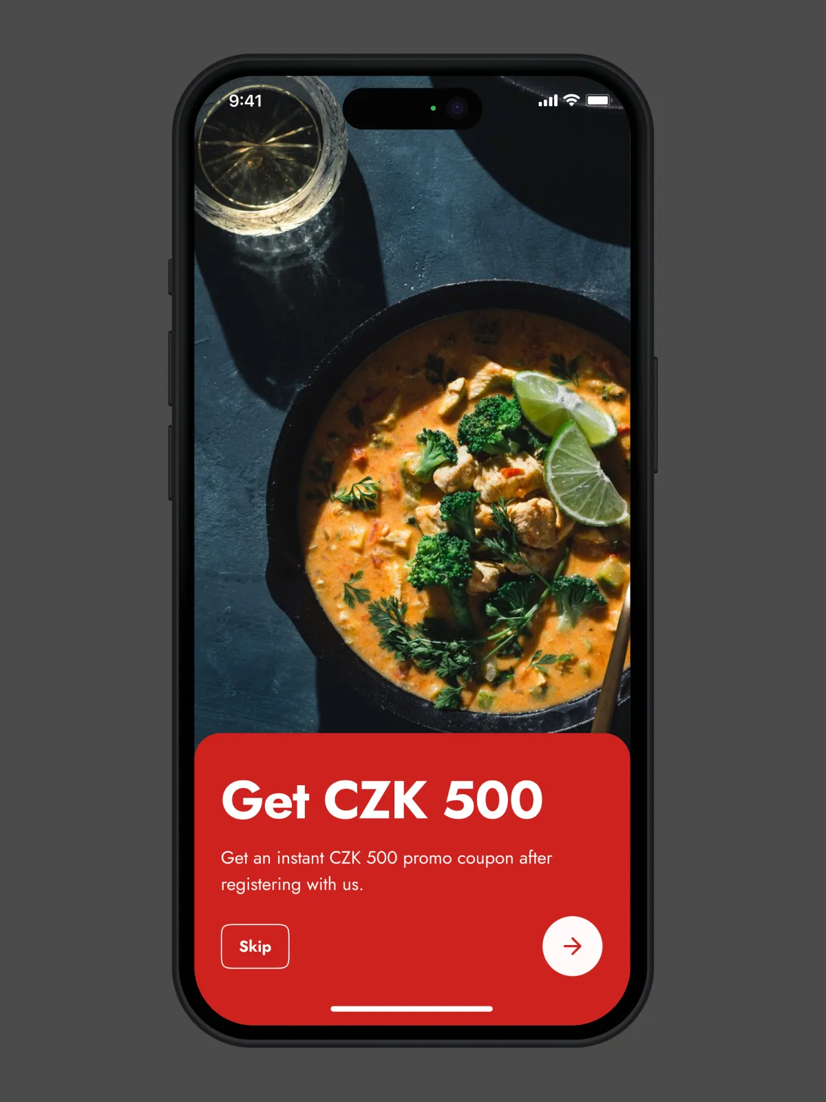
Designing Local 🍽 Food Delivery Experience for Prague 🇨🇿
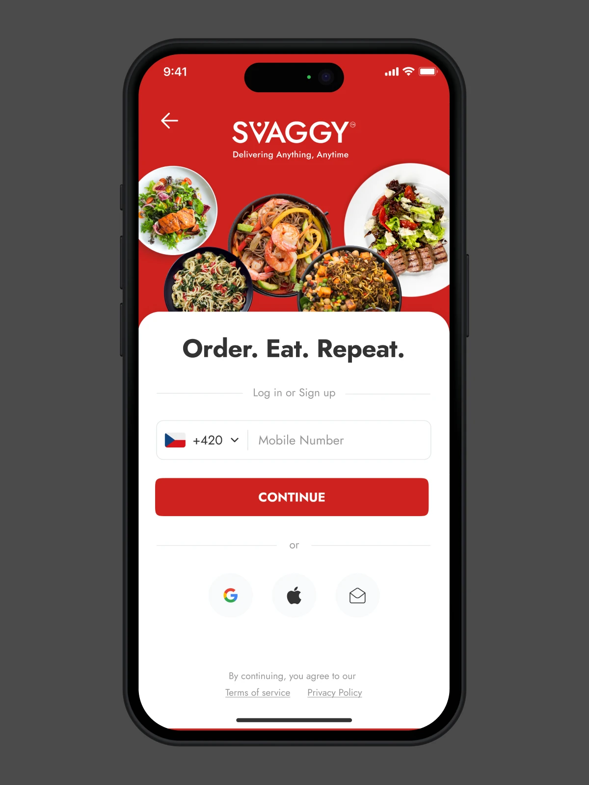
Svaggy is a food delivery app developed by Think360. It is designed to offer an efficient and user-friendly experience for customers, restaurant owners, and logistics partners.

A Quick Glimpse Before I Dive In
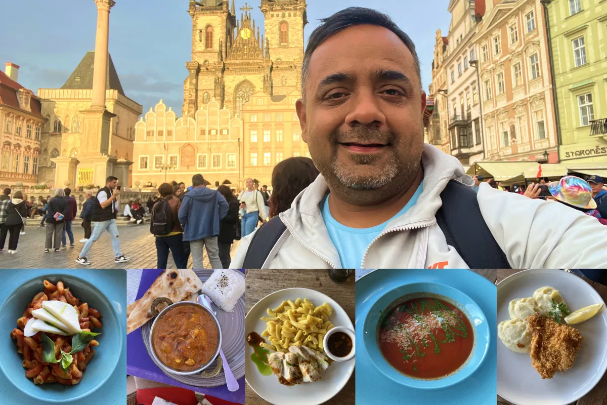
If you’ve ever stood on a cobbled street in Prague, hunger setting in, scrolling through Wolt or Bolt, and still not feeling like you found the meal—that’s kind of where this journey began. Svaggy wasn’t created to compete with the giants head-on. It was designed to feel local. Familiar. And—hopefully—delightful.
From July to early October 2023, I lived and worked in Prague, immersing myself in the culture and, of course, the food (a lot of it). Over those three months, I didn’t just sit behind a screen; I spent time with food lovers, restaurant owners, delivery folks, and startup stakeholders. We talked, argued, and whiteboarded; we laughed. What emerged was Svaggy.
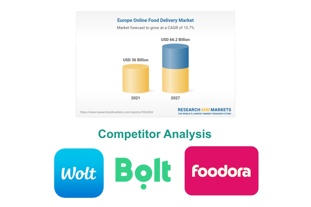
💡 Problem Worth Solving
Polished giants, including Wolt, Bolt, and Foodora, dominate food delivery in Prague. Fast, yes. Functional, sure. But… something’s missing.
Here’s what I kept hearing:
- “I don’t trust the food will be hot when it arrives.”
- “Support? You mean the chatbot that never understands me?”
- “Prices on apps are inflated. I’d rather call the restaurant.”
It was pretty straightforward: people wanted the convenience of tech, without losing the warmth of local service.
That’s where Svaggy would step in—not as a Swiss army knife trying to do everything, but as a crafted, Czech-centric experience that serves:
Delivery partners often feel like they’re last in the priority chain.
Hungry individuals seeking reliable food without filler.
Restaurants are seeking better margins, greater control, and simpler tools.
My Role & User Research
🧭 My Role in the Chaos (and Clarity)
This wasn’t just a UI gig. It was… everything.
- Branding: Name, voice, logo, colors—Svaggy had to sound and look like it belonged to Prague.
- Research: I conducted field interviews with customers, owners, and riders. Often at odd hours and sometimes over trdelník.
- UX/UI Design: Wireframes in Axure. Hi-fi prototypes in Figma. Pixel to pixel, button to button.
- MVP Definition: Wrote the specs, scoped what not to build, and crafted stories in Jira for devs.
- Multiple Apps: Designed the entire suite—consumer mobile app, delivery partner app, restaurant web portal, and the super admin dashboard.
Yes, it was a lot. No, I didn’t sleep much..
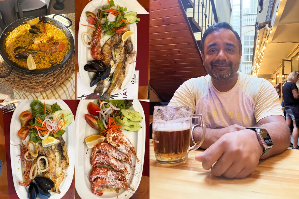
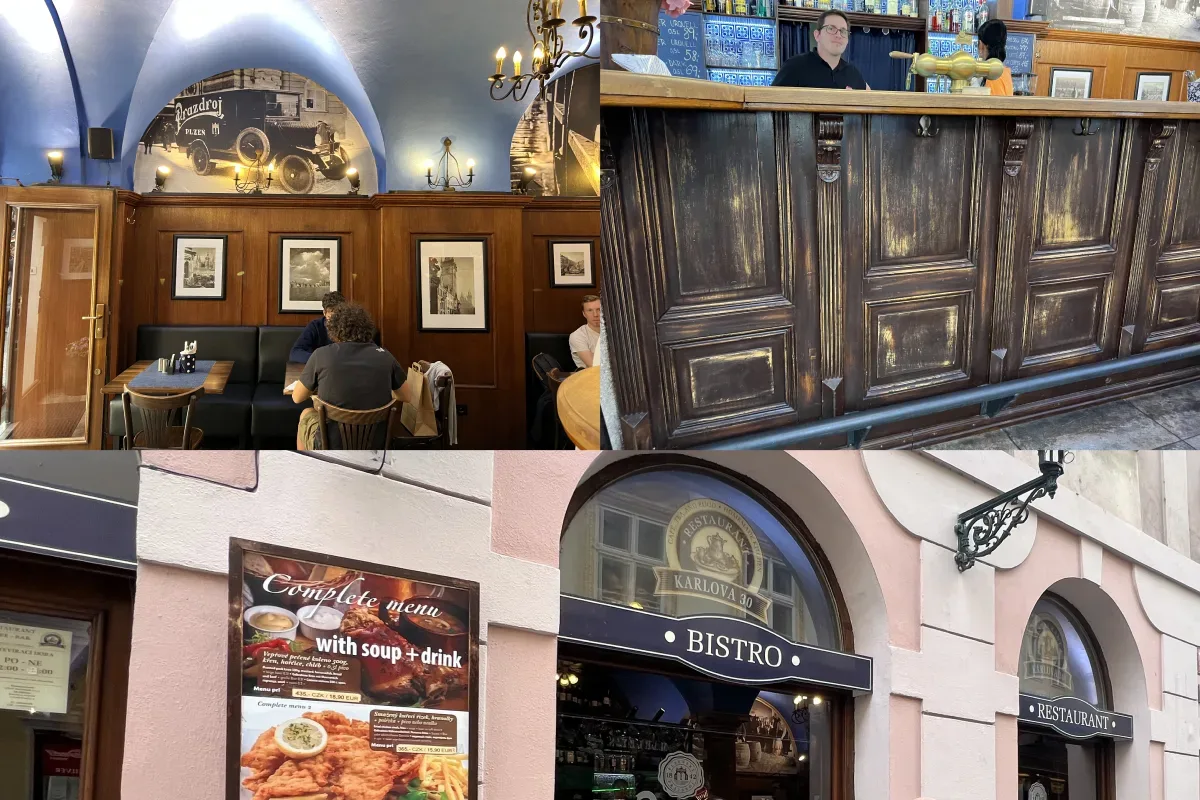
🔍 On-the-Ground Research (in Real Prague Weather)
I don’t believe good design happens in isolation. So, I went out. Walked the streets. Visited 20+ restaurants. Sat down with delivery riders who braved rain and tram traffic. Watched people order food—or give up trying.
Some hard-hitting takeaways:
- People desperately wanted real-time delivery tracking—especially during bad weather.
- Restaurant owners hated existing dashboards. “I just want to update today’s menu, not launch a rocket.”
- Delivery partners had no proper route planning. They often used Google Maps on a second device.
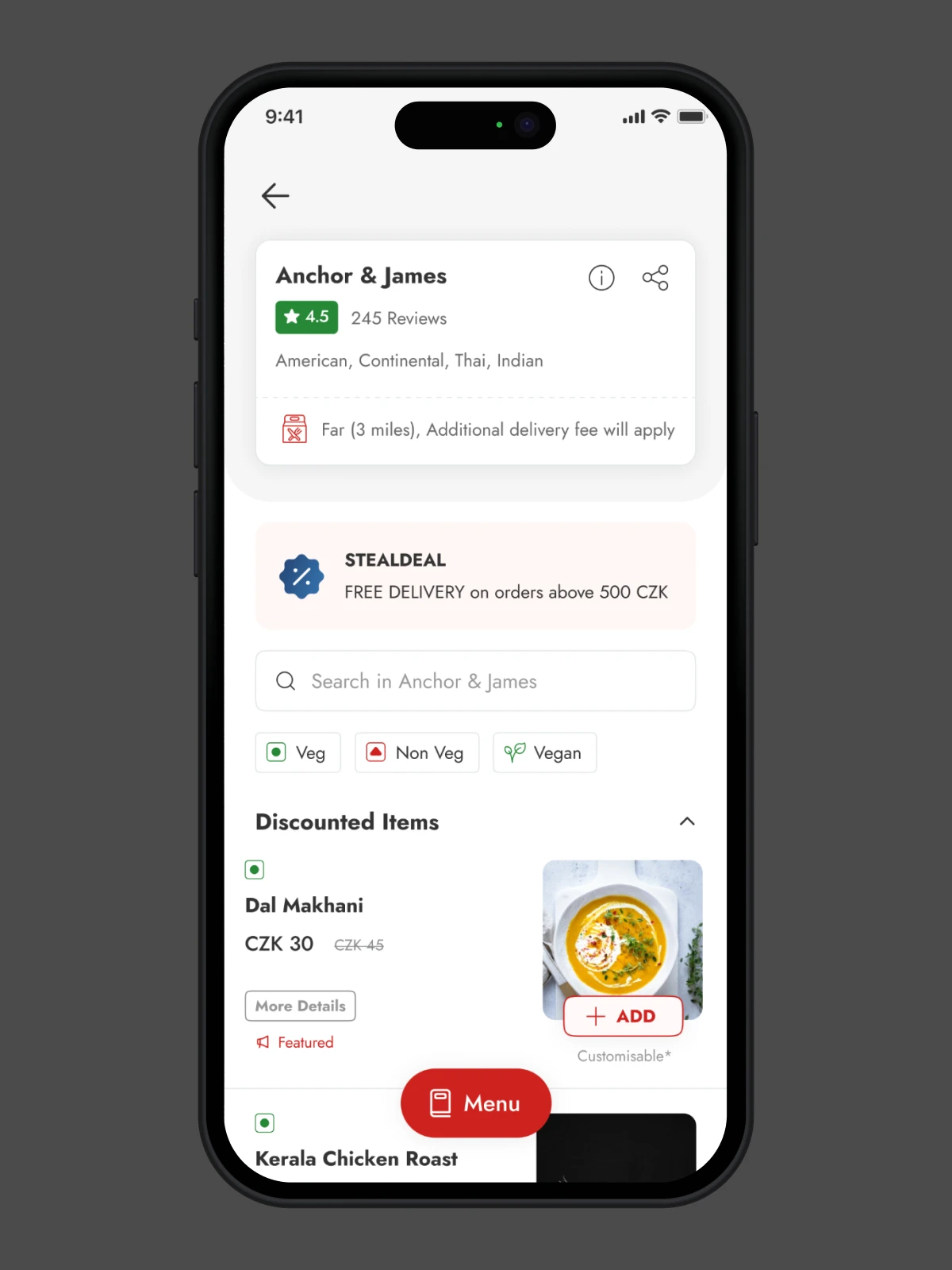
Also, the menu item images? A big deal. When the visuals were good, trust followed. When they weren’t, bounce rates spiked.
🏗 Wireframes to Visual Language
Axure helped me nail the structure fast. I iterated quickly—especially for the restaurant dashboard, where flow mattered more than polish.
Then came Figma. I built a consistent, flexible design system using atomic components for:
- Buttons (tiny to bold)
- Card patterns for dishes and deals
- Modals and notification bars for upsells and status updates
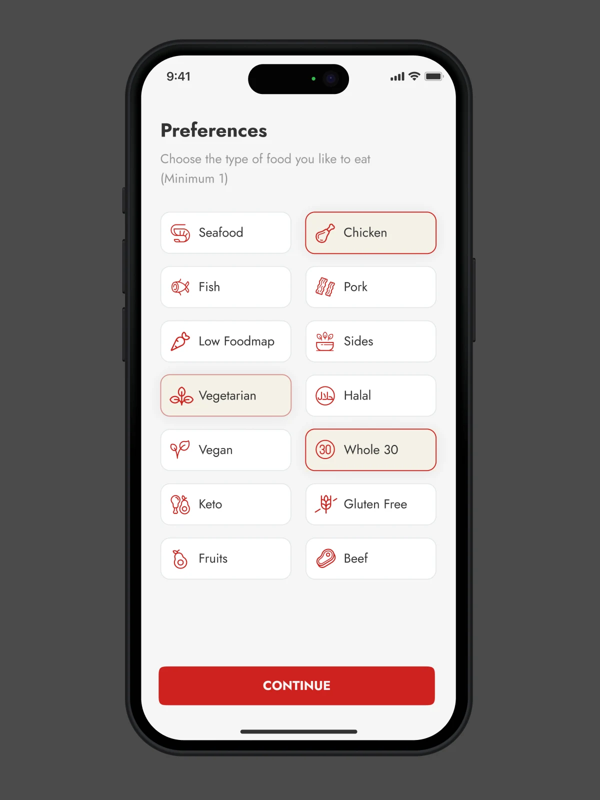
- Icons and badges (like “Vegan-friendly,” “Family Meals,” and even “Fast in Rain”)
Colors? I kept it vibrant/fresh but not childish. A warm, deep orange paired with charcoal gave it energy, but also a sense of trust.
Showcase of Management Skills
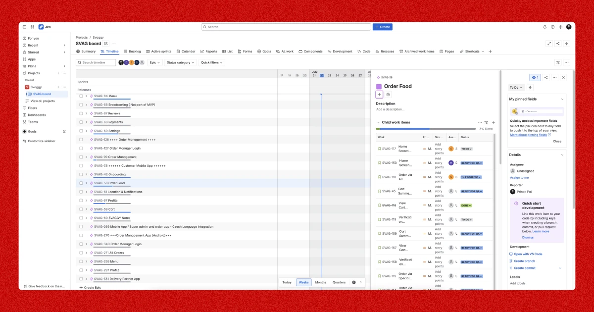
As a Principal Product Designer, my client has given me free rein to think like a product owner, and for that, documentation is crucial.
🧾
MVP Scope: What Made the Cut or Add
Writing the MVP document forced me to think like a product manager. We focused on core flows:
- Browse → Add to Cart → Pay → Track → Rate
- Restaurant: Add dish → Edit price → See orders
- Rider: Accept job → Navigate → Mark delivered
Voice ordering? AI menu clustering? Great ideas. But later.
✍️
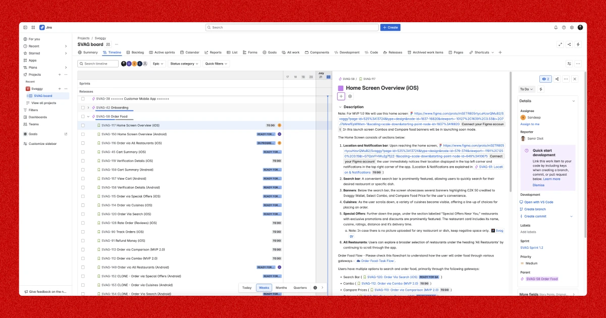
Writing the User Stories
Jira saw a lot of me. Each user story wasn’t just a bullet point. I included:
- The “why”
- Acceptance criteria
- Edge case examples
Developers told me it helped them catch logic gaps early. Win-win.
Achieved Dream Figure
Svaggy isn’t just about clicks and orders. It’s about building local loyalty. That can’t be bought—it has to be earned.
70%
returning users in the first 2 months
<30mins
Avg. delivery time
100+
restaurants onboarded within Prague
🎨 Branding Svaggy: A Visual and Emotional Identity for a Czech Food App
When you’re designing a food delivery platform for a market already dominated by global giants, you can’t afford to be forgettable. The app has to work, yes—but the brand has to connect. It needs to speak to people. Visually, emotionally, and instinctively. That’s where the branding journey of Svaggy began.
🧠 Brand Naming: Why “Svaggy”?
Naming a brand isn’t just a creative exercise—it’s strategic positioning in disguise. The name needed to feel:
- Fresh and friendly (not overly corporate)
- Easy to pronounce for both Czech and English speakers
- Open enough to allow for future verticals (like groceries, pet food, or parcel delivery)
After many rounds of brainstorming names and testing reactions on the ground in Prague, Svaggy stood out.
It’s short. It’s quirky. It has a rhythm.
And more importantly, it sounds like a friend. Not a platform.
I wanted the name to feel like someone you could rely on when you’re hungry, in a rush, or craving something comforting. Something like, “I’ll just Svaggy it.”
It passed the spelling test, the .com domain test, and the emotional vibe check. So we locked it in.
Brand Identity: Visuals That Feel Friendly, Not Generic
The visual identity of Svaggy had to strike a tricky balance. It couldn’t feel too startup-y or tech-heavy, nor too traditional or “restaurant-y.” It needed to sit somewhere between comfort and confidence.
Color Palette
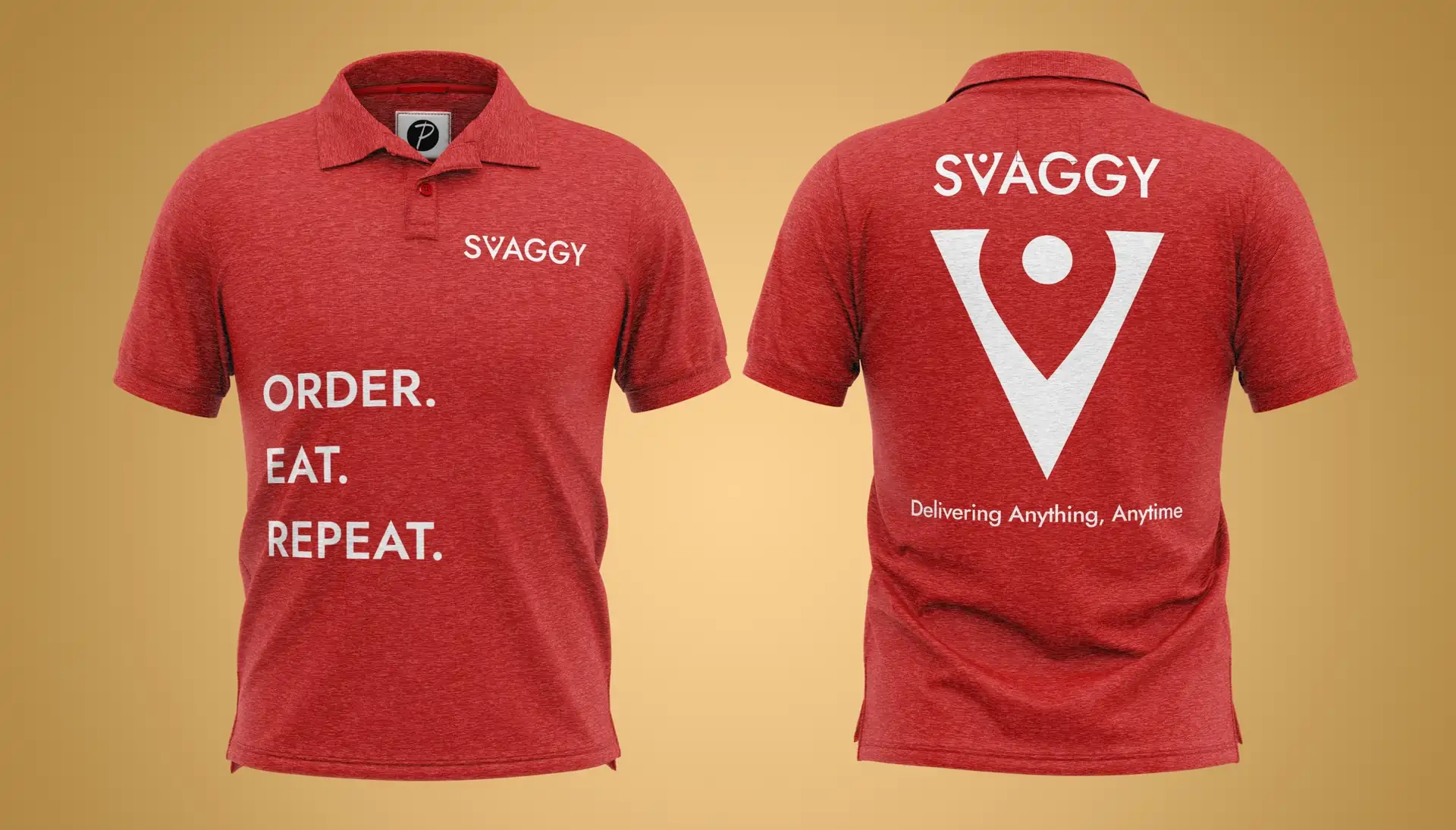
I leaned into warm, energetic colors—a vibrant orange paired with a soft charcoal gray.
- Orange signals appetite, warmth, and friendliness. It’s also attention-grabbing in busy app stores or small social media ads.
- Charcoal adds contrast, grounding the design and keeping it from feeling too playful.
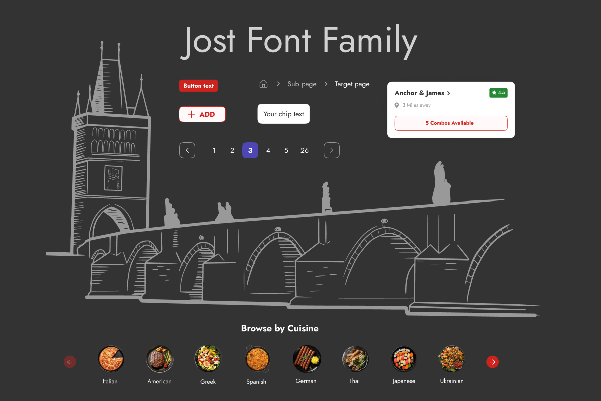
I also introduced supporting accent tones for categories—like leafy green for vegan filters, gold for premium dishes, and soft blue for subscription plans.
Typography
I picked a clean/minimal sans-serif typeface – Jost (Google font) that reads well on both mobile and web screens. Clean, legible, with just a hint of personality—because even buttons and dish names should feel human.
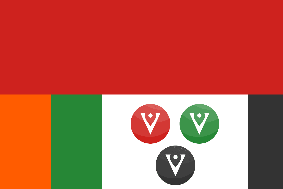
Logo Design
The Svaggy logo is a custom wordmark featuring subtle, location-inspired curves that reflect victory/achievement, speed, and friendliness. A minimal icon version (a stylized “V” with a delivery location) works well across mobile favicons, app icons, and stickers.
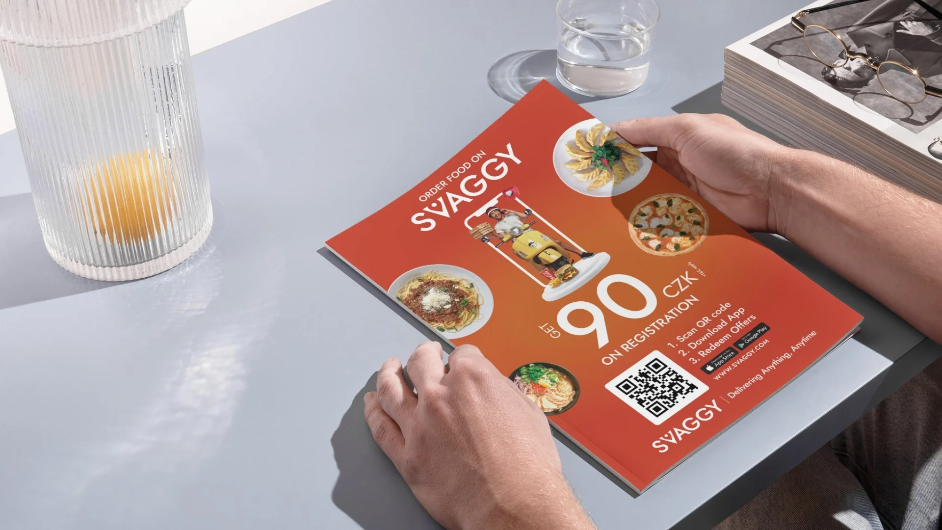
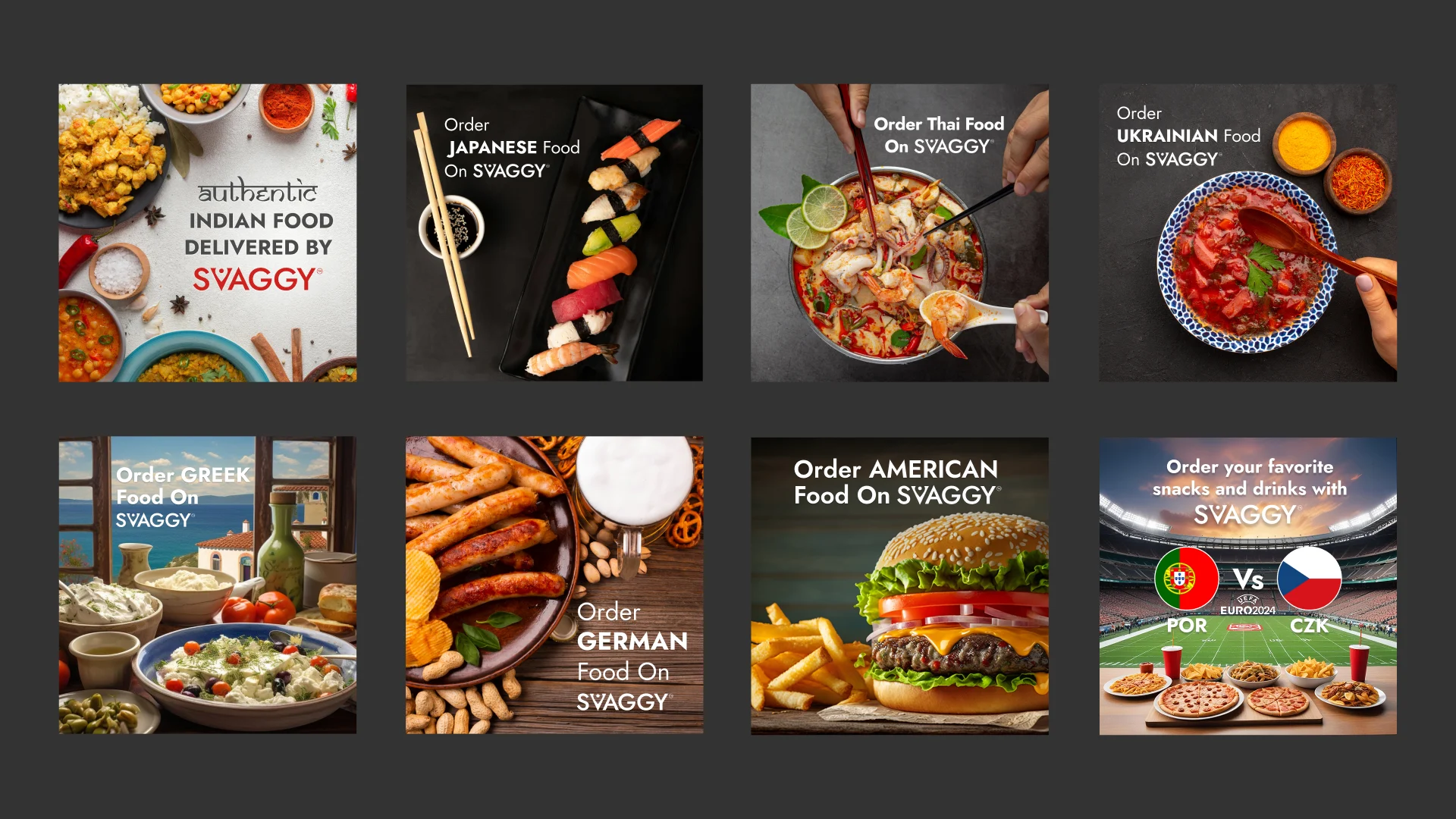
📣 Social Media Graphics: Making the Brand Speak Across Platforms
Svaggy’s social presence wasn’t an afterthought—it was an essential brand touchpoint, especially for our target users (students, young professionals, foodies, and families).
Every graphic was designed to reinforce the brand voice: friendly, helpful, a little cheeky, and always local.
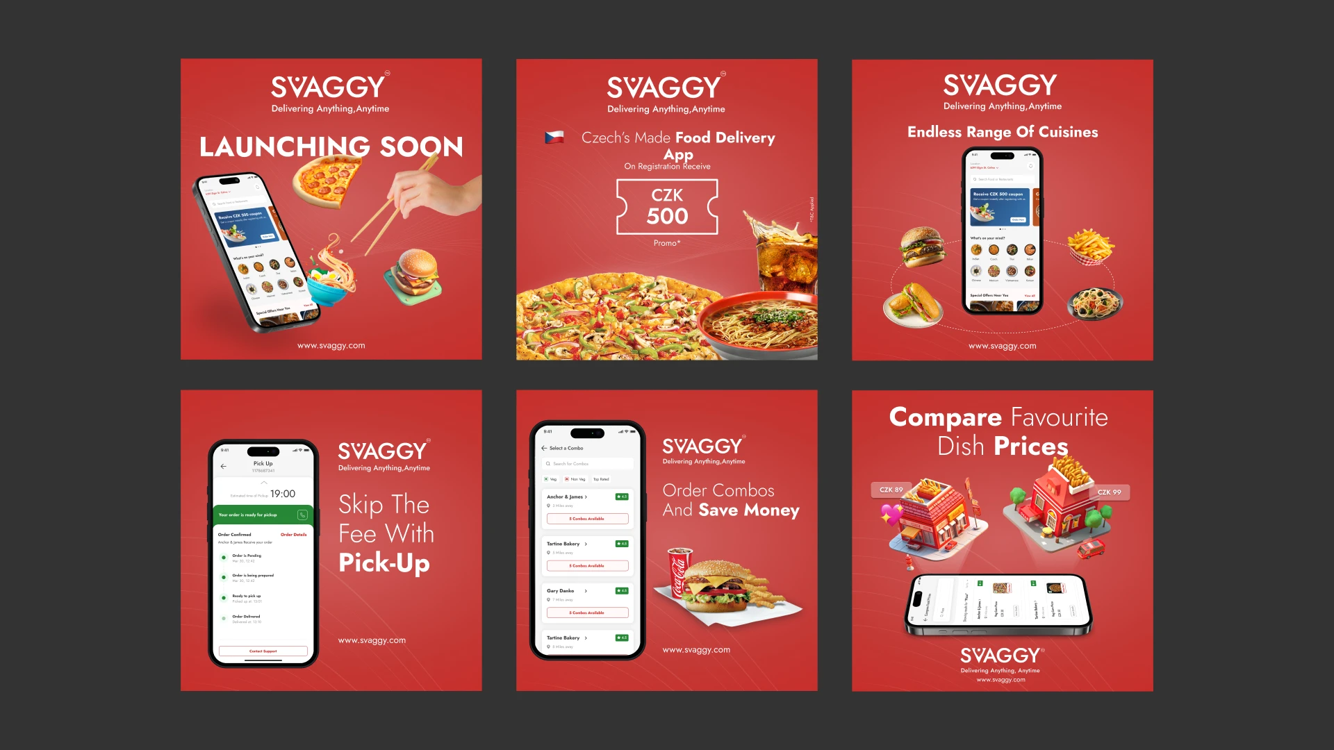
Content Buckets I Designed For:
- Deals & Promos: Bright banners with bold typography and bite-sized CTAs like “Crave Less, Save More” or “Lunch Under 99 CZK.”
- Food Spotlights: Carousel posts showing local dishes, new restaurant partners, or customer favorites—with photo-first layouts that pop in feeds.
- Behind-the-Scenes: Illustrations and micro-reels of riders, kitchen staff, or “how Svaggy works” content to build trust.
- Rider Hiring & Partner Restaurant Graphics: Visuals tailored for recruitment and B2B engagement, using a slightly more professional tone but still on-brand.
Platform-First Design
Each visual was crafted in multiple formats for:
- Instagram & Facebook stories
- Feed posts
- LinkedIn partner shoutouts
- App Store & Google App Store screenshots
We built a flexible Canva + Figma-based template system so our in-house or partner marketers could reuse branded elements without breaking visual consistency.
From the name to the logo to the Instagram scroll-stoppers, Svaggy’s brand identity was designed to be familiar but fresh. Visually bold, emotionally approachable, and strategically grounded in local culture.
Because in a crowded food delivery market, your interface gets you users—but your brand makes them stay.
Multiple Touchpoints, One Experience
Designing a food delivery platform isn’t just about building an app. It’s about creating an ecosystem.
And that ecosystem needs to feel connected—whether you’re a hungry customer, a rushed delivery partner, a busy restaurant manager, or the admin keeping it all afloat. For Svaggy, that meant treating every touchpoint as equally important.
Not just in terms of UI aesthetics, but in terms of thoughtfulness. Because if one link in the chain is frustrating, the whole experience breaks down.
Let’s walk through each surface I designed—and more importantly, why I created it that way.
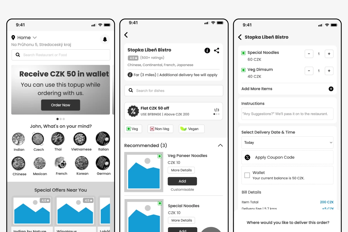
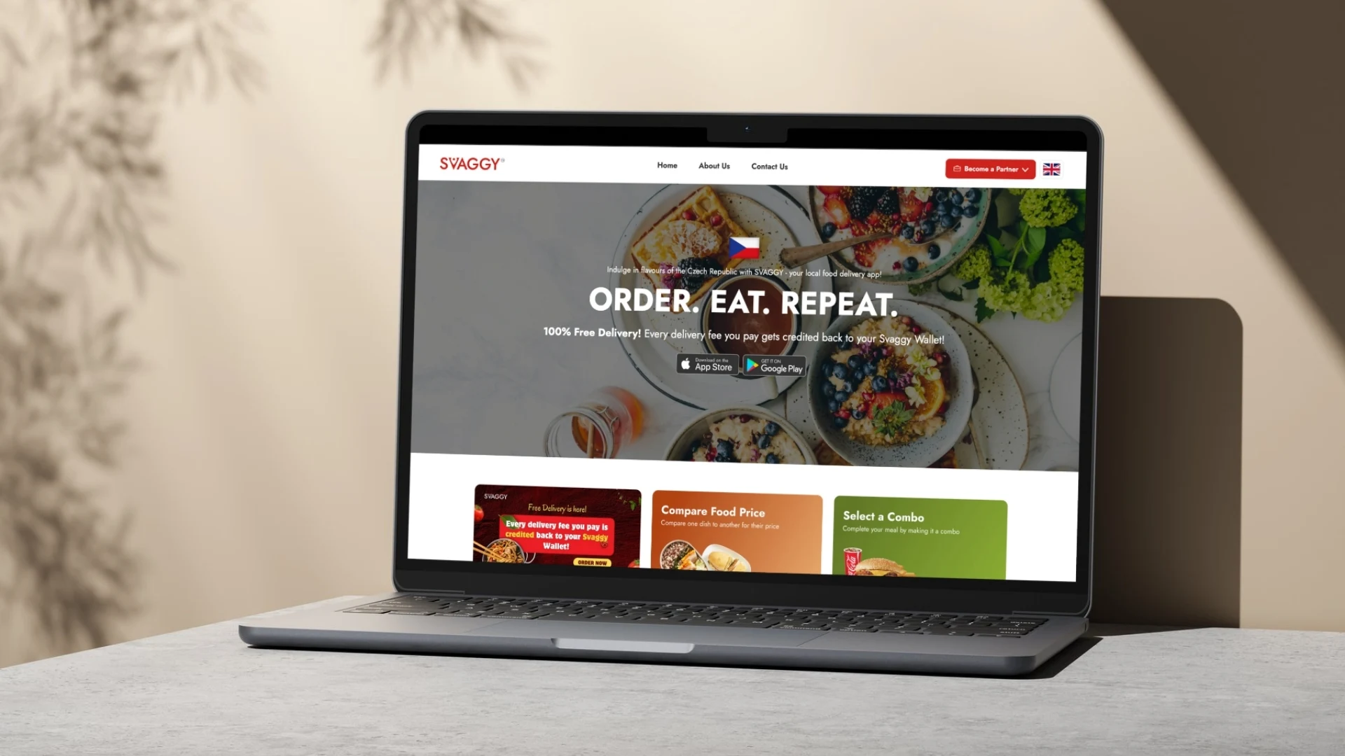
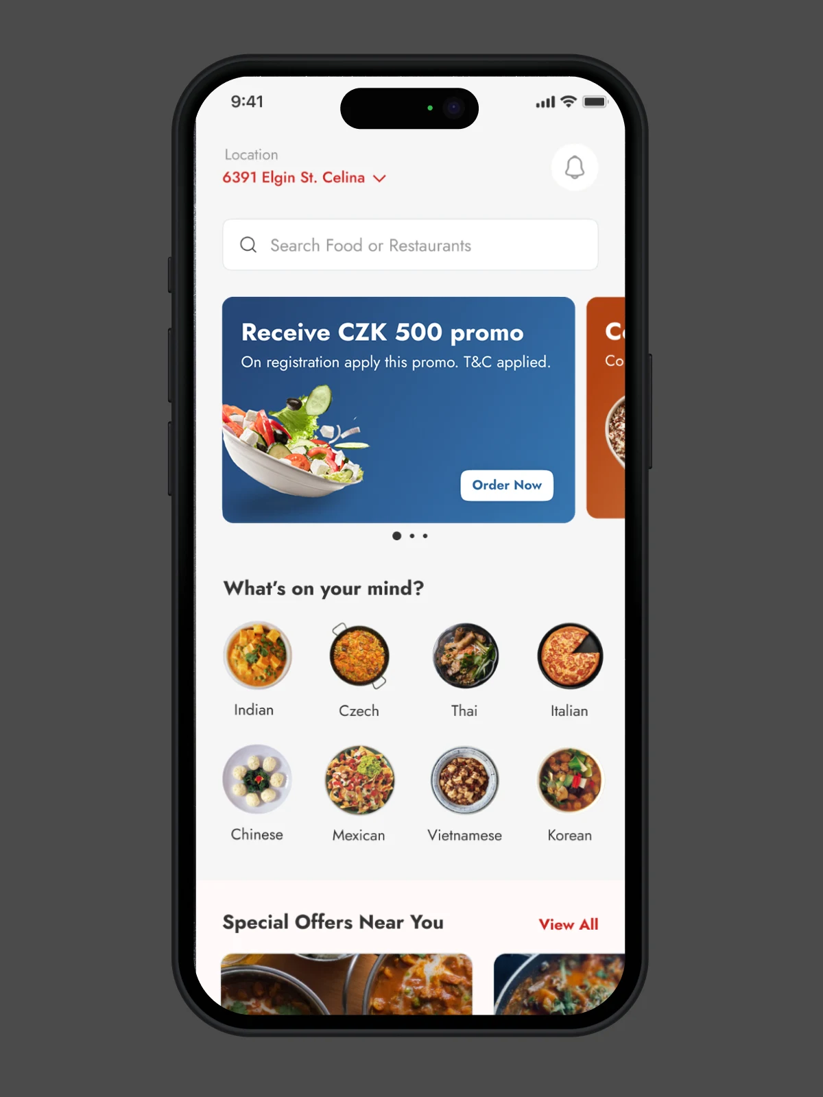
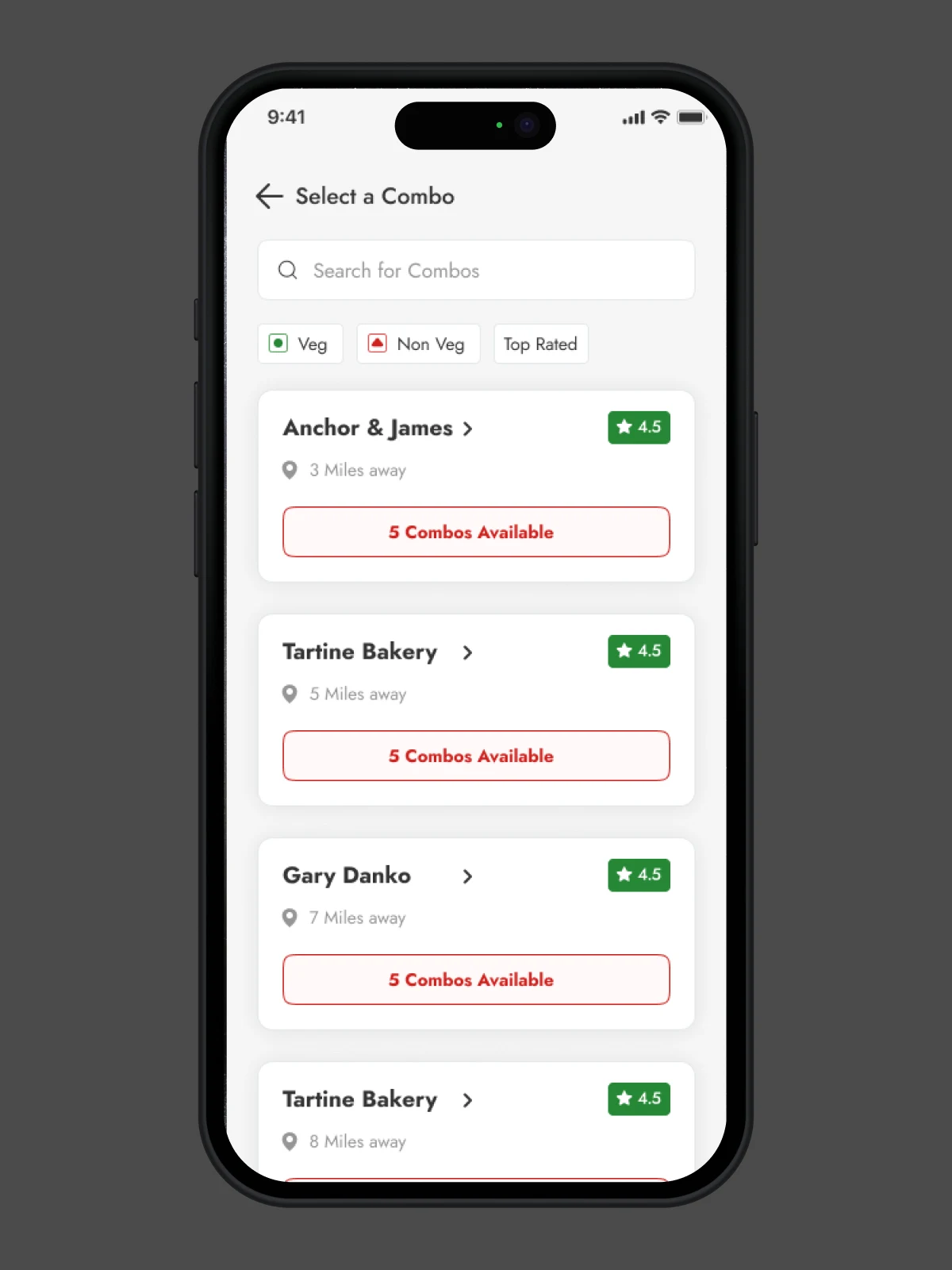
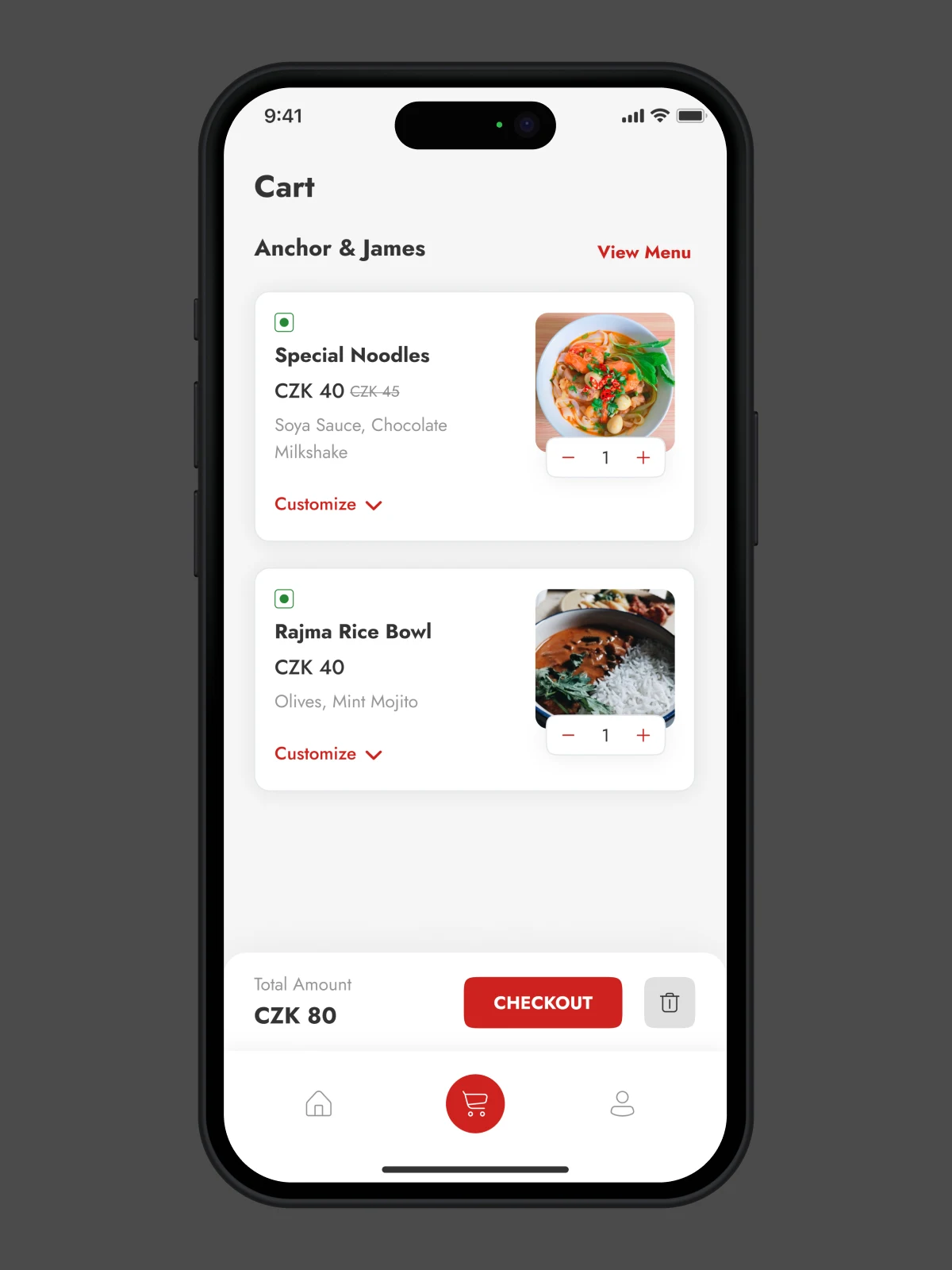
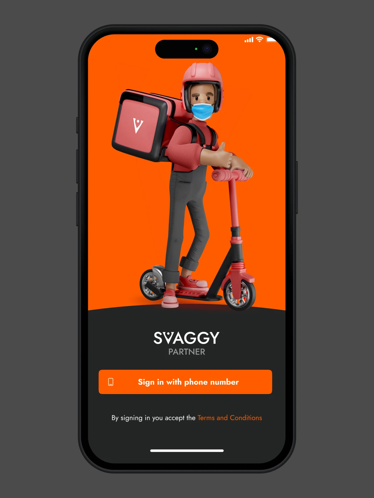
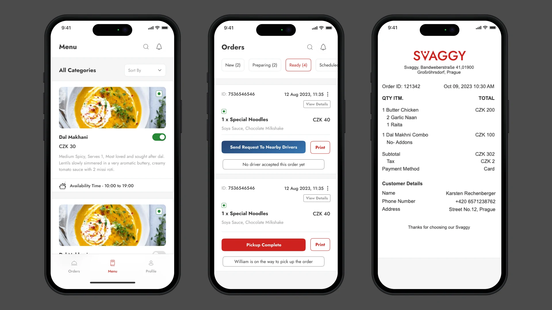
1. 🍴 Svaggy Consumer App
(aka, The One Everyone Sees)
This is where the magic has to happen—or at least feel like it does. So we obsessed over the details, but also questioned many default norms.


🔍
Personalized Recommendations
While the AI logic isn’t fully integrated yet, we have laid the groundwork for a system that will eventually learn from a user’s food habits, order timings, cuisine preferences, and even factors such as weather. (Because, yes, people do crave soup when it rains.)
For now, the experience includes contextual nudges—such as showing warm meals when it’s cold outside or vegetarian menus during religious fasting seasons.
🚴♂️
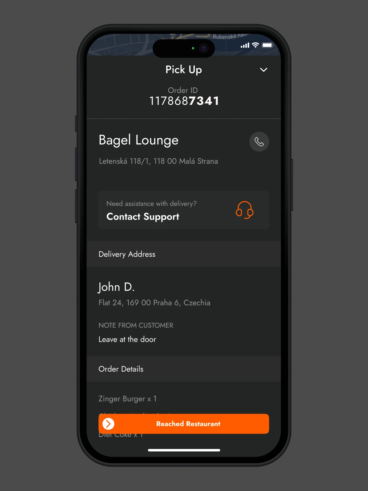
Transparent Delivery Tracking
This was non-negotiable. Users want to know who is delivering their order, where the delivery person is, and how long it will take. No vague “your food is on its way.” We show the rider’s name, estimated delivery time, and a real-time map.
There’s even a fun little loading animation that shows when the food’s being packed. It’s small, but it makes waiting feel a little less annoying.
🥗
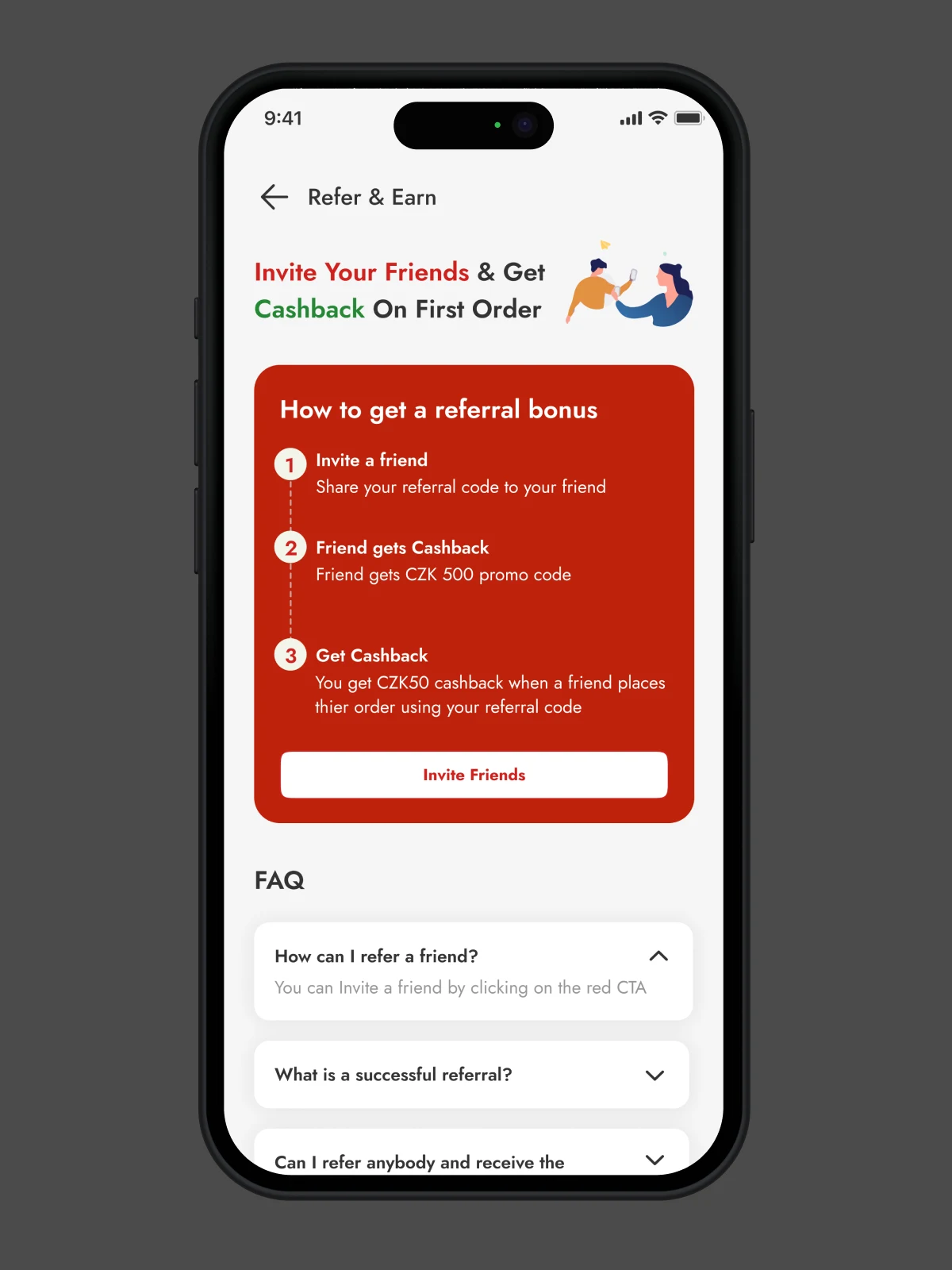
Weekly Subscriptions & Lunchboxes
One insight from talking to students and corporate workers in Prague: many wanted to “set it and forget it.” So we designed a simple way to subscribe to weekly meals—like affordable lunchboxes delivered daily. Think of it as meal planning without the meal prep.
Users can pause, swap, or skip a day, and we designed that flow to be stupidly simple because food decisions shouldn’t need decision fatigue.
🍛
Food Filters That Get You
We ditched the boring filters like “Fast Food” or “Asian” and created categories that reflect how people think:
- Under 100 CZK – for budget-conscious students
- Rainy Day Comforts – warm, hearty meals for gray skies
- Quick Eats – 15-minute prep or less
Why? Because cravings aren’t always based on cuisine—they’re based on moods, budgets, and time.
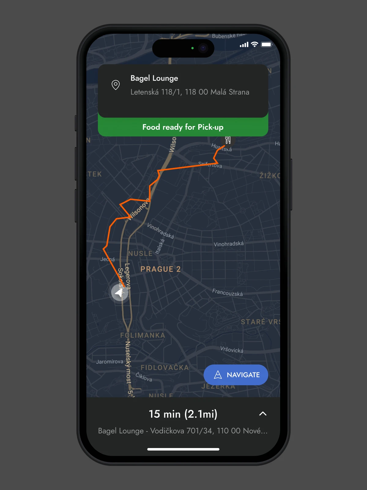
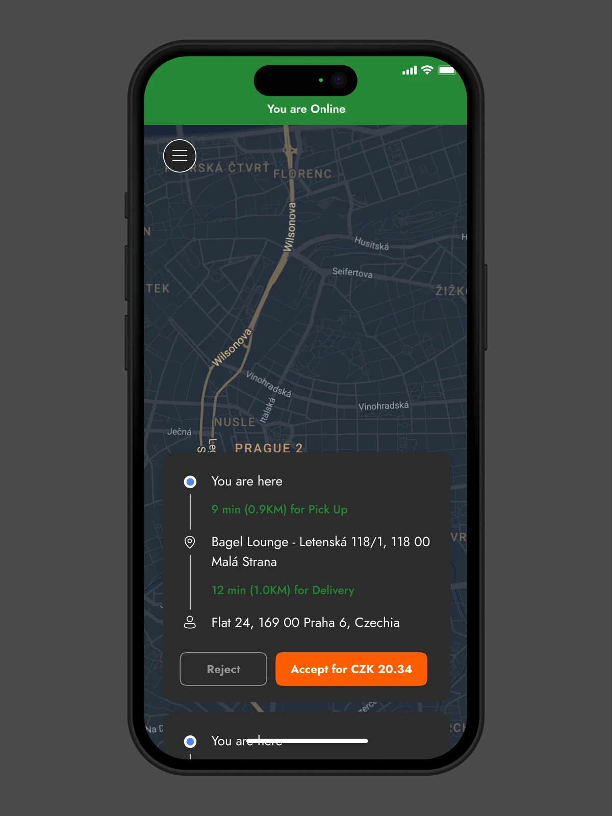
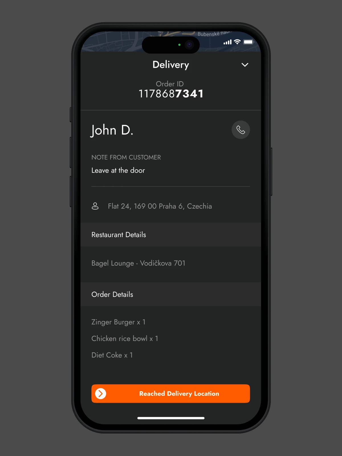
2. 🛵 Delivery Partner App
(aka, The Often-Ignored Interface)
Let’s be honest. On most platforms, the delivery partner experience often feels like an afterthought, at best. However, these individuals are the bridge between the app and the food. Treating them like second-class users wasn’t an option.
🧭
Smart Route Suggestions
Riders deal with real-world chaos—roadblocks, rain, shortcuts no map knows. We have incorporated intelligent routing that takes into account weather and traffic conditions. The app suggests optimal routes, but also allows manual override—because sometimes a shortcut through an alley is better.
🚨
Emergency SOS Button
This came straight from rider interviews. “What if I crash?” “What if a dog chases me?” “What if a drunk customer opens the door aggressively?”
The SOS button isn’t tucked away. It’s right on the delivery screen—subtle but accessible. It instantly alerts the support team, shares its GPS location, and can even auto-call an emergency contact if no action is taken within 15 seconds.
It’s not fancy. It’s just necessary.
💰
Daily Earnings Snapshot
We added a screen that gives riders a quick earnings breakdown for the day. It’s not just motivational—it also builds trust and transparency. Bonuses, tips, and pending payments are clearly shown, color-coded, and filterable.
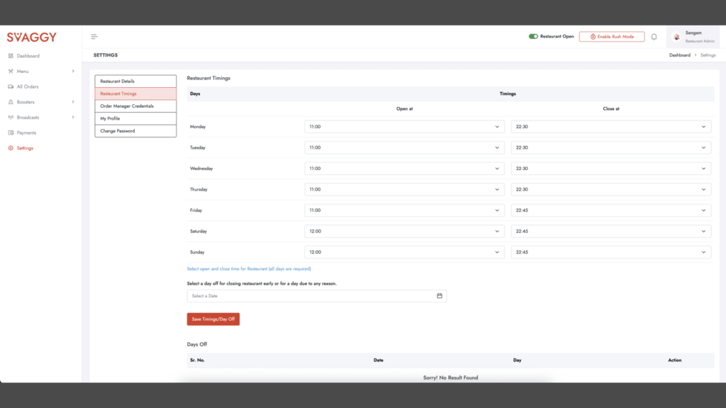
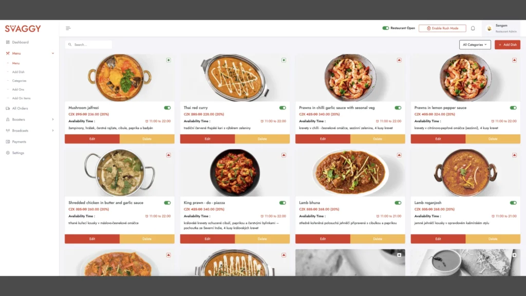
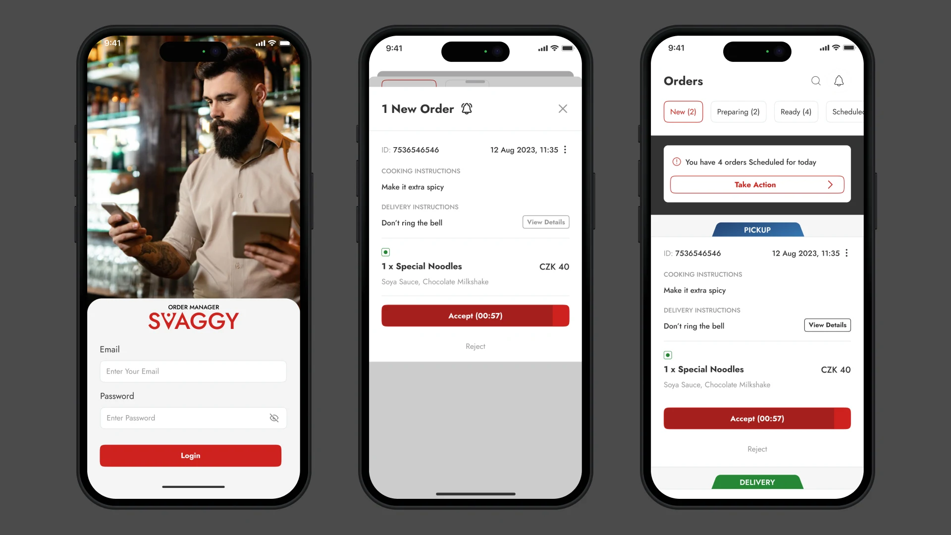
3. 🍽 Restaurant App/Web Dashboard
(aka, Where Orders Are Made or Broken)
Most restaurant dashboards resemble spreadsheets that have had babies with admin panels. We took a different route—visual, modular, intuitive.
🧾
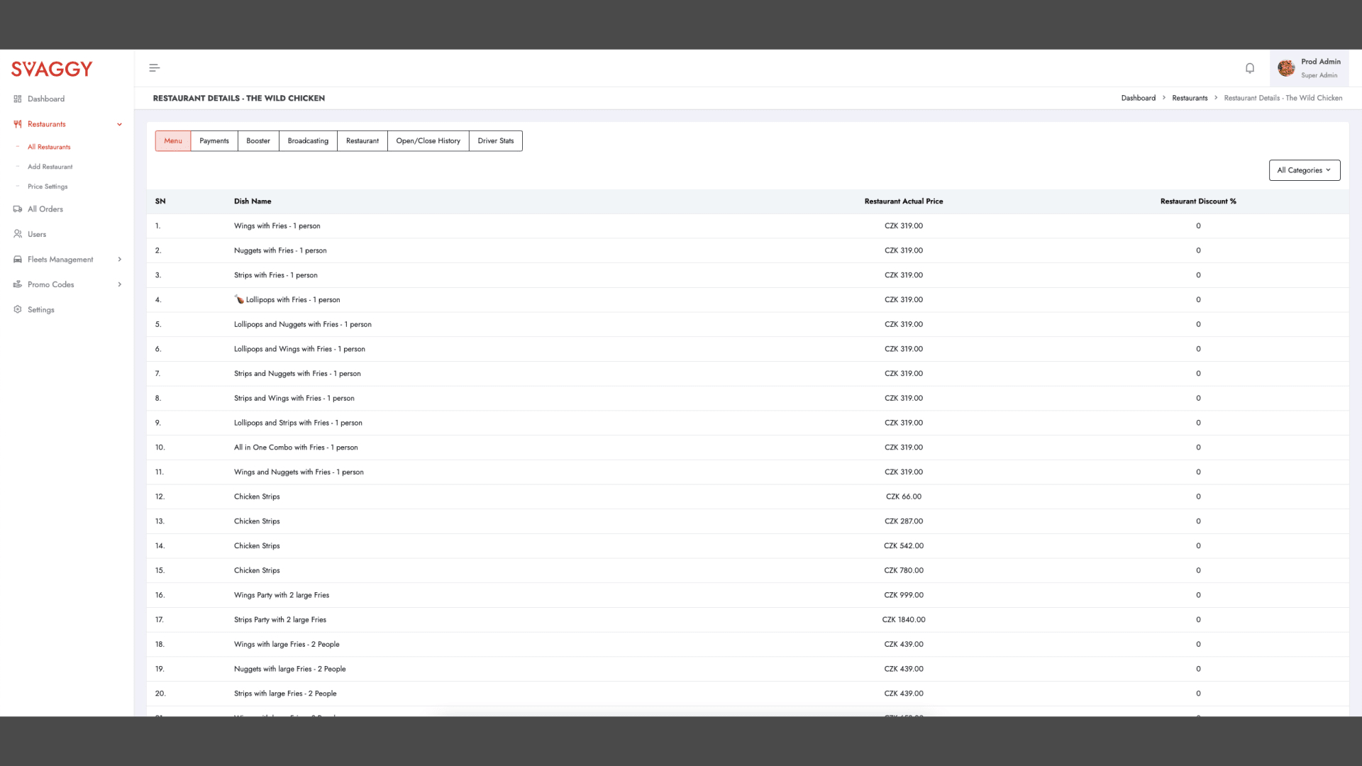
Visual Menu Editor
Drag-and-drop. Upload a dish image. Add variants. Highlight bestsellers. Done.
We ensured that restaurants could update menus without needing to call “someone from tech.” There’s even a “preview as customer” toggle to see how a dish will appear in-app.
📣
Promotions Scheduler
Would you like to offer a 15% discount during slow hours? Schedule it.
Want to push a new vegan dish every Thursday? Set it and forget it. Restaurants get analytics too—like which promo worked best and what time of day they sell the most garlic bread.
📦
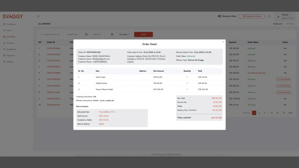
Real-Time Order Queue
Incoming orders are shown in a vertical timeline, color-coded by urgency. Staff can mark orders as “Cooking,” “Packed,” or “Waiting for Pickup.”
It’s fast. It’s clean. And, crucially, it syncs with the rider app to prevent confusion during pickup.
🍕
Svaggy Restaurant Android App
The Svaggy Restaurant Android App streamlines online orders and acts as a mobile POS, letting staff manage menus, track orders, and update statuses in real time. It’s fast, intuitive, and built to keep kitchen and delivery operations running smoothly.
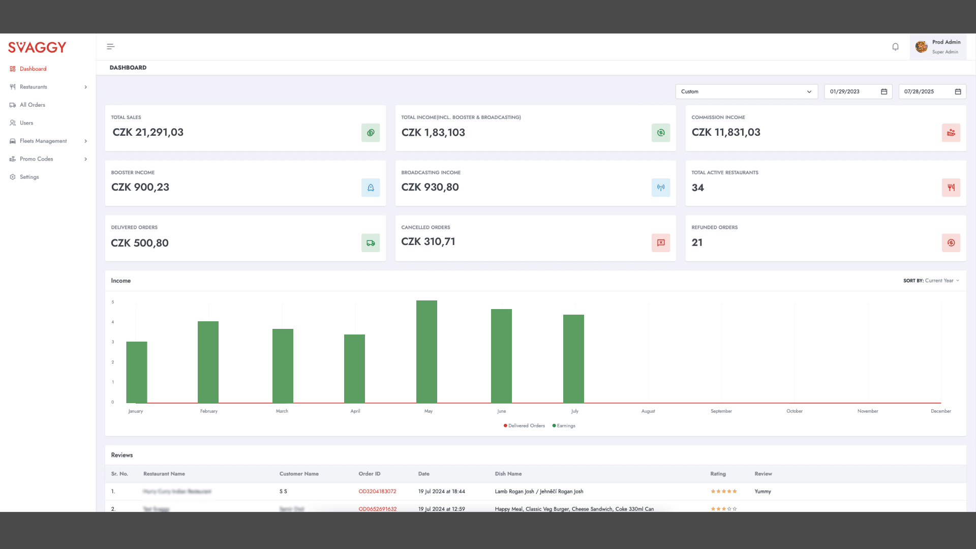
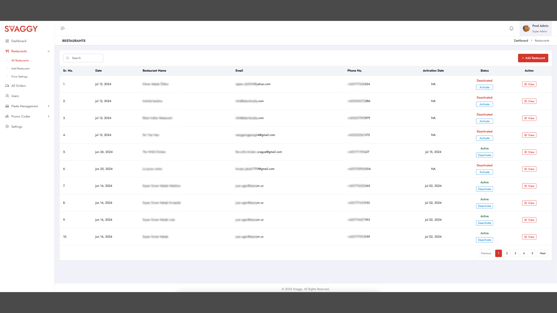
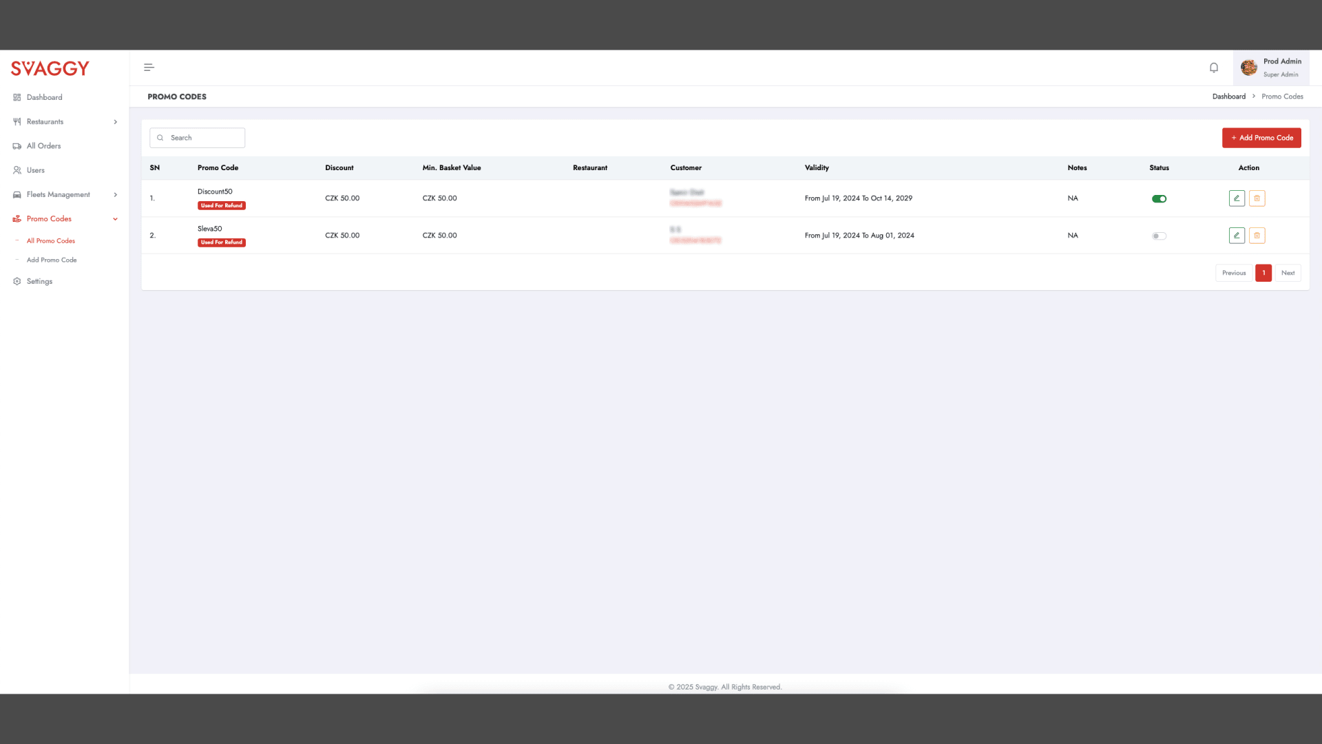
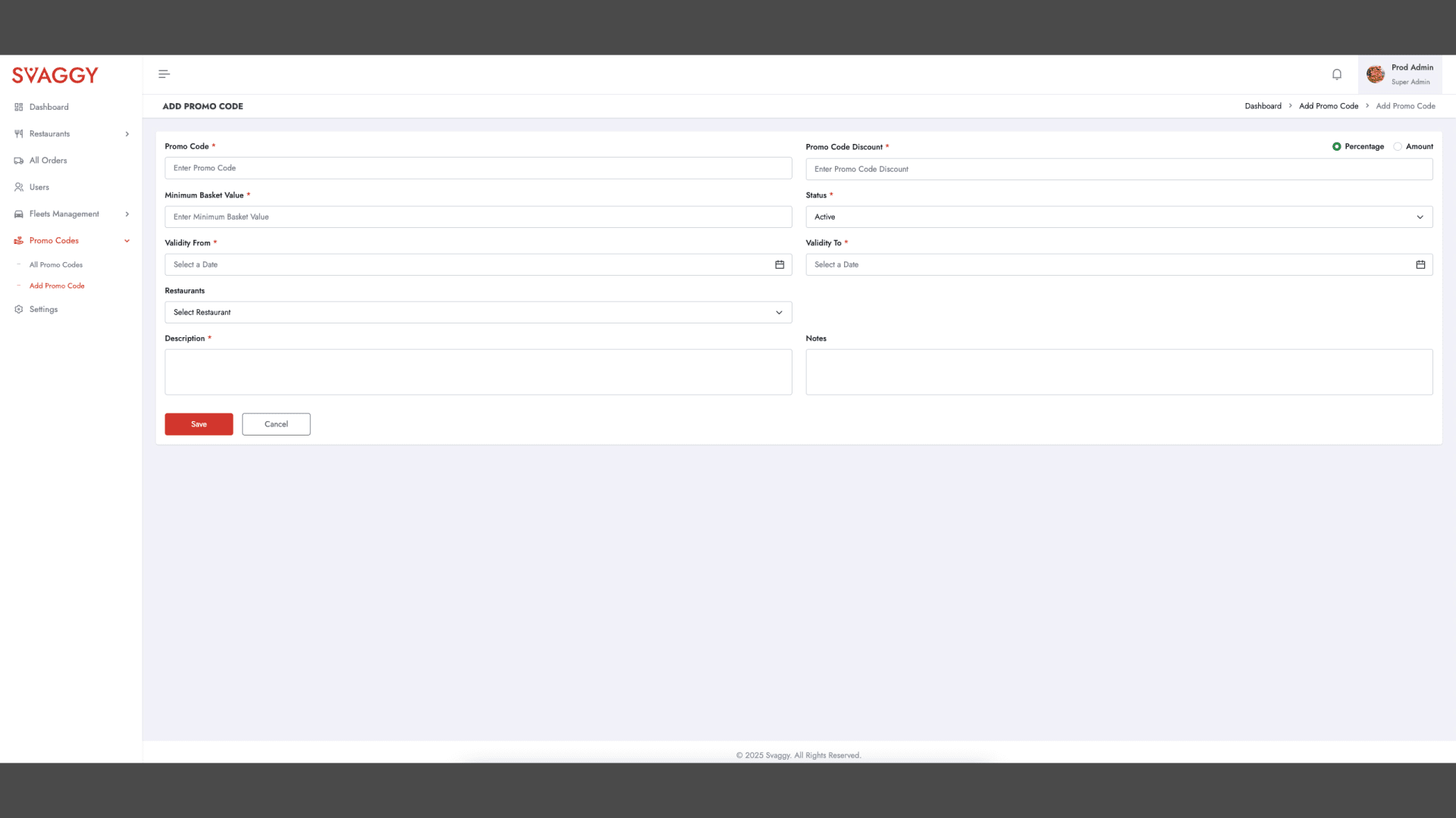
4. 🧠 Super Admin Dashboard
(aka, The Invisible Backbone)
End users rarely see this one. But without it, Svaggy wouldn’t be able to scale, monitor, or manage growth. It’s built for operations, finance, and support teams to handle chaos… gracefully.
🏢
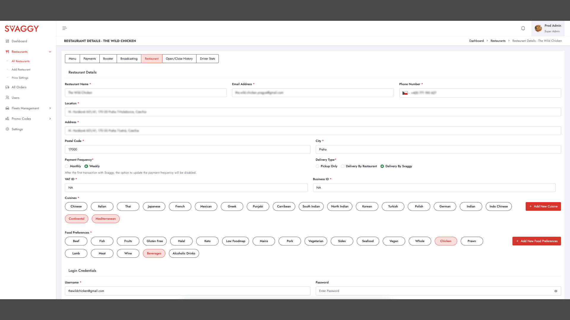
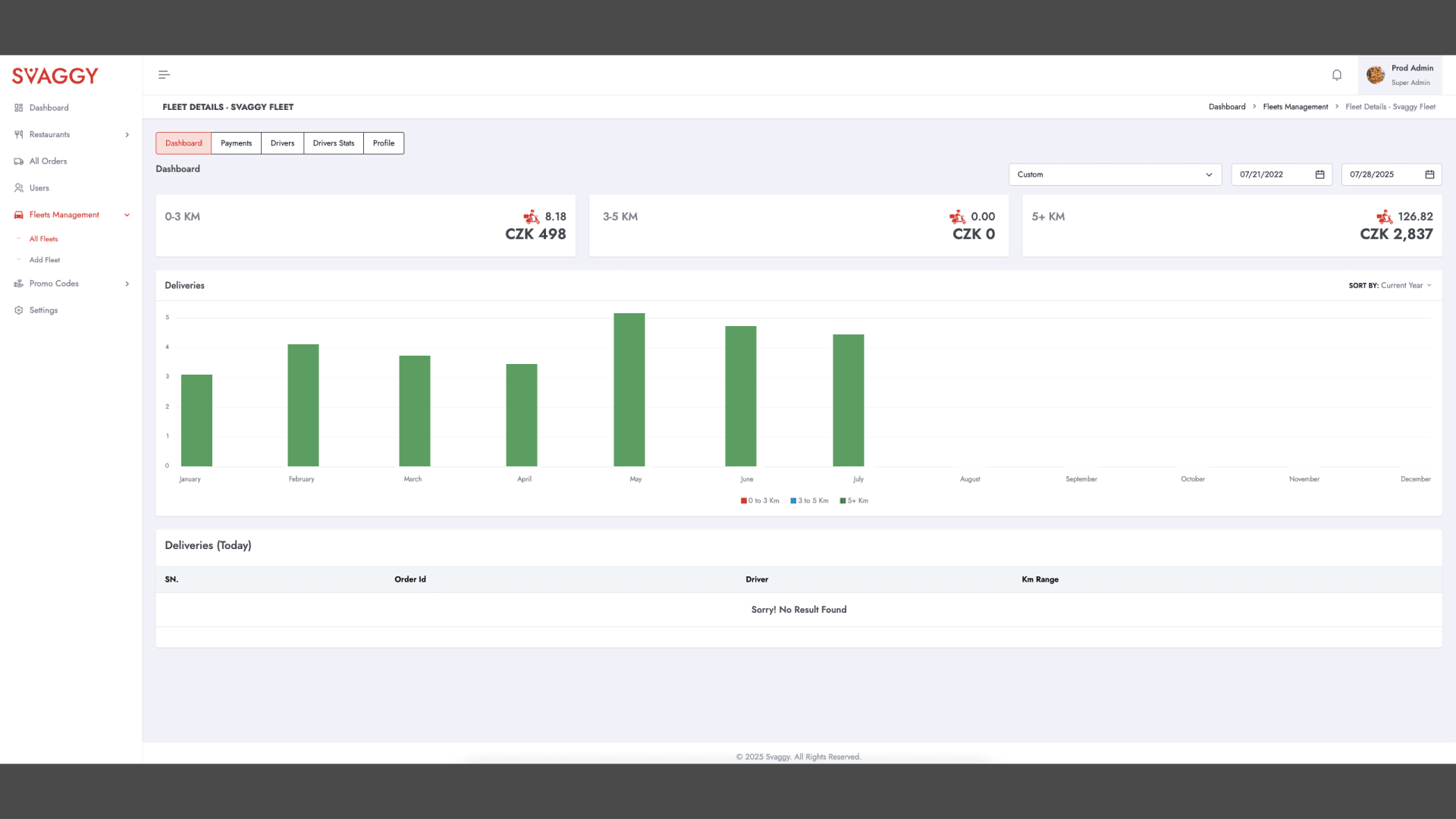
Multi-Restaurant View
Admins can switch between different restaurants, monitor live order volume, see onboarding progress, or flag underperforming outlets.
It’s like mission control—but prettier.
🧩
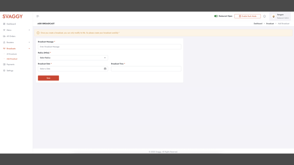
Feature Toggles
Want to test subscriptions in one district before rolling them out citywide? Flip a toggle.
Want to temporarily disable onboarding in a new region due to courier shortages? Done.
This modular control panel keeps Svaggy lean and flexible—even as it scales.
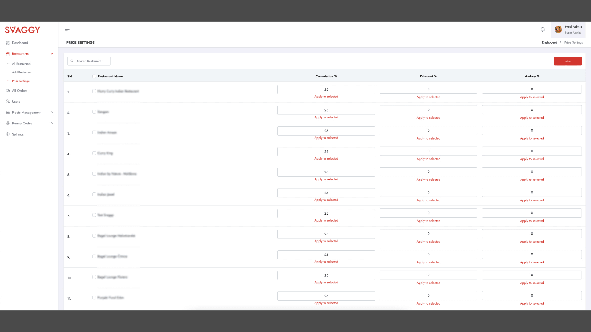
💸
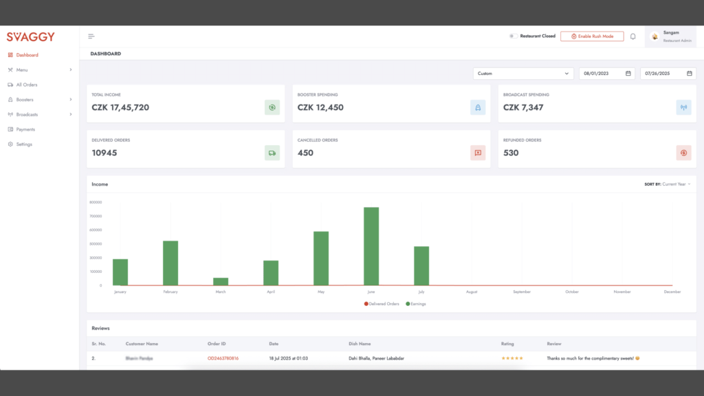
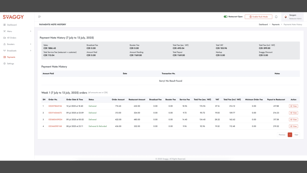
Finance Reports & Payout Logs
Every invoice. Every refund. Every partner commission. Exportable as CSVs or visible via sleek charts.
We also integrated payout delays and penalties (in case a restaurant repeatedly delays orders) with proper flags and automated warnings.
Thanks To Think 360 Studio – Our Dev Partner
Big ideas are only as good as the people who can bring them to life—and that’s where Think 360 Studio, stepped in like absolute legends.
While I may have spent sleepless nights obsessing over pixel-perfect layouts and microinteractions, it’s the developers at Think 360 who turned those static Figma frames into a breathing, functional, real-world product.
Using a solid tech stack—ReactJS for the frontend, NodeJS for the APIs, Bootstrap 5.0 for the www.svaggy.com website, Swift with Xcode for iOS, and Kotlin in Android Studio for Android—they stitched together a seamless experience across devices.
From integrating Firebase, Google Maps SDK, and payment gateways, to debugging edge cases I didn’t even know existed, they handled it all with grace (and only a few sarcastic Slack messages).
Honestly, a designer can dream all day—but without a dev team like Think 360, it’s just fancy art. So here’s to them—the real MVPs behind Svaggy’s heartbeat.