Tummly – Branding Case Study
Tummly aims to be an innovative, mobile-first solution that allows QSR operators to instantly hire chefs and other staff when someone is unexpectedly unavailable, even for same-day needs. This aligns well with current UK labor laws, which allow for short-term hires, and brings significant value to restaurant operations.

PROJECT OVERVIEW
ROLE
Product Designer
TIMELINE
Ongoing
PLATFORM
Mobile and Web App
FOCUS
Research and MVP product launch
CONTEXT AND PREMISE
Tummly is a UK-based hybrid SaaS + marketplace platform built for the Quick Service Restaurant industry. It brings together shift scheduling, vendor sourcing, compliance management, and operational analytics into one integrated, mobile-first system — replacing the patchwork of spreadsheets, WhatsApp threads, and disconnected tools that QSR operators currently rely on. I was brought in as the product designer at the very beginning — before a single screen existed. There was a vision, a business model, and a lot of ambition. No existing product. No design system. No validated flows. My job was to take a complex, multi-sided platform concept and translate it into something real, structured, and buildable.
THE PROBLEM
QSR operators are running high-pressure, fast-moving businesses with almost no purpose-built digital infrastructure. Shift gaps get filled over WhatsApp. Vendors get sourced through Google searches and word-of-mouth. Compliance logs are done on paper. The tools that do exist — scheduling apps, back-office platforms, hiring tools — are fragmented and don’t talk to each other. Tummly needed to solve for all of this in one product. The design challenge wasn’t just UI — it was making sense of an enormous scope, across multiple user roles, without a single reference point to build from.
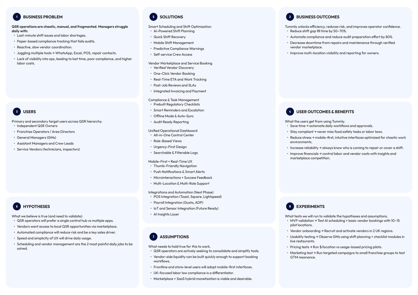
1. Research — building clarity from ambiguity
There was no existing product to reference and the client-provided materials were a starting point, not a blueprint. I audited the full QSR tech landscape — scheduling tools like 7shifts and Deputy, back-office platforms like Toast and CrunchTime, marketplace models like Upwork and ServiceTitan — cross-referencing them against Tummly’s specific context. I filtered through AI-generated guides, stakeholder briefs, and competitor flows, discarding what didn’t hold up and building my own understanding of what the product actually needed to do. The research wasn’t handed to me — it was figured out.
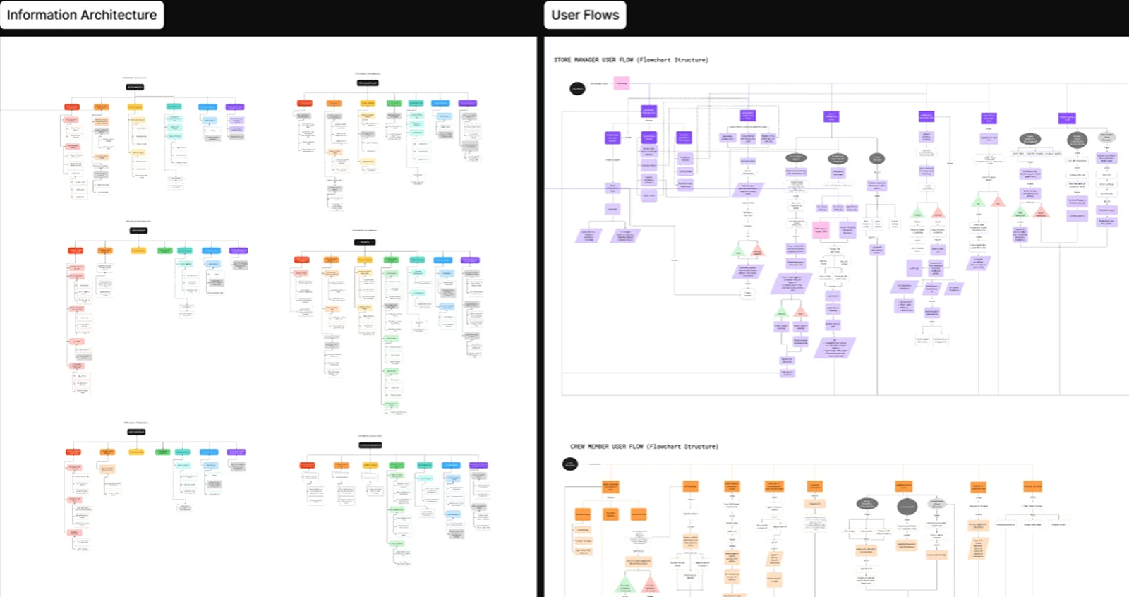
2. Information Architecture + User Flows
With no existing product to build from, the first step was defining the system itself. I mapped the complete information architecture along with role-based user flows — covering scheduling, vendor sourcing, compliance, and operations across multiple user types.
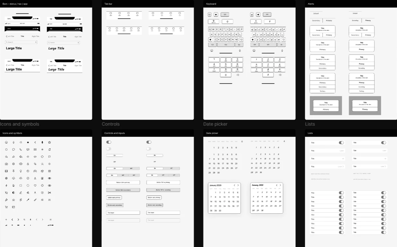
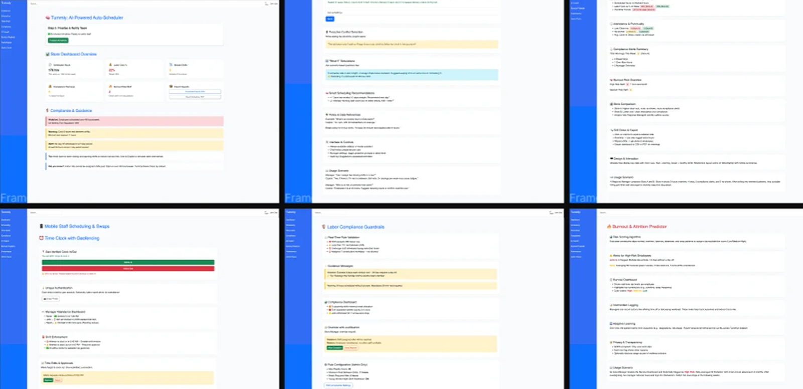
3. Design System
Before moving into screens, I built a design system to ensure consistency across mobile and web. Components, navigation patterns, and interaction behaviors were defined to support a scalable product.
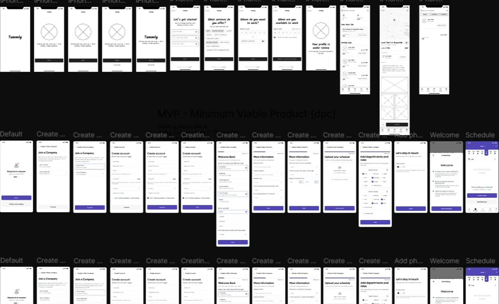
4. A mobile-first experience across two distinct user types (LOW FEDILITY)
Early mobile explorations focused on simplifying key actions like scheduling, job discovery, and shift management for different user types.
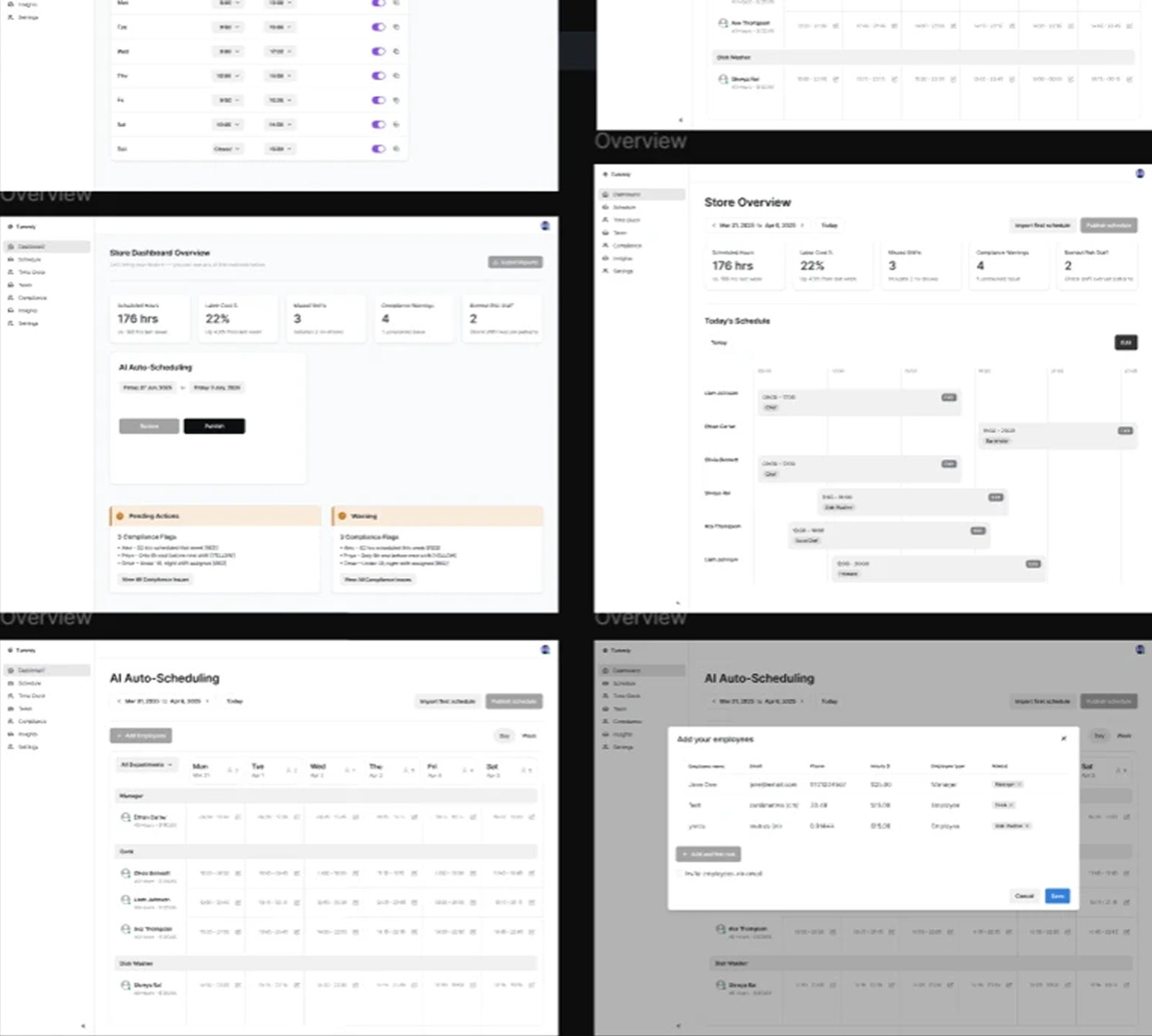
5. A web dashboard built for operational clarity(LOW FEDILITY)
The dashboard was structured to organize complex operational data into clear, actionable views.
6. MVP Design (Refined Direction)
The MVP translates validated flows and systems into more refined, component-based screens, preparing the product for development.