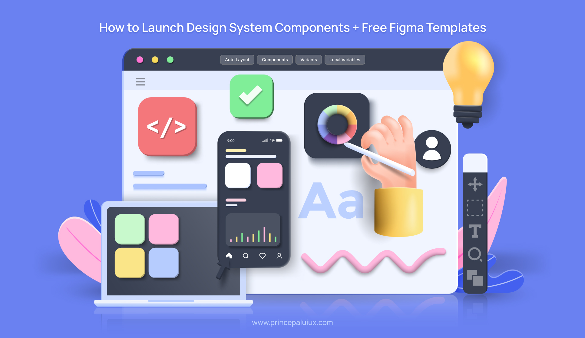
So, do you need to add a new component to your design system? Cool. But before you jump into Figma and start pushing pixels around, let’s talk about how to Launch Design System Components without creating a mess that designers and developers will curse you for later.
So here’s a no-BS, step-by-step guide on properly launching a design system component — from that first “we need an X component” moment to the official release in both design and code.
Step 1: Do Your Homework (No Skipping Allowed)
🧹 Audit Existing Components
Before you design anything, check if someone else in your company already built something similar. Different teams might have hacked together their versions of the same button, dropdown, or card. Find those, see what’s working, and determine why they exist.
📚 Research Best Practices
Don’t reinvent the wheel. Look at:
- How do other design systems (Material, Carbon, Atlassian) handle this component?
- What variants (sizes, states) do they support?
- How they name things (because “primary vs. secondary” is better than “big blue button vs. small blue button”).
✅ Study Accessibility & Behavior
A component isn’t just about looks—it’s about how it works.
- Keyboard navigation?
- Screen reader compatibility?
- Mobile vs. desktop interactions?
- Error states? Disabled states?
🗂️ List All Possible Variants & Properties
Think through every possible way this component could be used.
- Different sizes?
- Icons on left/right?
- Loading state?
- Light/dark mode?
- RTL (right-to-left language) support?
Then, decide which props need to be customizable vs. which should be locked down. (No, not every button needs 15 shades of purple.)
Step 2: Design the Bare Bones (No Fancy Stuff Yet)
🧪 Proof of Concept (POC) – Structure First
Skip the colors, shadows, and fancy animations for now. Focus on:
- Layout (How does it expand? How does content wrap?)
- Spacing & Alignment (Padding, margins, icon placement)
- Core Interactions (Hover, focus, active states)
💬 Get Feedback Early
- Talk to engineers—will this even work in code? Are there edge cases you missed?
- Run a design review with other teams—does this fit their needs?
- QA early—avoid last-minute “Oh, this breaks in Safari” surprises.
🧱 Start Simple: Base → Variants → Themes
- Base Component – The simplest, most neutral version.
- Variants – Different sizes, states, and configurations.
- Themes – Light/dark mode, brand-specific styles.
Step 3: Document Everything (Yes, Everything)
📖 Component Specs
- Props & Tokens (What can designers/devs tweak?)
- Usage Guidelines (When not to use this component)
- Accessibility Rules (Contrast ratios, keyboard nav, ARIA labels)
📖 Interaction & Motion
- How does it animate? (Micro-interactions matter.)
- How does it behave across platforms? (Mobile, desktop, tablet?)
- Does it support localization? (Different text lengths, RTL?)
🛠️ Another Round of Reviews
Before finalizing:
- Dev Review – “Can we build this?”
- Design Review – “Does this solve real problems?”
Step 4: Release & Iterate
✅ Launch in Design & Code at the Same Time
No “Figma is done, now wait 3 months for dev” nonsense. Sync the release.
✅ Gather Feedback & Prioritize Changes
- What’s breaking?
- What’s missing?
- What’s over-engineered?
Bonus Tips
⚙️ Designing the Component API (Without Overcomplicating Things)
One of the most important — and often overlooked — steps when building a design system component is API design.
Think of a component’s API as the toolkit developers and designers get to work with. It includes all the props, variants, and events they can use or customize. If you’re working in Figma, you see everything in the right-hand properties panel when you select a component instance.
Here’s the cool part: when the API is designed well, it becomes a shared language between design and development.
That’s precisely what made Blade (our design system) so effective — we focused on reducing misalignment by synchronizing the component APIs across design and code. So, if a prop exists in Figma, it directly maps to a React prop in the codebase. No guessing. No back-and-forth. Just smooth handoffs.
Of course, it’s tempting to expose many props and let users tweak everything. But more control isn’t always better. Too many options can lead to inconsistency, misuse, and styling chaos.
Instead, we aim for balance.
Here’s how the process works:
- Start by listing every possible variant and property the component might need — across use cases and platforms.
- Then, collaborate with engineers and designers to determine which props should be exposed and handled internally or abstracted away.
The goal? Make it powerful enough for flexibility but simple enough to ensure consistency.
Less guesswork, more harmony. ✨
💡 Internal Discussions: Where Ideas Start to Take Shape
Once you’ve got your proof of concept (POC) ready, it’s time to bring it to the table — and by that, we mean your design system team.
This stage concerns feedback, collaboration, and catching blind spots before things go too far. It usually breaks down into two key discussions:
1. 🧠 Design Discussion: Brainstorm & Review
This is your first real checkpoint.
Design system designers get together to review the POC and talk through:
- The component’s structure and how it’s put together
- Styling and alignment with your design language
- Props and whether they make sense
- The use cases the component is meant to cover
It’s part brainstorming and part review session, where much refining happens.
2. 🛠️ Engineering Discussion: Reality Check
Once the design review is wrapped up, it’s time to loop in the developers.
This isn’t a deep technical dive just yet — it’s more about sharing how the component works from a design standpoint and getting feedback on:
- Tech feasibility — Can it be built as designed?
- Edge cases — Are there scenarios that haven’t been considered yet?
- Implementation insights — Any constraints or suggestions from the dev side?
It’s a back-and-forth that helps both sides get aligned early. And the earlier that happens, the fewer surprises you’ll face later.
🔁 What Happens Next?
Once feedback from both design and engineering is in, the component gets refined — tweaks, updates, polish — and then it’s ready to be shared with a larger group for broader review.
This step is key. It’s where a solid idea starts turning into a production-ready component.
Biggest Mistake? Jumping Into Figma Too Early
It’s so tempting to start designing right away. But if you do, you’ll likely:
- Waste time on a solution that doesn’t fit real needs.
- There are missing edge cases that engineers will point out later.
- End up with inconsistent variants because you didn’t plan.
Instead:
- Define requirements first.
- Get cross-team buy-in.
- Build the simplest version that works.
- Test, document, then polish.
🎬 Motion Design: Bringing Components to Life
This is where the magic happens — motion design.
At this stage, we add UI animations to interactive components to make them feel responsive, intuitive, and delightful. While static components like badges or indicators might not need any motion, interactive components do — think accordions, dropdowns, tooltips, modals, etc.
We follow a well-defined motion system powered by design tokens, so animations stay consistent across the product.
Here’s what we focus on during this phase:
- State transitions — How the component animates from one state to another (e.g., open to closed, hover to active)
- Entry and exit animations — How the component appears or disappears from the screen
- Interaction patterns — How motion guides the user’s attention or reinforces feedback
Once the motion design is finalized, we document all the animation details and hand them off to developers so they can smoothly and accurately bring the same motion into production.
Motion might feel like a finishing touch, but it creates polished, user-friendly experiences.
🚀 Time to Go Live
I intentionally hold off releasing components in the Figma library until they’re ready for development. This avoids a common issue where designers start using a new component that hasn’t been built yet, forcing developers to create custom versions and breaking consistency.
The ideal launch happens when both design and development are perfectly aligned: the component is published in Figma and released in code simultaneously. But going live isn’t the end—once an element is out in the wild, real-world feedback starts rolling in.
New use cases or improvements are reviewed, prioritized, and updated as needed to keep the system evolving smoothly.
Free Figma Template & Other Resources
Rama shared a handy template to help structure your component creation:
👉 Get the Figma Template Here
Resources:-
- The Future of Digital: How Design Systems Lead the Way By Prince Pal
- How To Organize A Design System, by Saurav Rastogi
- How To Run A Component Sprint, by Brian Alfaro
- Component Sprint Figma Template, by Washington Post
- How To Organize 1250+ Design Screens in Figma (+ file examples), by RAT
- DoctoLib Design System Organization, by Jérôme Benoit Reveau
Final Thought
A design system is a system—not just a collection of pretty UI pieces. The more you plan upfront, the less you’ll hate yourself later.
Now, build something solid. 🚀