
Summary: In this article, I wrote a comprehensive guide on Information Architecture (IA) in a natural, casual, and human tone—stepping away from rigid, overly formal content.
I covered everything from defining IA and what makes it effective, to common pitfalls, how to build one from scratch, and ways to evaluate it using real user input.
Techniques such as card sorting and tree testing were explained in relatable language, albeit with imperfect clarity, mirroring how real people think and work.
Altogether, it’s a user-centered, genuinely helpful breakdown of IA that’s both informative and easy to connect with.
So… What Is Information Architecture Anyway?
“Good information architecture is invisible… until it isn’t.” — Probably everyone who’s ever gotten lost on a website.
Let’s start with the basics.
Information architecture—or IA if I want to sound official—is the way you organize and label all the stuff on your website, app, or product.
It’s not flashy. Most users will never “see” it directly. But they’ll feel it when it’s not working.
You know that moment when you’re just clicking around, totally lost? That’s usually a sign the IA is struggling.
A solid IA gives people a clear path to follow. It quietly supports the design and user experience, like the blueprint underneath the walls of a house.
Now, IA isn’t just one thing. It’s more like a bundle of related parts that work together. That includes:
- Navigation – how people move through the site
- Labels – how you name and frame information
- Search – how users try to locate something specific when they’re not clicking around
The goal? Pretty straightforward: help people find what they came for—whether it’s on a website, inside an app, or even in real-world spaces like a library or store.
So What Makes a “Good” IA?
That’s the million-dollar question. And while there’s no one-size-fits-all answer, there are a few practical principles that tend to hold up across the board:
1. Start with Your Users
Before you design anything, stop and ask: What do they need? What are they trying to do here? If you’re unsure, consult with them. Look at analytics. Ask support teams. Guessing is where bad IA begins.
2. Don’t Overload the Homepage
It’s tempting to cram everything on your homepage—like it’s a catch-all for every type of visitor. But here’s the thing: a lot of people may never even land there. They’ll come from Google, from a link, from an ad. So your deeper pages need to make sense on their own.
3. Search Isn’t a Shortcut
A search bar is helpful, sure. But it’s not a substitute for good structure. Most users try to navigate first—scrolling, scanning, clicking—before typing into search. If they’re jumping to search every time, it might be a red flag.
4. Label Things Clearly
Please—say what you mean. A “Contact Us” page shouldn’t be called “Chat with Us” unless it opens a chat. Be kind to the people visiting your site. Clarity over cleverness every time.
5. Design for Change
Websites evolve. Pages are added, products change, and teams reorganize. Your IA should be flexible enough to grow with you. Don’t lock yourself into a structure that’s impossible to adjust.
6. Keep Pages Digestible
When in doubt, simplify. Pages don’t need to be mini encyclopedias. If something’s getting long or overloaded, it’s probably a good idea to split it into smaller chunks.
Wait—What Does an Information Architect Do?
Here’s where things get a little fuzzy.
Information Architecture → The structure and organization of content.
Information Architect → The person (if there is one) who helps build that structure.
That said, not every team has a dedicated IA expert. And that’s okay. A lot of the time, the job ends up split between product designers, content strategists, developers, and PMs. Everyone contributes a piece.
In a way, we’re all information architects at some point—whether I mean to be or not.
How Do You Develop an Information Architecture?
Let’s be honest—building an IA isn’t exactly a quick or tidy job. It can feel overwhelming.
There are numerous moving parts. And the only real way to get it right? Start with your users.
Understand what they need, what they’re trying to find, and how they go about looking for it.
That sounds simple, but… It’s not.
Which is probably why so many websites (and even physical spaces, such as museums or office buildings) end up reflecting how the organization thinks things should be laid out, rather than how people use them.
So, where does it go wrong?
Honestly, most of the time it’s just that nobody bothered to talk to users. Or maybe they did once, ages ago, and kept guessing ever since.
Common IA Mistakes (That You Might Be Making Too)
- Weird content groupings – Stuff gets sorted into silos that make perfect sense internally, but confuse the average person. Additionally, there’s the notion that a piece of content should only exist in one place. Why? Users don’t think like that.
- Missing content – You click on a section expecting a proper page… and it’s just not there. That’s frustrating. It leaves users guessing or causes them to give up.
- Scattered subsites – Microsites or campaign pages that feel like they’re on a completely different planet. Integration matters more than you’d think.
- Over-reliance on search – Search is great, but it’s not a fix for bad navigation. People will try to browse first—if they’re forced to search every time, something’s broken.
“So many things can go wrong when creating a site’s information architecture. Often it turns into a political battleground between rival departments each seeking to have their area of responsibility highlighted at the highest level of the site.” – Paul Boag
Sound familiar?
Alright, So What’s the Process?
It’s not always linear, but here’s a pretty good starting point—call it a high-level map:
1. Identify Your Users’ Top Tasks
What are people trying to do on your site or app? Look at analytics. Talk to support and sales. Better yet, ask your users directly. You’ll probably get a long list at first, but don’t panic—you can prioritize later.
2. Audit Your Content
Think of IA like the branches of a tree, and your content as the leaves. Before you start rethinking the structure, you need to know what you already have. A good ol’ content audit helps you see the whole picture—what’s useful, what’s outdated, what’s missing.
3. Group and Label Content
Once you’ve got a handle on your content, start grouping it into categories that (hopefully) make sense. This is where card sorting comes in. You give users a stack of “cards” (each representing a content item), and ask them to group them in a way that feels logical. You might be surprised by the results.
4. Map Out Navigation
With your groups in place, you can start thinking about how users get from point A to B. This is where you build a sitemap—a basic diagram that shows how content is structured and connected. It helps you (and your team) see the bigger picture before diving into any actual design.
5. Test Early—and Often
Don’t wait until the site is fully built to test your IA. Seriously. Use card sorting in the early stages, and then try something called tree testing. It’s like a stripped-down version of your site—no visuals, just labels—and it shows how people move through your structure. Where they get stuck. What makes sense. What doesn’t?
There’s no perfect formula, but the sooner you involve users and the more you test your assumptions, the better your IA will hold up in the real world.
And if it’s still not perfect after launch? That’s okay, too. IA isn’t set in stone. It’s something you tweak, refine, and improve as your product—and your users—evolve.
How Do You Know If Your Information Architecture Is Working?
If you already have an IA in place (even a half-decent one), evaluating it is a smart move—especially if you’re planning a redesign or feel that something’s off.
Think of it this way: Are there pages users constantly miss? Do they click around aimlessly before they finally give up? If you never take a closer look at how your current structure is performing, how will you know if any changes you make later are improvements?
And really, this all starts with understanding what your users are trying to do and how your content fits into that.
How to Pinpoint What Matters to Your Users
You don’t need a crystal ball—you need to dig a little.
“Top tasks” are the things users come to your site to do most often. Not the fluff. Not the wish list. The real stuff.
Here’s how you can start figuring that out:
- Ask your internal teams – Talk to support, sales, and marketing. They’re on the front lines and probably already know what users are always asking for. Don’t be surprised if the list is very long.
- Loop in stakeholders – Yep, those folks. They usually have strong opinions. The goal here is to help trim down that lengthy list into something more manageable.
- Get users to vote – If possible, show your task list to actual users and let them select what’s most important. Doesn’t have to be fancy—a simple survey can do the trick.
- Prioritize – Once you’ve gathered the data, rank those tasks from highest to lowest priority. What can’t users live without? What’s just “nice to have”?
Tree Testing: Finding Out Where People Get Lost
Tree testing (also known as “reverse card sorting”) is a straightforward method for evaluating how easy—or not—it is for people to find information on your website.
You give them a basic text version of your navigation—no design, no buttons, no colors—and ask them to locate specific pieces of information. It’s surprisingly revealing.
Tree testing helps you spot things like:
- Are your labels clear to people who don’t work on your team?
- Do the categories you created make sense to anyone outside your bubble?
- Can people find what they’re looking for fast—or are they stumbling around?
It’s not glamorous. But it works.
Card Sorting: Understanding How People Think
Card sorting is like the brainstorming session of IA. You hand users a set of “cards” labeled with content items and ask them to group them in a way that makes the most sense to them.
It’s super helpful when:
- You’re designing a new site (or just cleaning up a messy one)
- You want to see how people expect info to be grouped
- You’re curious how users interpret different terms or concepts
- You want users to rank things based on what they care about
You’ll probably find that what makes sense to your team doesn’t always align with how users think. And that’s okay—that’s what this is for.
So yeah, evaluating IA isn’t about perfection. It’s about uncovering the small gaps and blind spots that cause people to drop off. And once you start seeing your site the way users do? That’s when everything clicks.
Top Information Architecture must-read books –
1. Information Architecture: For the Web and Beyond
Authors: Louis Rosenfeld, Peter Morville, and Jorge Arango
Often referred to as the “Polar Bear Book,” this seminal work offers comprehensive coverage of IA principles. It’s considered essential reading for anyone involved in designing user-friendly digital spaces.
The book explores the process of organizing and labeling websites, intranets, and software to enhance their usability and findability.
2. Don’t Make Me Think, Revisited: A Common Sense Approach to Web Usability
Author: Steve Krug
This classic on web usability emphasizes intuitive navigation and information design. Krug’s witty and straightforward approach makes complex concepts accessible, making it a favorite among designers and developers who aim to enhance the user experience.
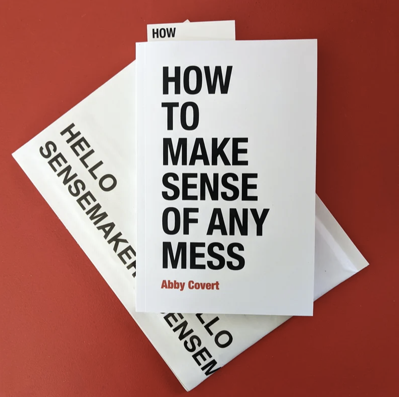
3. (Free) How to Make Sense of Any Mess: Information Architecture for Everybody
Author: Abby Covert
Covert’s book demystifies IA by presenting it as a problem-solving tool applicable beyond digital design. It’s praised for its clarity and practicality, making IA concepts accessible to a broad audience, regardless of their technical background.
These books are celebrated for their contributions to the field of Information Architecture and are valuable resources for both beginners and seasoned professionals.
In the end
Information architecture isn’t just a technical layer buried beneath your website—it’s the quiet guide behind every good user experience.
When it’s done well, users don’t notice it. They find what they need, without friction. But when it’s off, things fall apart fast.
The good news? IA doesn’t have to be perfect from the start. It just needs to be intentional, tested, and built around real people—your users.
Whether you’re mapping out a brand-new site or untangling a confusing one, start small, listen often, and keep adjusting.
Because great IA isn’t just a structure—it’s an ongoing conversation.