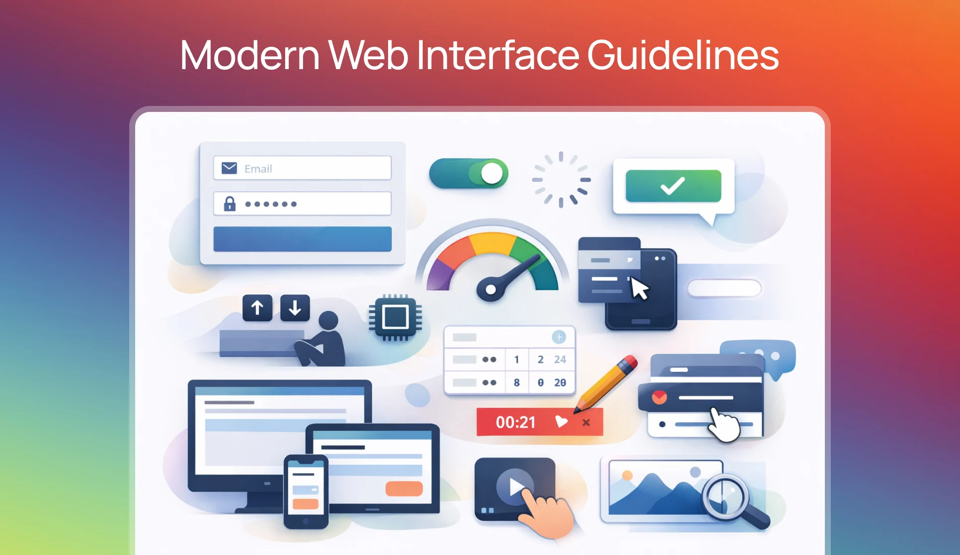
Introduction – Discover essential web interface guidelines covering interactivity, typography, motion, accessibility, performance, and design systems. A comprehensive reference of proven UX principles and technical best practices for building polished, user-friendly websites that feel effortless across all devices and user contexts.
Table of contents
- 🖱️ Interactivity: The Small Details That Are Felt, Not Seen
- 🅰 Typography: Legibility Is Earned, Not Assumed
- ♒︎ Motion: Animation as Communication, Not Decoration
- 👆 Touch: Designing for Fingers, Not Pointers
- 📈 Optimizations: Performance as a Design Decision
- ♿ Accessibility: Designing for Everyone Is Designing Better
- 🌀 Design: Thinking in Outcomes, Not Just Appearances
- 🌈 Color and Contrast: The Foundation of Visual Clarity
- ⏳ Loading States: Managing Perception While Managing Time
- Navigation: Finding Things Should Not Require Effort
- Forms: The Most Underestimated Touchpoint
- 📟 Color Scheme and Theme Preferences: Respecting the User’s Environment
- 🎛️ Content Strategy: What Is Said Matters As Much As How It Looks
- ⚡ Performance: Speed Is a Feature, Not a Metric
- Design Systems and Consistency: The Infrastructure of Trust
- Privacy and Trust: Designing for Confidence
Trust-First Interface Design for the Age of Automation
The article will serve as a behavioural foundation for building modern AI-powered interfaces, in which users interact not only with buttons but also with software decisions.
Clear input behaviour, predictable feedback, minimal motion, and accessible navigation will help users understand what the system is doing and why.
In AI products, uncertainty naturally exists because outcomes are generated rather than predefined, so consistency and responsiveness become the primary sources of trust.
By following these guidelines, designers and developers can reduce confusion, prevent accidental actions, and communicate system state without overwhelming users with explanations.
As a result, AI features will feel dependable rather than mysterious, fast rather than complex, and human-centered rather than automated — which is essential for adoption in modern intelligent applications.
🖱️ Interactivity: The Small Details That Are Felt, Not Seen
Interactivity is where the character of an interface is revealed. Users rarely articulate what makes something feel “right,” but they notice immediately when something feels off.
Labels and Inputs
When a label is clicked, the focus should automatically transfer to its associated input field. This behavior is expected by users; when it is absent, it creates a subtle sense of friction. Similarly, all input fields should be wrapped within a <form> element so that pressing Enter triggers submission — a behavior so deeply ingrained in users that its absence is disorienting.
Input Types
Fields designated for email addresses, passwords, or phone numbers should declare their type explicitly using the appropriate HTML type attribute. This enables browsers and devices to present the most suitable keyboard layout and autofill behavior. Spellcheck and autocomplete can also be suppressed on fields where they create noise rather than value.
Icons and decorative
Icons and decorative elements inside inputs should be positioned absolutely within the field using padding — not placed beside it. This keeps the input’s visual footprint clean while preserving clickability. When such decorative elements are purely visual in nature (glows, gradient overlays), pointer events should be disabled on them so they do not intercept clicks meant for the underlying element.
Toggles should act immediately.
When a toggle is toggled, the change should be applied immediately, without a confirmation dialog. Asking users to confirm a toggle removes the very intuitiveness that toggles are designed to provide.
Buttons
Buttons should be disabled after a form is submitted. This prevents duplicate network requests from being sent when a user clicks multiple times. It is a small detail with significant consequences for data integrity and user trust.
Dead areas between interactive elements should be eliminated.
In vertical or horizontal lists of clickable items, gaps between elements create uncertainty. Users should not have to hunt for a clickable zone. Increasing padding on each element so that the entire list area is interactive is a far more satisfying experience.
🅰 Typography: Legibility Is Earned, Not Assumed
Font smoothing should be applied.
Both -webkit-font-smoothing: antialiased and text-rendering: optimizeLegibility are widely supported properties that have been shown to improve on-screen text rendering. These are not optional polish — they are foundational to legibility.
Font subsetting is a trade-off between performance and precision.
Rather than loading an entire typeface, fonts should be subsetted to include only the characters and scripts that are actually used on the page. A page written in English does not need Cyrillic glyphs. A page using only numerals does not need the full alphabet.
Font weight should never change on hover or in a selected state.
When weight changes, the surrounding text shifts position — a phenomenon known as layout shift. This is visually jarring and entirely avoidable. Weights below 400 should be avoided entirely on screen, as they render poorly on most displays.
Headings at medium scale
(Such as section titles or card headers) are generally best rendered at a font weight between 500 and 600. Heavier weights at medium sizes tend to feel aggressive; lighter ones lose presence.
Fluid typography scaling
Fluid typography scaling is achieved through the use of CSS clamp(). A heading might be expressed as clamp(48px, 5vw, 72px), which allows it to scale naturally with the viewport while remaining bounded by sensible minimum and maximum values.
Tabular figures are a typographic feature that is frequently overlooked. When numbers are displayed in tables or in contexts where they change frequently (like timers or counters), font-variant-numeric: tabular-nums the rule should be applied. This ensures that each digit occupies the same horizontal space, preventing the text from shifting as values change.
On iOS, text can unexpectedly resize when the device is rotated to landscape orientation. This is suppressed by applying -webkit-text-size-adjust: 100%.
♒︎ Motion: Animation as Communication, Not Decoration
Animation plays a role in interfaces — but that role is frequently misunderstood. Motion should communicate meaning, not perform it.
Theme switching (dark mode to light mode, or vice versa) should not trigger transitions.
When a theme is changed, elements with transition rules applied will animate from their previous color to their new one. This creates a flash of color-change that feels like a bug rather than a feature. Transitions should be temporarily suppressed during theme changes.
Interaction animations should complete within 200ms.
Beyond this threshold, animations begin to feel like delays rather than feedback. Users are left waiting rather than feeling responded to.
Animation scale should be proportional to the size of the trigger.
A modal dialog should not scale in from zero to full size — it should fade in and scale from approximately 0.8, appearing to bloom into existence rather than pop abruptly into view. A button pressed by a finger should scale down to approximately 0.96, not 0.8 — a subtlety that feels physical and grounded.
Frequent, low-novelty interactions should not be animated.
A right-click context menu that appears dozens of times a day does not need an entrance animation. Adding items to a list, deleting entries, and triggering routine buttons are actions whose animation costs outweigh their value. Users do not want to watch the same animation repeatedly — they want the result.
Looping animations should be paused when off-screen.
Continuous animations running in background tabs or on invisible elements consume CPU and GPU resources unnecessarily. When an element is not visible, its animation should not be running.
Smooth scroll behavior
It should be applied to in-page anchor navigation via scroll-behavior: smooth, with an appropriate offset to prevent headings from being hidden beneath fixed headers.
👆 Touch: Designing for Fingers, Not Pointers
A website is increasingly likely to be experienced with a finger rather than a cursor. Touch introduces distinct considerations that mouse-first design often fails to account for.
Hover states should not be visible on touch press.
On many mobile devices, a brief hover state is triggered when a tap is detected before the click event fires. Unless explicitly scoped to pointer devices using @media (hover: hover), these hover styles will flash visibly on touch — a small but disorienting behavior.
Input font sizes must be at least 16px on touch devices.
iOS automatically zooms the viewport when a focused input has a font size smaller than 16px. This behavior is helpful in theory but disruptive in practice, and is best avoided by maintaining a minimum input font size.
Auto-focus should not be used on touch devices.
When an input is auto-focused, the soft keyboard opens immediately, consuming half the screen. On touch, focus should remain with the user’s intent.
Videos intended to auto-play on iOS
It must include both the muted playsinline attributes. Without these, iOS will not allow autoplay. This is a documented restriction that is frequently discovered too late in the development process.
Custom pan and zoom gestures
When implemented in components, you must disable the default touch-action behavior to prevent the browser’s native scrolling and pinch-zoom from interfering with the custom interaction.
iOS applies a default tap highlight to interactive elements
A semi-transparent gray flash on touch. This is suppressed with -webkit-tap-highlight-color: rgba(0,0,0,0). However, removing it without providing an alternative leaves users without any feedback on tap. A custom active state should always be supplied in its place.
📈 Optimizations: Performance as a Design Decision
Performance is not a purely technical concern. The speed at which an interface responds is perceived by users as a signal of quality, care, and respect for their time.
Large blur values
On filter and backdrop-filter are computationally expensive, particularly on mobile hardware. They should be used sparingly and tested across device classes.
Blurring and scaling filled rectangles
It produces banding artifacts. Radial gradients should be substituted where a blurred glow effect is desired, as they scale and blur without the same visual artifacts.
GPU acceleration
It can be selectively applied to elements with poorly performing animations using transform: translateZ(0). This is a last resort, not a default strategy — applying it indiscriminately can degrade performance by introducing unnecessary layers.
The will-change Property should be treated similarly
It is used temporarily and targeted, toggled on for the duration of a scroll animation, and removed afterward. Leaving will-change. Applying permanently can increase memory usage without benefit.
Auto-playing videos should be managed carefully on iOS.
Playing too many videos simultaneously has been observed to cause device slowdowns and crashes. Videos that scroll out of view should be paused or, when practical, unmounted entirely.
React’s render lifecycle can be bypassed
In real-time scenarios, by using refs to track values and commit changes to the DOM directly. For interactions like wheel events that fire at high frequency, this avoids the overhead of re-rendering the component tree on every event.
Hardware and network capabilities should be detected and adapted to.
High-end devices on fast connections warrant richer experiences. Low-end devices or constrained networks require simplified solutions. This adaptation demonstrates respect for the full spectrum of users.
♿ Accessibility: Designing for Everyone Is Designing Better
Accessibility is not a separate concern from design — it is a dimension of design quality. Interfaces built with accessibility in mind are generally clearer, more logical, and more usable for all users.
Disabled buttons should not have tooltips.
Disabled buttons are removed from the tab order and are never announced to keyboard users or screen readers. A tooltip on a disabled button will never be surfaced to the very users who most need to understand why the button cannot be pressed. The explanation should be surfaced through other means — inline text, for example.
Focus rings should be rendered using box-shadow, not outline.
As of recent browser versions, outline it does not consistently follow border radius, causing focus indicators to appear as rectangles even on rounded elements. An box-shadow implementation respects the element’s curvature.
Focusable elements in a sequential list
It should be navigable with the up and down arrow keys, not just Tab. They should also support deletion via ⌘ Backspace, following established interaction conventions for lists in native applications.
Dropdown menus
It triggered on mousedown rather than click open at the moment the mouse button is pressed rather than released. This creates a perception of immediacy that feels closer to a native application.
SVG favicons
It can be styled with a <style> tag that responds to prefers-color-scheme, automatically switching between light and dark variants without requiring separate files.
Icon-only buttons
It must include an aria-label. An icon without visible text provides no context to a screen reader. The aria-label attribute is the bridge between visual and non-visual communication.
Tooltips triggered by hover should not contain interactive content
It links, buttons, or other elements. Hover tooltips are transient and unreachable by touch users. Interactive content placed inside them becomes inaccessible.
<img> tags
Images should be rendered using <img> tags, not CSS backgrounds, for screen reader compatibility and to enable right-click saving behavior expected by users.
HTML illustrations
It was built from <div> and <span> elements should carry an aria-label on their containing element. Without this, the raw DOM structure may be read aloud to screen reader users in a fragmented and meaningless way.
Gradient text should revert to a solid color on ::selection the state.
When gradient text is selected, the highlight and the clipped gradient can produce illegible results. Unsetting the gradient on selection restores readable highlighted text.
Nested menus
It benefits from a “prediction cone” — an invisible triangular zone projected from the cursor’s current position toward the submenu. This prevents the menu from closing inadvertently when the user moves the pointer diagonally from a parent item to a child menu, a common source of frustration in dense navigation structures.
🌀 Design: Thinking in Outcomes, Not Just Appearances
Beyond code and implementation, certain design-level decisions shape how trustworthy and responsive an interface is perceived to be.
Optimistic UI updates
It dramatically improves perceived performance. When a user performs an action, the interface should reflect the change immediately — before the server confirms it. If the server returns an error, the change is rolled back, and the user is informed. This pattern is widely used in modern applications because it eliminates waiting.
Authentication
Authentication redirects should happen on the server before the client loads any content. Client-side redirects cause a brief flash of the unauthorized page before navigation occurs. This is visually jarring and can expose content that should be protected.
The selection state
It deserves intentional styling. The ::selection pseudo-element should be styled to align with the interface’s visual language, rather than defaulting to the browser’s blue highlight on every background color.
Feedback should be contextual.
A successful copy action is best communicated by a temporary checkmark appearing inline near the copy button — not a notification that floats in from the corner of the screen. A form error is best communicated by highlighting the relevant field — not by presenting a generic error message at the top.
Empty states should invite action.
When a list has no items, the empty state should explain what the list is for, suggest ways to populate it, and ideally offer a starter template. Empty states that simply say “Nothing here yet” have been observed to increase user confusion and reduce activation rates.
🌈 Color and Contrast: The Foundation of Visual Clarity
Color is one of the most powerful tools available to an interface designer — and one of the most frequently misused. When color is applied without regard for contrast, a significant portion of users is silently excluded from the experience.
A minimum contrast ratio of 4.5:1 should be maintained between body text and its background.
This threshold is defined by the Web Content Accessibility Guidelines (WCAG) and corresponds to the level of vision loss experienced by someone with approximately 20/40 vision. For larger text (18pt or 14pt bold), the minimum is relaxed to 3:1. These are floors, not aspirations.
Color should never be the sole means of communicating information.
When a form field is marked as required by turning its label red, users with color vision deficiency may have no way of distinguishing required from optional fields. A text label, icon, or asterisk should accompany any color-based signal. This is not only a usability concern; it is also a legal requirement in many jurisdictions under the ADA and similar accessibility laws.
Problematic color combinations are widely known and should be avoided.
Red and green, for instance, are indistinguishable for a significant portion of the population — approximately 8% of men. Pure black text on pure white backgrounds, while seemingly safe, can cause eye strain over long reading sessions. An off-white background with near-black text is often more comfortable for extended reading.
Interactive states
When it hovers, focuses, and is active, it must also meet contrast thresholds. A button that passes contrast in its default state but fades to an unreadable tone on hover has broken its promise at the moment it is most needed. All states should be tested, not just the resting one.
Opacity and gradient overlays silently degrade contrast.
A semi-transparent overlay placed over a background image may render underlying text technically compliant in a tool, but visually inadequate across the range of images it overlays. Testing should account for the weakest-case combination, not the average.
Dark mode must be designed, not merely inverted.
Simply swapping light and dark values produces poor results — colors that work in light contexts often become harsh or unreadable in dark ones. Both themes deserve independent design decisions, particularly for interactive elements, shadows, and text contrast.
⏳ Loading States: Managing Perception While Managing Time
What a user sees while they wait is as important as what they see when content arrives. Loading states are not a technical afterthought — they are part of the experience.
Skeleton screens should be used instead of spinners for content-heavy pages.
A skeleton screen — a wireframe-like placeholder that mirrors the structure of the incoming content — has been shown to reduce perceived waiting time and improve user satisfaction. It gives users a sense of what is coming, which turns waiting into anticipation.
Skeleton screens should not be used for all loading situations.
Toast notifications, dropdown menus, modal dialogs, and small inline loaders do not benefit from skeletons. These components should use simpler loading indicators or appear without a loading state when content is expected to arrive quickly.
A shimmer or pulse animation should be applied to skeleton elements.
A gentle, slow animation — either a shimmer that sweeps across the placeholder or a quiet pulse — signals that the page is alive and working. A static skeleton can look like a broken layout. The animation is not decoration; it is communication.
Progress indicators should replace skeletons when an operation takes longer than two seconds.
When a process takes seconds or minutes, a determinate progress bar indicates its progress and helps users decide whether to wait or return later. Where exact duration cannot be determined, a general message such as “This may take a few minutes” sets appropriate expectations without making promises that cannot be kept.
A screen reader should be notified when content is loading and when it finishes.
Users who cannot see visual loading indicators are left with no indication that anything is happening. ARIA live regions allow loading states to be announced audibly.
Lazy loading should be applied to images and content outside the initial viewport.
Loading everything at once is rarely necessary and often harms performance. The Intersection Observer API is a well-supported, performant mechanism for triggering loads as elements enter view.
Navigation: Finding Things Should Not Require Effort
Navigation is the interface’s promise to its users: that they will not get lost. When navigation is clear, users explore freely. When it is ambiguous or inconsistent, users bounce.
Main navigation should be limited to five to eight items.
Beyond this range, users begin to scan rather than read, and the site’s hierarchy becomes unclear. Items that cannot be surfaced at the top level should be organized into logical secondary navigation, dropdowns, or a search function.
Navigation labels should be descriptive, not clever.
A label like “Explore” tells a user nothing. “Products,” “Resources,” or “Case Studies” tell them exactly where they are going. Clarity should be prioritized over personality in navigation, even when personality is appropriate elsewhere in the interface.
Breadcrumbs should be provided on pages more than one level deep.
They orient the user, communicate the site’s hierarchy, and provide a quick path back up the tree — all without requiring a return to the main navigation. They are especially valuable on content-dense sites.
A “Skip to content” link should be available at the top of every page.
This is a standard accessibility pattern that allows keyboard users and screen reader users to bypass repeated navigation elements and jump directly to the page’s main content. It is typically hidden visually but present in the DOM, and should become visible on focus.
Sticky navigation
Navigation that remains visible as the user scrolls — improves wayfinding on long pages, but must be implemented with care. A sticky header that is too large consumes too much of the viewport on small screens. Its height should be proportional, and it should ideally shrink on scroll.
Active navigation states must be visually distinct.
Users need to know where they are in relation to where they could be. An underline, a color shift, a background fill — whatever convention is chosen, it should be immediately legible and consistent across the site. Relying on color alone to signal an active state fails the users who cannot perceive that color distinction.
Search should be offered on any site with more than a few dozen pages.
Users who know what they are looking for should not be required to navigate to it — they should be able to name it. Search should be fast, fault-tolerant to minor typos, and surfaced prominently.
Forms: The Most Underestimated Touchpoint
Forms are where user intent becomes action. They are also where abandonment occurs most frequently in the user journey. The friction embedded in a poorly designed form is directly measurable in lost conversions.
Forms should ask only for what is strictly necessary.
Research has consistently found that the average checkout or sign-up form contains more fields than users are willing to complete. Each additional field is a barrier. Fields that are optional should be clearly marked as such — or removed entirely.
Inline validation should be used instead of end-of-form validation.
When an error is surfaced only after the user submits the form, they must scroll back to find it and re-enter data they may have already filled in. When validation occurs in real time — as the user completes each field — errors are caught early, corrected immediately, and rarely repeated.
Error messages must explain what went wrong and how to fix it.
“Invalid input” is not an error message. “Please enter a valid email address.” Error messages should be specific, placed in proximity to the field they concern, and written in plain language. They should also be accompanied by a non-color cue—an icon, a border change, or a text label—to ensure visibility for users with color vision impairments.
Form fields should have sensible defaults wherever possible.
A country selector that defaults to the most likely selection, a date picker that opens to today’s date, a phone field that pre-fills the likely country code — these small assistances reduce the cognitive load placed on users and speed up form completion.
Multi-step forms should show a progress indicator.
When a form spans multiple screens, users should know how many steps remain. “Step 2 of 4” is not glamorous, but it is enormously effective at reducing abandonment. Users are far more likely to complete a process if they can see the end.
Autofill should be enabled wherever it is appropriate.
Browsers have invested heavily in autofill prediction. Fighting that investment by disabling it on address, name, and payment fields adds friction for users who have come to depend on it. The autocomplete attribute should be used to give browsers accurate hints about a field’s purpose.
📟 Color Scheme and Theme Preferences: Respecting the User’s Environment
Users do not experience a website in a vacuum. They experience it within the context of their device settings, their environment, and their personal preferences. Designing with this in mind produces interfaces that feel considerate rather than imposed.
System dark mode preference should be respected by default.
The prefers-color-scheme Media queries are widely supported and enable an interface to adapt to the user’s OS-level settings. Ignoring it forces users to choose between their system preference and a comfortable viewing experience on your site.
A manual theme toggle should be provided.
Not all users set their system preferences, and not all users want the same theme for all contexts. A clearly accessible toggle lets users override the system default when needed. The preference should be remembered across sessions.
OLED screens benefit meaningfully from true dark mode.
On OLED displays, black pixels are fully powered down rather than illuminated to a dark shade. True dark backgrounds (near #000000 rather than #1a1a1a) can extend battery life on mobile devices. This consideration is particularly relevant for media-heavy or always-on applications.
prefers-reduced-motion should be respected.
Some users — those with vestibular disorders, motion sensitivity, or simply personal preference — have elected to reduce motion at the system level. This signal should be honored. Animations that are purely aesthetic should be suppressed entirely. Functional animations may be replaced with simpler, non-motion alternatives such as opacity changes.
Color contrast should be tested independently in both light and dark themes.
A design that passes contrast checks in light mode may fail in dark mode, particularly for elements like secondary text, placeholder text in inputs, or border colors. Both themes must be validated separately.
🎛️ Content Strategy: What Is Said Matters As Much As How It Looks
Interface design is inseparable from the words that appear within it. Microcopy — the small, utilitarian text that guides users through actions — shapes the experience as profoundly as any visual decision.
Button labels should describe the action that will occur, not simply confirm it.
“Submit” is ambiguous. “Send Message,” “Create Account,” or “Download Report” tells the user exactly what clicking the button will do. This specificity reduces hesitation and increases trust.
Placeholder text should not be used as a substitute for labels.
Placeholder text disappears the moment a user begins typing, leaving them without any reminder of what the field was supposed to contain. Labels should always be persistent — positioned above the input, not inside it.
Error and empty states should be written with humanity.
A 404 page that says “Page Not Found” has communicated the failure accurately but unhelpfully. A 404 page that acknowledges the confusion, suggests alternatives, and offers a path forward has turned a failure into a recoverable moment. The same principle applies to empty states, failed searches, and loading errors.
Confirmation dialogs should be reserved for irreversible actions.
A dialog that asks “Are you sure?” every time a user performs an action trains users to click through without reading. Confirmation should be reserved for deletions, purchases, and other actions that cannot be undone. For reversible actions, an undo option is almost always a better experience than a confirmation prompt.
Onboarding copy should be concise and task-oriented.
New users do not want to read about what the product can do — they want to experience it. Onboarding flows that surface functionality through doing rather than describing it result in higher activation and better retention. The first action a user is guided to take should produce a meaningful result.
⚡ Performance: Speed Is a Feature, Not a Metric
Page speed is not a back-end concern left to engineers. It is a design quality that every user feels on every visit. Research has shown that even a one-second increase in load time is associated with measurable declines in engagement and conversion rates.
Core Web Vitals should be targeted for all major page types.
As of 2024, Google’s Core Web Vitals — Largest Contentful Paint (LCP), Interaction to Next Paint (INP), and Cumulative Layout Shift (CLS) — represent the most widely recognized framework for measuring perceived performance. LCP should be under 2.5 seconds, INP under 200 milliseconds, and CLS under 0.1 at the 75th percentile across real user sessions.
Images should be delivered in next-generation formats.
WebP and AVIF deliver comparable visual quality to JPEG and PNG at significantly smaller file sizes. Where browser support allows, these formats should be preferred. The <picture> element makes it straightforward to serve different formats to different browsers with a single markup pattern.
Third-party scripts should be audited ruthlessly.
Analytics tags, chat widgets, advertising pixels, and social sharing buttons — each of these introduces external dependencies that can block rendering, consume bandwidth, and introduce failure points beyond the team’s control. Every third-party script should be justified, delayed where possible, and removed when not essential.
Layout shift should be actively prevented.
Cumulative Layout Shift — the tendency of page elements to move unexpectedly as content loads — is experienced by users as instability. Image dimensions should be declared in HTML so that space is reserved before the image loads. Font loading strategies should be chosen to prevent text from shifting when web fonts arrive. Ad slots should have reserved dimensions.
Fonts should be loaded using font-display: swap
Or (optional, where appropriate) to ensure that the text is visible even before the custom font has finished loading. Invisible text that appears only once the font has loaded creates a frustrating blank reading experience, particularly on slow connections.
A Content Delivery Network (CDN) should be used for static assets.
Serving images, scripts, and stylesheets from a CDN places those assets physically closer to the user making the request. Latency is reduced, and performance improves across all geographic regions.
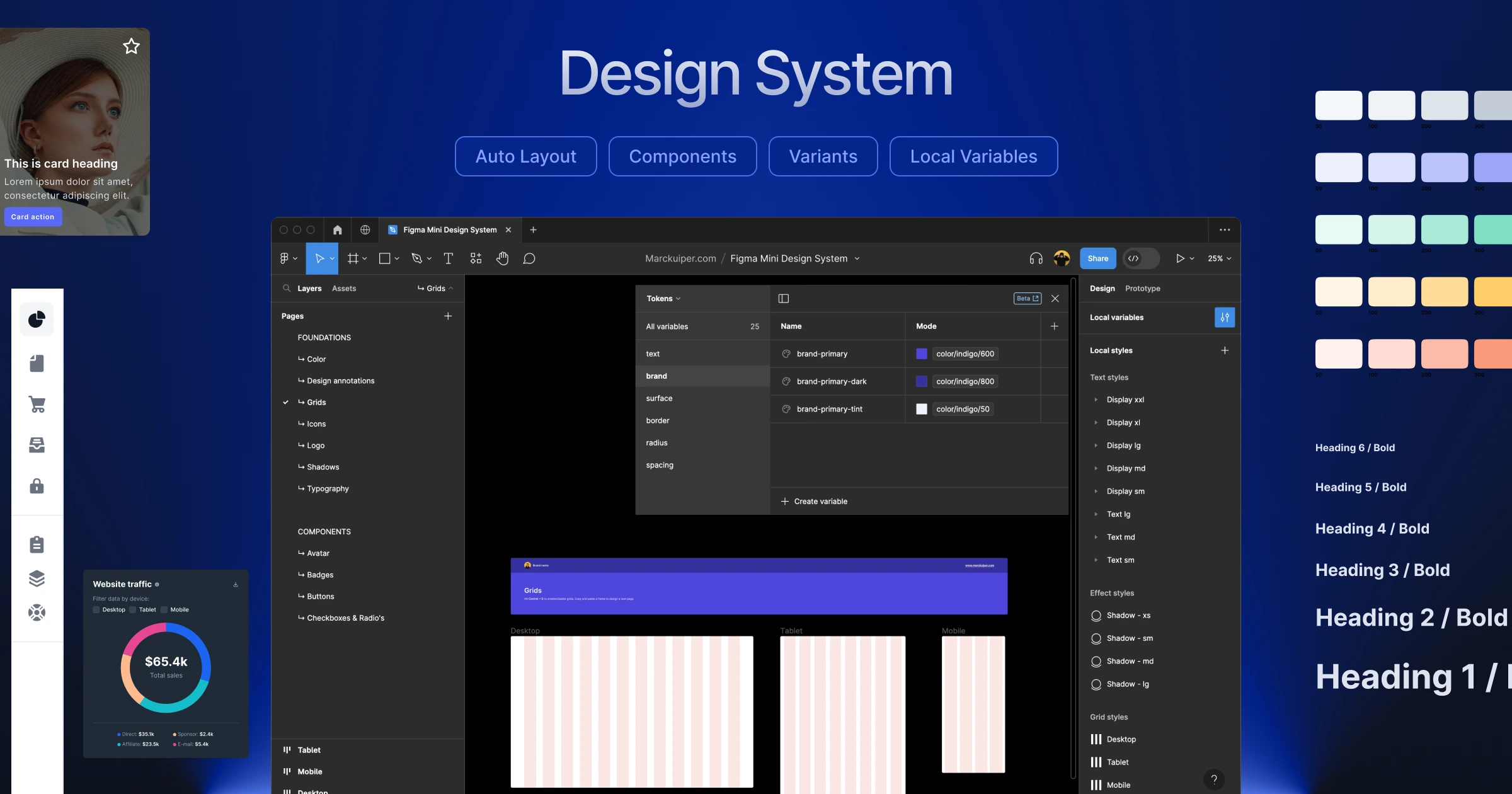
Design Systems and Consistency: The Infrastructure of Trust
Consistency is not a stylistic preference — it is a functional requirement. When buttons look different across pages, when spacing varies unpredictably, and when the same action produces different visual results depending on context, users lose confidence in the product.
A design system should be treated as a living product, not a static document.
A design system is only as valuable as its adoption. When components drift from the system over time — due to shortcuts, urgency, or lack of governance — the system becomes a reference document that no one references. Regular audits, clear contribution processes, and version control keep a design system useful.
Reusable components should be defined for every repeated UI pattern.
A button should have one definition. A card should have one definition. A form field should have one definition. Variations are introduced through explicit props or modifiers — not through ad hoc overrides in local stylesheets. This discipline makes the interface predictable to users and maintainable by developers.
Design tokens should be used to connect design decisions to implementation.
Color values, spacing scales, type scales, and animation durations should not be duplicated across stylesheets and design files. A shared token system — where a color like “brand primary” maps to a single hexadecimal value that is referenced everywhere — ensures that a single change propagates correctly across the entire product.
Spacing should follow a consistent scale.
An 8-point grid — where all spacing values are multiples of 8 — has been widely adopted because it produces harmonious layouts on screens with varying pixel densities. Whether 4-point, 8-point, or another base unit is chosen, consistency within that system matters more than which system is chosen.
Design and development should share the same language.
When a designer names a component “Card — Featured” and a developer names the corresponding component “FeaturedItem,” friction is introduced at every handoff. A shared naming convention for components, states, and variants reduces miscommunication and accelerates development.
Privacy and Trust: Designing for Confidence
Users constantly make micro-assessments of a productis trustworthiness. These assessments are made quickly, often unconsciously, and are influenced by design decisions as much as by policy language.
Consent flows should be honest and specific.
Cookie banners and permission prompts that use dark patterns — large “Accept All” buttons paired with hidden “Manage Preferences” links, pre-checked marketing consent checkboxes, deliberately unclear language — may achieve short-term compliance rates but undermine long-term trust. Users who feel manipulated do not return.
Data collection should be minimized by design.
The most trustworthy signal a product can send is that it collects only what it genuinely needs. Forms that ask for a phone number when none is required, analytics setups that track behavior that will never be analyzed — these add up to a posture of overreach that users increasingly recognize.
Security signals should be surfaced when vulnerabilities arise.
When a user is asked to enter payment information or create a password, brief trust signals — a lock icon, a note about encryption, a clear data handling summary — provide reassurance at exactly the moment it is needed. These signals cost nothing to implement and have been shown to improve conversion on sensitive forms.
Transparent error attribution builds trust.
When an operation fails, the interface should be honest about why. “Something went wrong” deflects responsibility. “We couldn’t connect to the server — your changes have been saved locally and will sync when you’re back online” is honest, specific, and reassuring. Users tolerate errors; they do not tolerate being told nothing.
Closing Thoughts
A great web interface is rarely the product of a single well-made decision. It is the cumulative result of dozens of small decisions, each carefully considered and resolved with the user in mind.
The guidelines presented here have been observed, tested, and refined by many designers and engineers. None of them is arbitrary.
What distinguishes interfaces that feel effortless from those that feel labored is precisely this kind of attention — applied consistently, across every layer of the experience.
When a button responds exactly as expected, when text scales gracefully, when a touch interaction feels physical, when a screen reader user encounters a coherent and navigable page — these outcomes are not accidents. They are the product of intentional craft.
The details matter. They always have.