category: Branding
How To Easily Create Visual Brand Identity? A Step By Step Guide.

Posted by: Prince Pal Singh | Posted date: 28-September-2021

What is brand identity? It is the most critical part of creating a brand and building a business. Your brand identity is an extension of your core values. It manifests the values, goals, and mission of your business. And with all the competition you face, having customers remember your brand is key when growing your business. This will help to establish your customer’s memory structure around your brand.
Chapter 1. Do you communicate clearly and consistently? 6 questions that might give you the answer.
Chapter 2. How To Easily Create Visual Brand Identity? A Step By Step Guide.
Chapter 1
"It's not what you say; it's how you say it." (… More people getting flashbacks to their teens?) This also applies to a very high degree when it comes to visual communication. All brands are measured, evaluated, and identified based on what they say, what they do, what others say about them, and - not least - how they look. No matter how good your message is, if it is conveyed in an inappropriate way, few or no one will be engaged by it.
☟Before start see this video to understand the difference between Brand Strategy and Design.
01 - Do you have a consistent visual voice?
Everyone who has a message to convey needs a visual identity. Your visual identity is the external face of your business. It's about giving a good first impression, about creating credibility, and about being recognizable. But a visual identity is more than a nice logo and a color palette. It is also the way you communicate. One might say that your visual profile is your "visual voice".
The elements in a visual profile can vary in both number and types, and have different functions, but the most basic are usually a logo, color palette, typography, image style, graphic elements, and illustrations. Together, they create an overall impression of your business or product. It ensures uniqueness, that all communication appears clear and credible, and evokes associations that are relevant and relevant to the target group.
Ask yourself; Is your visual voice consistent, clear, and recognizable in all channels? Your website, social media, marketing materials, online store, store, office, newsletter, and anywhere else the customer meets your business? If the visual expression speaks different languages in different channels, your business will appear indistinct and unreliable.
02 - Is your visual identity tailored to your target audience?
To be able to communicate in a clear way, you need to know who your target audience is. Who is the typical buyer of a product or service? Gender, age, education, income, and lifestyle will have an impact on visual expression. If you drive e.g. a flower shop, you want to reach a specific target group, which means that the company's visual identity should convey exactly what the target group is looking for.
Take a critical look at your visual profile. What do you think the customer is attracted to? What appeals to your customer base? Does the customer understand who they are dealing with - or are there ambiguities and misunderstandings? Be as specific as possible. If your customer group consists mainly of men, black, gray, and slightly tight lines may work well. Are you a wedding photographer, maybe it would be smart to add some slightly softer lines or a slightly more feminine color palette?
Think about how you can visualize your brand so that you attract your target audience.
03 - Do you use colors that strengthen (or weaken) your brand?
Soft drink bottle with red label, I say. Coca-Cola, you think. Isn't it weird how you associate certain colors with certain brands?
Ps. Can you guess which brands these are, just by looking at the colors? (the conclusion can be found at the bottom of the post)
Brand 1:
Brand 2:
Colors give your brand identity and create a recognition effect. Colors can actually increase recognition by up to 80%.
You may have noticed that some brands are characterized by strong and slightly "gaudy" colors (… not a bad word about Nille) For comparison, e.g. Apple mostly with black and white. Think about what the two different brands look like. How the shops are decorated. How the logos are placed on the products. What the packaging looks like. How the product images look like. Or the websites. None of this is accidental. Without us thinking about it, color and design will quickly give us an idea of both products, quality, and price.
And do not forget that colors communicate emotions. The color red is often associated with energy, warmth, and love. Black will help you appear credible and confident. While blue is a color that communicates calm and balance. What colors do you use to communicate your brand? Remember, even if e.g. Turquoise is your favorite color, does not necessarily mean that it is turquoise that communicates your brand in the best possible way.
Do you communicate with colors that strengthen (or weaken) your brand? Do the colors appeal to your customer group?
04 - Do your photos tell a story?
We remember 80% of what we see, 20% of what we read, and 10% of what we hear.
Our brain processes visual information 60,000 times faster than text. A very famous phrase is "A picture says more than 1000 words" TRUE. The image is the strongest visual tool we have. You have probably experienced it yourself many times, images communicate much more effectively and evoke much stronger emotions in you than words do.
Pictures are not something you should just "fill up" your channels with, so you get something to look at other than letters. If the image does not tell a story or helps to emphasize what you want to convey, the image can have the exact opposite effect. Images can communicate as badly as words if they are without content. At best, they are ignored.
A good example of this picture is in a housing ad. The pictures are often very decisive for whether people choose to go on viewing or not. The house can give a luxury feel! However, if the pictures are dark and bad, it will not trigger the desire to take a closer look at the home. Do you recognize yourself?
… Or the menu of a restaurant! The food can be really good, it. But if the foods' pictures are presented in a slightly appetizing way, the chances are very high that you order food right there.
Do your photos tell a story? Do they strengthen your brand? Do they evoke good feelings?
05 - Do you stand out in the crowd (in a positive sense)?
As a consumer, you like to choose the brand that communicates most clearly, so in industries with many players, it is important to have a distinctive character. It's about giving a good first impression, about creating credibility, and about being recognizable. You want the customer to remember you, recommend you, and come back. What makes you unique? What values and what message is important for you to convey?
Strong brands dare to stand out and clearly show what they stand for. Maybe it is necessary to deal with the desire that everyone should like what you do and what you offer? Focus on addressing your target audience. They are the ones who demand your services, not "everyone else". Remember, your visual identity should be like a fingerprint - a unique way to define your brand.
In what way do you stand out in the crowd - in a positive way?
06 - Marketing. A chore - or a joy?
Marketing. Ahhh, no. You hate the word. Not least what it means of effort. Who really thinks it's fun to "sell" themselves? No, someone else will.
But for you, We should just replace the word "marketing" with "communication"? Because that's what it's about. A well-developed visual identity will help you communicate in a clear way, which will naturally facilitate the marketing of your business. If you know exactly what and in which way to communicate, it is easier to "share what you want to with people who will love to hear about it." It also gives you a competitive advantage in meeting both potential and existing customers, because you are perceiving as a solid player in the market.
Tips! It can be helpful to first evaluate what works well and what may need to be improved or changed. For example. : You have an ok logo, but maybe it's a little outdated? The website is informative and useful, but it is not mobile friendly and does not give a good first impression? The blog has many readers and is updated frequently, but it is not very user-friendly and lacks social media integration? You may have many followers on Instagram, but due to an outdated website, it's hard to refer potential customers? You have a fantastic portfolio, but the presentation and the visual expression do not match with your work?
Do you recognize yourself? Take a detailed look at your website, your Instagram profile, your Facebook page, marketing materials, and/or other channels where the customer is in touch with your brand. Are you happy with your existing visual identity? What do you think should be changed?
BRAND 1: IKEA. BRAND 2: PEPSI.
I hope you found this helpful. Maybe you got some good tips? And you, feel free to leave a few words in the comments below!
Chapter 2
How to create a clear and personal visual profile. A step-by-step guide.
Have you thought about how to visualize your brand? Is it difficult to create a consistent visual voice that communicates in a clear and personal way? Below you will find a step-by-step guide that consists of a total of seven steps. Are you ready? Find pen and paper - and preferably the famous coffee cup. Here we go!
- Evaluation
- Who are you?
- The customer
- Visual inspiration
- Color palette
- Logo
- Pictures
but first. Brand or trademark?

Trademark and brand (and also English brand) are often used interchangeably. It's easy to go buzzing. For what exactly is the difference between a brand and a trademark? Is there any difference at all? And why is it so important to understand the difference?
For a product or company, a trademark is a special feature that can be patented. A name, a distinctive logo, color combinations, or anything else associated with that particular product or company. Coca-Cola's glass bottle from 1915 is a classic example.
A brand is the sum of all the associations one has to a product, your business, or you as a person. It can e.g. be a logo, a color palette, or type of image, but also what the customer says when he/she describes your business. If the associations are uniform and clear, you have a strong brand. If the associations split in many different directions, you have a weaker brand. If the associations are negative, you should do an important reversal operation.
01 - Evaluation
- Where are you now?
If you already have a brand, it can be helpful to first evaluate what works well and what might need to be improved or changed. For example. : You have a nice logo, which may have a relationship with, but it may be a bit outdated? The website is informative and useful, but it is old-fashioned and does not give a good first impression? You have a fantastic portfolio, but the presentation and the visual expression do not match your work? Do you recognize yourself?
- Make a checklist
The key to any professional and easily recognizable brand is to communicate in a consistent manner. Take a critical look at your website, your Instagram profile, your Facebook page, marketing materials, and/or other channels where the customer is in touch with your brand. Are you happy with your existing visual profile? Is it consistent? Complete? If the answer is no, make a list of the elements and channels that need a little extra love and care in the time ahead.

02 - Who are you?
A stable core must be in place before you can start. Yes, it is important to adapt to the customer group and your industry, but you can not appear as something you are not. You can try. And maybe you even fix it well for a while, but in the long run, you will probably fail. Be yourself. This is what makes your brand unique. And that is why it is so important to first and foremost define who you are. Once that is done, you can build the brand in a long-term perspective - on the right terms - and with your customer group in mind.
- Can you answer all the questions below?
- Who are you?
- What are you passionate about?
- What do you offer?
- Who are you going to reach?
- What do you want to say?
- Where do you want to say that?
- What are your core values?
- What is the brand identity?
- How will you be perceived?
- What do you want your customers to say about you and your brand?
Ps. Your answers will be useful to take with you further in the process when you need to gather inspiration and make important decisions with regard to design and expression.
03 - The customer
Does your visual profile match what you offer and who you want to reach? Take a critical look at your visual profile. What do you think the customer is attracted to? What is it that appeals to your customer base? Be as specific as possible. Is that the logo on your business card? The color palette on the website? The photos on Instagram?
Identity is two different things. It is what you recognize yourself in. The second is how others perceive you. It is your brand, so it will and should of course be colored by who you are and what you are good at. You will hardly succeed if you try to be someone other than yourself. But remember, the most important thing is not to show your personal taste but to attract the customers you dream of being able to work with.
Ps. This is important to keep in mind when working with the various steps below. After all, it's your customers who decide your brand.
04 - Inspiration
How to visualize a brand? And how to create an identity that feels genuine and genuine?
Pinterest is a useful tool now to visualize a brand! Create a board on Pinterest and pin photos that inspire. Colors, fonts, moods, patterns, fonts, etc. What feeling do you want the customer to have in meeting your brand?
Feel free to write a few lines under each image about why you chose this particular image and why it represents your brand in a good way.
- Inspiration board
From the pictures you have just pinned, you can make a small inspiration board. Select e.g. 9 images that together will work well as a visual reference point when you work out the various components of your brand - logo, color palette, patterns, fonts, icons, etc.
… But how do I make such an inspiration board, you might think?
If you are not already familiar with Illustrator or other Adobe tools I would recommend you test Canva. It is a free and super simple online design tool. Download the photos you pinned to your Pinterest board, upload them to Canva, find a ready-made template you like, and drag and drop to place your photos in the design. Vips!

05 - Colors
Color is a fundamental element of any brand's visual profile. It is an effective communication tool, gives your brand identity, and ensures a high recognition effect. Thorough and consistent use of colors in all channels, everything from business cards to social media, creates trust and loyalty!
Colors are fun! But try to avoid the wildest color bonanza. If your color palette consists of 20 different colors, it will hardly appear clear and recognizable, and you will miss the power of colors. I would recommend you to make a color palette consisting of 6 colors. Preferably a mixture of light and dark colors, e.g. 3 main colors and 3 secondary colors. I also always include all-black and all-white.
In this blog post, you will find a step-by-step guide on how to create a beautiful color palette. Feel free to create a system with colors and color combinations.
Tips! Take a look at the pictures on the inspiration board that you have just made. What colors are left there?
06 - Logo (Brand Mark)
- Name
You need a good name! Good company names can be anything - there are no rules for what a good name is. (In everyday speech, the terms company, company, and company are often used interchangeably. But in Norwegian law, the term company is used.) A Design Studio, which is my company name, works in both English and Norwegian and says something simple about what I do. and what my name is. 'A' for Anette. And 'Design studio' because I offer design services. Or in English, the slightly unpretentious 'A design studio'.
The actual design of a word, how it sounds, or how the different letters are put together, can also be of great importance. And the company name can often have a connection because it often brings with it some associations, and perhaps a nice story. Associations are a brand's best friend! If the associations are good well and good.
There are also 'neutral words'. Apple, for example. The name itself does not have much to do with computers or technology. And Microsoft was probably a much cooler name in its day, but Apple has aged better. Only Apple is Apple.
- Not sure if the name is available?
Check company name/company name in the Register of Legal Entities.
Check if the domain name is available
The Indian Trademark Register
Have you found the perfect name? Then you can register your company name. In the Business Register in India.
- Slogan
I always recommend my customers to use the company slogan in combination with the company name. "Hello and jump" is a fun and catchy name, you get the impression that the owner is a creative and fun person, but the name does not say anything about what is offered. "Hello and jump - Clothes for children on the go!" however, communicates much more clearly. No doubt about what this company offers.
"Just do it" or "Just loving 'it" are good examples of slogans that are effective and well-established. You know right away which brand it is, without mentioning the name. (Ok, Nike and Mc Donald's for you who suddenly became a little insecure ;)
Your logo is an important part of your brand. It makes you stand out, be recognized, remembered. A well-designed logo should make your brand shine! It should be relevant and clear, appeal to your customers, and recognize your brand.
A logo is in many ways a "shortcut". It contains everything you put into your brand, in a single symbol or word. If you see it often enough, you will automatically associate the logo with your feelings and moods associated with it.
Does your business need a logo? Or maybe you want to redesign your existing logo? Then I would recommend you (and your designer) to first focus on the shape and composition of letters and elements. Colors can be added in the next round. How can each individual elements work together and possibly be enhance the brand messaging? Round shapes give a different message than angular shapes. A handwritten font gives the logo a softer/friendly look than a corporate font. What is best for your brand this you have to decide or take a consultation from a brand designer?
- Logo versions
Best tips! Remember to design several different variants of your logo for a versatile logo concept!
Your logo should fit into several different formats and channels. It should look good on printed matter and marketing materials such as business cards, flyers, packaging, advertisements, brochures, books, magazines, posters, signs, uniforms, and window decorations. And really excel in digital media like Instagram, Facebook, website, movie, animation, online ads, etc. Only one logo version will not be enough to communicate clearly in all channels.
Examples of responsive versions of a logo:

07 - Pictures
We live in a visual world and communicate more than ever through images. Your images are an important part of your visual identity. So even if you have now done a great job with the 6 previous steps, everything will be in vain if your photos do not fit into this whole. (Sorry, but that's, unfortunately, the TRUTH) Try to take an objective look at your photos. Do they give a professional impression?
Think about the type of images that communicate the feeling you want to create. Pictures in black and white? Colorful pictures? Dark and evocative images? Bright and minimalist? High contrast or soft and dreamy? By images I mean not only photographs but also video, animation, graphic design, illustrations, diagrams, graphs, etc. Combining text and images is a powerful and effective tool.
Tips! It can be useful to look at the image style of the images you pinned on your inspiration board. What type of images have you chosen?
If you are a photographer, you of course have a huge advantage. If not? Learn everything you need to know about photography (you do not need the most fancy equipment) or get a photographer to take some pictures for you. You can also use so-called 'stock photos'. I would not recommend you to use only such pictures, it can quickly become a bit impersonal, but it can be a good place to start!

… what now?
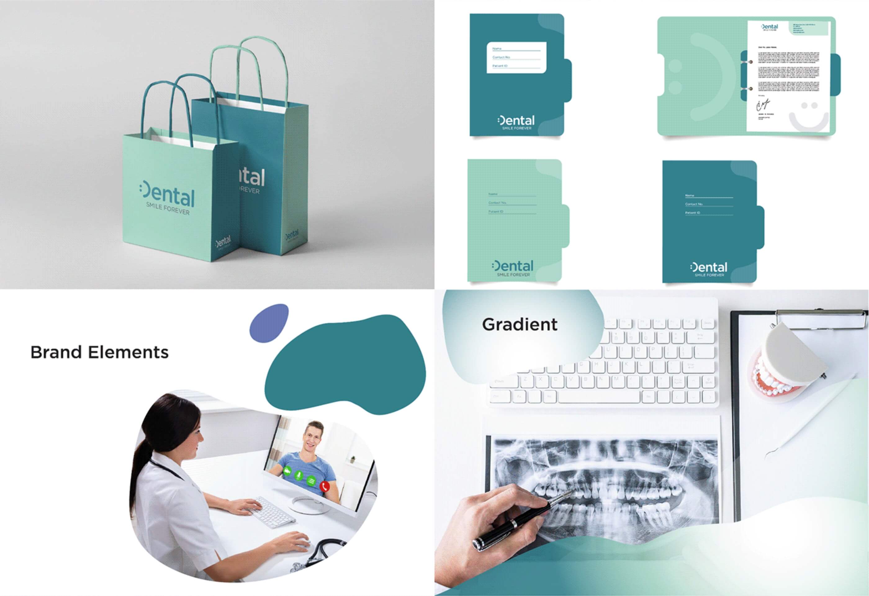
The elements of a visual profile can vary in both number and types, and have different functions. The most basic are usually a logo, color palette, and image style - which we have taken over - but illustrations, patterns, typography, icons, etc. can also form an important part of a visual profile.
Are you starting to get an overview? Then you should create a design manual with rules for how to use your visual profile + associated files for all communication surfaces. This will make it easier for employees and partners to use the profile in the right way, and you will ensure that your brand appears consistent and holistic in all channels…
Stay tuned!
I hope you found this helpful. Maybe you got some good tips? And you, feel free to leave a few words in the comments below!
Ready to work together?
Hire me for brand identity design.
 Every task, business objective, and success metric can be achieved by intelligent, skillful design.
 Branding/marketing strategy
- Visual/Verbal identity
- Brand Collateral
- Graphic design
- Motion design
- Design system