

Learn how Google’s HEART Framework connects user goals with meaningful UX metrics across Happiness, Engagement, Adoption, Retention, and Task Success to guide smarter product decisions.
Your dashboard says engagement is up 18%.
Great.
But are users happier?
Are they completing important tasks with less effort? Are new customers reaching value faster? Are existing customers coming back? Or are people simply spending longer inside the product because they can’t figure out what to do?
This is one of the awkward truths of product analytics: having more data doesn’t mean you know more about your users.
A SaaS team can track hundreds of events and still struggle to answer a basic question:
Is the user experience actually getting better?
Google researchers Kerry Rodden, Hilary Hutchinson, and Xin Fu developed the HEART framework to help product teams deal with this problem. Published at CHI 2010, HEART introduced a set of user-centred metric categories and a process for connecting product goals with measurable signals.
Those five categories are:
H — Happiness
E — Engagement
A — Adoption
R — Retention
T — Task Success
Simple enough.
The interesting part is what you do with them.
First, Why Do UX Metrics Get Messy?
Imagine you’ve redesigned the onboarding experience for a B2B SaaS product.
Three weeks later, someone asks:
“Did the redesign work?”
Marketing says registrations increased.
Product says activation improved.
Engineering says fewer errors occurred.
Customer support says fewer people are asking how to set up their accounts.
The UX researcher says usability test participants completed setup faster.
Who’s right?
Potentially, everyone.
Each person is looking through a different window.
The problem starts when teams choose a convenient number and treat it as proof of a better experience.
Take time spent in the app.
Higher time spent could mean strong engagement.
Or users could be hopelessly searching for the export button.
Context changes everything.
That’s why good UX measurement starts with the experience you want to create rather than the analytics dashboard you happen to have.
What Is the HEART Framework?
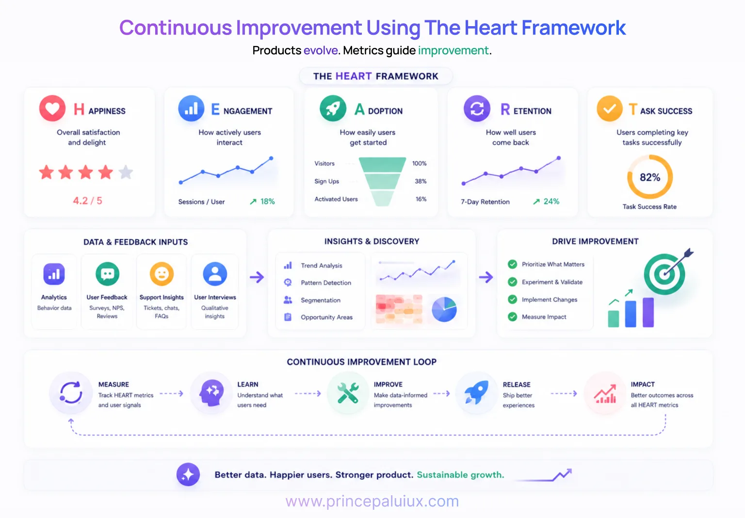
HEART is a framework for selecting user-centred product metrics.
It isn’t an analytics platform or a fixed list of KPIs.
You don’t install HEART alongside Google Analytics.
Instead, it gives your team a structure for deciding what is worth measuring and why.
Google’s original research describes HEART as five categories from which teams can define metrics that track progress against their goals. The researchers paired it with a Goals–Signals–Metrics process so teams could move from broad product intentions to measurements they could actually use.
Google continues to use and discuss HEART beyond consumer UX; Google Cloud, for example, has applied the framework to developer experience and notes that teams don’t need to use every category for every project.
That’s an important point.
You don’t need five dashboards because HEART has five letters.
Pick the dimensions that tell you something meaningful about the problem you’re trying to solve.
Let’s look at each.
❤️ H — Happiness: How Do Users Feel?
Happiness covers user attitudes.
Analytics can tell you that somebody completed onboarding.
It can’t necessarily tell you:
“That was surprisingly easy.”
That’s where attitudinal research comes in.
Happiness can include measures such as:
- Customer satisfaction (CSAT)
- Perceived ease of use
- Net Promoter Score (NPS)
- Product satisfaction
- User confidence
- Survey responses
Google has also researched large-scale in-product Happiness Tracking Surveys, or HaTS, for measuring user attitudes and open-ended feedback over time.
For a FinTech product, happiness might relate to confidence:
“I feel confident that this transaction was completed correctly.”
For a healthcare platform, it might relate to clarity:
“I understood what would happen after booking my appointment.”
For an AI SaaS product, trust becomes especially interesting:
“I understand why the AI recommended this action.”
Same HEART category. Very different questions.
That’s why copying another company’s UX metrics rarely works.
📊 E — Engagement: Are People Meaningfully Using the Product?
Engagement looks at the level of user involvement.
Depending on your product, you might track:
Sessions per active user
Features used per week
Reports created
Projects completed
Messages sent
Content shared
Google describes engagement as the frequency, intensity, or depth of a person’s interaction with a product over a period of time.
There’s a catch, though.
More engagement isn’t automatically better.
Imagine accounting software.
If users previously needed 20 minutes to reconcile an account and your redesign reduces that to five minutes, session duration might fall.
Bad engagement metric?
Perhaps.
Great UX improvement?
Quite possibly.
A productivity product often exists to help someone finish something and leave.
Don’t punish your design for respecting people’s time.
🚀 A — Adoption: Are People Starting to Use It?
Adoption looks at new users beginning to use a product, service, or feature.
Examples include:
- Account registration rate
- New subscriptions
- Feature adoption
- Trial activation
- Upgrade rate
- First project created
- First AI workflow completed
Say you launch an AI assistant inside an existing SaaS platform.
You could measure:
Percentage of eligible users who try the assistant within 30 days.
But even that number needs context.
Imagine 70% try it once and only 8% use it again.
Your launch campaign may have worked beautifully.
Your product experience might have another story to tell.
This is where Adoption and Retention start talking to each other.
🔁 R — Retention: Do Users Come Back?
Acquisition gets attention.
Retention tells a quieter story.
It asks if people continue receiving enough value to return.
Typical measurements include:
7-day or 30-day retention
Subscription renewal rate
Repeat purchase rate
Returning active users
Churn
Google Analytics, for example, distinguishes new, active, total, and returning users, giving teams several ways to examine how audiences behave over time.
For subscription SaaS, retention can be particularly revealing.
A customer may complete onboarding, explore several features, and disappear three weeks later.
Adoption looked healthy.
Engagement looked healthy.
Retention says:
Something didn’t stick.
Now you have a useful research question.
Why?
✅ T — Task Success: Can Users Actually Get the Job Done?
This is one of my favourite UX metrics because it gets very close to the experience itself.
Task Success looks at effectiveness and efficiency.
You might measure:
- Task completion rate
- Time on task
- Error rate
- Search success
- Form completion
- Checkout completion
- Number of attempts
- Abandonment during a critical task
Suppose you’re redesigning appointment scheduling for a telehealth platform.
You could track:
Percentage of users who successfully book an appointment without assistance.
Then look deeper.
How long did it take?
Where did people hesitate?
How many changed their selection?
How many contacted support?
Did they feel confident after booking?
Suddenly you’ve moved from:
“Bookings increased.”
to:
“More patients can successfully book appointments with less effort and greater confidence.”
That’s a much richer product conversation.
Don’t Start With Metrics. Start With Goals.
Here’s where HEART becomes genuinely useful.
You don’t begin by opening Mixpanel, Amplitude, Hotjar, or Google Analytics and asking:
“What numbers have we got?”
Start with:
“What experience are we trying to improve?”
The original HEART work introduced a simple process:
Goals → Signals → Metrics
Think of it as moving from intent → evidence → measurement.
Let’s unpack that.
Step 1: Goals — What Should Become Better?
Goals describe the experience you’re trying to create.
A weak goal might be:
Increase onboarding completion by 20%.
That’s already a metric.
Try stepping back.
Perhaps the real goal is:
Help new customers confidently set up their workspace and reach their first useful outcome.
Now the team can discuss what success actually means.
This distinction matters.
If your only goal is increasing completion, you might remove useful onboarding information and make the flow shorter.
Completion rises.
Two weeks later, support requests rise too.
You improved a number while damaging the experience.
That’s the trap.
Step 2: Signals — What Behaviour Would Tell Us We’re Getting There?
Signals sit between goals and metrics.
Let’s continue with our SaaS onboarding example.
Goal
Help new customers confidently set up their workspace and reach value quickly.
What signals might suggest that’s happening?
Users:
- complete setup without assistance
- make fewer errors
- don’t repeatedly go backwards
- create their first project
- use a core feature
- report feeling confident
- return after onboarding
These are signals.
Some are behavioural.
Some are attitudinal.
That’s healthy.
The original HEART research argues that metrics shouldn’t stand alone and should be considered alongside findings from other research sources. (Google Research)
Analytics tells you what happened.
Research often helps explain why.
Step 3: Metrics — Turn Signals Into Numbers
Now we make the signals measurable.
For example:
| HEART | Goal | Signal | Possible Metric |
|---|---|---|---|
| Happiness | Users feel confident | Positive onboarding feedback | CSAT after onboarding |
| Engagement | Users discover useful features | Meaningful feature interaction | Core actions/user/week |
| Adoption | New users reach value | First project created | Activation rate |
| Retention | Users continue receiving value | Users return | 30-day retention |
| Task Success | Setup feels easy | Users complete setup | Completion rate + time on task |
Notice something?
We’re no longer collecting numbers simply because they’re available.
Every metric has a job.
That’s the point.
So, Which HEART Categories Should You Choose?
You don’t have to track all five.
In fact, doing so can create another dashboard nobody reads.
Google Cloud gives a useful example of this selective approach: onboarding could focus on Adoption, Task Success, and Happiness; a new feature might focus on Adoption and Happiness; increasing ongoing usage could involve Engagement, Retention, and Task Success.
I like to ask three questions:
What user behaviour are we trying to change?
What user feeling matters here?
What evidence would make us change a design decision?
That final question is especially useful.
If nobody would make a decision based on a metric, why are you spending time tracking it?
A Practical B2B SaaS Example
Imagine you’ve built an AI reporting feature.
Users can ask:
“Show me why customer churn increased this quarter.”
The AI analyzes account data and generates an explanation.
The feature works technically.
But adoption is weak.
Here’s how HEART could frame the problem.
Happiness
Do users trust the generated explanation?
Metric:
Confidence rating after viewing an AI-generated report.
Adoption
Are eligible users trying the feature?
Metric:
Percentage generating their first AI report.
Engagement
Do users continue exploring the report?
Metric:
Meaningful follow-up queries per reporting session.
Retention
Do people return to AI reporting?
Metric:
Percentage of first-time users who use it again within 30 days.
Task Success
Can users answer their original business question?
Metric:
Percentage successfully finding an actionable explanation without switching to manual reporting.
Now you’ve moved far beyond:
“How many AI queries were generated?”
You’re measuring product value through user behaviour and experience.
For AI products, that’s increasingly important. A technically correct model can still create poor UX if people don’t understand its output, don’t know its limitations, or don’t trust what happens next.
Beware the Vanity Metric Trap
Every product dashboard has numbers that look impressive in a meeting.
Page views.
Total registrations.
Total prompts.
Downloads.
Time spent.
Number of AI generations.
Big numbers feel comforting.
But ask:
Can this metric help us make a product decision?
If the answer is no, it may simply be interesting data.
Imagine your AI assistant processed 1.2 million prompts.
Sounds fantastic.
But perhaps 40% were users repeatedly rephrasing questions after poor responses.
Volume isn’t necessarily success.
Or your redesigned checkout gets completed faster.
Wonderful.
Unless error rates increased and users are accidentally selecting the wrong subscription.
Metrics need neighbours.
One number rarely tells the full story.
HEART Works Better With Qualitative Research
There’s a temptation to think metrics make interviews and usability testing less necessary.
I’d argue the opposite.
Say Task Success drops from 84% to 69%.
That’s useful.
But the number can’t tell you why.
Now watch five usability sessions.
Suddenly you notice people pausing at the same permission request.
There’s your clue.
Quantitative data finds the smoke.
Qualitative research helps you find the fire.
Google’s own discussion of HEART describes it as combining behavioural measurements with subjective insights rather than treating UX as purely numerical.
That’s particularly useful for healthcare, financial products, enterprise SaaS, and AI systems where trust and confidence can matter as much as clicks.
Your HEART Framework Doesn’t Need to Be Complicated
A small product team doesn’t need a 40-metric UX dashboard.
Start with one product problem.
Pick one or two HEART categories.
Write the goal.
Identify the strongest signals.
Choose a small number of metrics.
Measure.
Learn.
Change something.
Measure again.
For example:
SaaS Onboarding
Goal: Help new users reach their first useful outcome quickly.
HEART focus: Adoption + Task Success
Metrics:
Activation rate
Onboarding completion
Time to first value
Setup error rate
Healthcare Scheduling
Goal: Help patients confidently book the right appointment.
HEART focus: Happiness + Task Success
Metrics:
Booking completion
Time to complete
Booking errors
Post-booking confidence score
AI Assistant
Goal: Help users confidently act on AI recommendations.
HEART focus: Happiness + Retention + Task Success
Metrics:
Trust/confidence rating
Recommendation acceptance
Successful task completion
Repeat AI usage
Different products.
Different behaviours.
Different HEART combinations.
Connect UX Metrics to Business Outcomes
UX teams sometimes make another mistake: keeping UX metrics inside the design department.
A reduction in task failure isn’t merely a usability win.
It could mean fewer support tickets.
Faster onboarding could mean earlier activation.
Clearer pricing could improve conversion.
Better workflows could reduce training costs.
Higher confidence in AI recommendations could increase feature adoption.
Improved retention can affect recurring revenue.
This is where UX measurement becomes much more useful to founders and product leaders.
Instead of presenting:
“Task completion improved by 14%.”
Connect the dots:
“After simplifying the workflow, more users completed setup successfully, support requests fell, and more accounts reached activation.”
Now UX isn’t discussing interface polish.
It’s discussing product performance.
A Simple Rule for Choosing UX Metrics
Before adding any metric to your dashboard, ask:
1. What goal does this number represent?
No clear goal?
Drop it.
2. What user behaviour or attitude does it capture?
Clicks alone aren’t enough.
3. Can we influence it through product decisions?
If your team can’t affect it, question its usefulness.
4. Will a change in this metric cause us to do something?
If nothing changes regardless of the result, you’re probably collecting trivia.
5. Does another metric provide necessary context?
Task completion + satisfaction.
Adoption + retention.
Engagement + task success.
Pairing metrics can prevent misleading interpretations.
From “We Think It’s Better” to “We Know What Changed”
Design will always involve judgment.
That’s a good thing.
Numbers can’t decide what your product should become.
But design without measurement can leave teams arguing from opinion.
HEART gives those conversations structure.
Happiness asks how people feel.
Engagement asks how meaningfully they interact.
Adoption asks if people begin using the experience.
Retention asks if they return.
Task Success asks if they can accomplish what they came to do.
Then Goals → Signals → Metrics connects those ideas to your actual product.
Google created HEART to help teams measure user experience at scale and connect those measurements with product decisions. More than a decade later, Google still references HEART in guidance for measuring user and developer experiences.
And perhaps that’s why the framework has aged well.
It’s simple without being simplistic.
You don’t need every metric.
You need the right evidence for the decision you’re trying to make.
So the next time someone asks:
“Which UX metrics should we track?”
Don’t start with the dashboard.
Start with the user.
Ask what should become better.
Then measure whether it actually did.
Better data should lead to better decisions.
Better decisions should lead to better experiences.
And that’s the metric that matters.